Protected: Grundbuch
Enter your password to view comments.
§9 定居许可(Niederlassungserlaubnis)
(1) 定居许可是一种无期限的居留许可。只有在本法明确允许的情形下,才可以附加附条件(附加条款)。§47不受影响。(sozialgesetzbuch-sgb.de)
(2) 向外国人应当签发定居许可,如果:(sozialgesetzbuch-sgb.de)
(同一款后续规定)(sozialgesetzbuch-sgb.de)
(3) 对处于婚姻共同生活的配偶:只要第(2)款第1句第3、5、6项由一方配偶满足即可。若该外国人正在接受可获得认可的学校/职业教育结业证书或大学学位的教育,则可不要求第(2)款第1句第3项(养老缴费/可比养老证明)。第1句在 §26 Abs.4的情形中同样适用。(sozialgesetzbuch-sgb.de)
(3a) 对于持有 §18c(专业人才定居许可)的外国人的配偶,应当签发定居许可,如果:(sozialgesetzbuch-sgb.de)
(4) 对签发定居许可所需的“持有居留许可”的期间,可计入:(sozialgesetzbuch-sgb.de)
§18 专业人才移民基本原则;一般规定
(1) 接纳外国雇员,应以德国作为经济与科研所在地的需求为导向,并考虑劳动力市场状况。对外国专业人才和劳动力的特别机会,旨在保障专业/劳动力基础并加强社会保障体系。相关规定应以专业人才以及具有显著职业经验的劳动力在劳动力市场与社会中的可持续融入为目标,同时注意公共安全利益。(sozialgesetzbuch-sgb.de)
(2) 依据本节为从事就业活动签发居留许可的前提是:(sozialgesetzbuch-sgb.de)
同款后续:若存在对雇佣该外国人的公共利益(尤其地区性经济或劳动力市场政策利益),可在个案中对上述条件作例外处理,尤其是在工资门槛仅略低或年龄门槛仅略超时。内政部每年最晚于上一年 12 月 31 日在联邦公报公布当年的最低工资标准。(sozialgesetzbuch-sgb.de)
(3) 本法所称“专业人才(Fachkraft)”是指:(sozialgesetzbuch-sgb.de)
(4) 依据 §§18a、18b、18g、19c 签发的居留许可,期限为四年;如果劳动合同或就业局同意的期限更短,则按更短期限另加 3 个月,但总期限不得超过四年。(sozialgesetzbuch-sgb.de)
性质不同
期限不同
条件侧重点不同
它们之间的关系
对“具备职业培训的专业人才”,应签发一项居留许可(Aufenthaltserlaubnis),用于从事任何合格的就业(qualifizierte Beschäftigung)。 (互联网法律)
对“具备高等教育背景的专业人才”,应签发一项居留许可(Aufenthaltserlaubnis),用于从事任何合格的就业(qualifizierte Beschäftigung)。 (sozialgesetzbuch-sgb.de)
(1) 对专业人才,无需联邦就业局(BA)同意,应签发定居许可(Niederlassungserlaubnis),如果满足:
(2) 作为蓝卡持有人(§18g),若已按 §18g 就业满 27个月并缴纳养老,且满足 §9 的相应条件,并具备“基础/简单德语”,则应签发定居许可;若德语达到“足够”,期限可缩短为 21个月。 (sozialgesetzbuch-sgb.de)
(3) 对“高度合格的、具备学术背景的专业人才”,在特殊情况下可(应当倾向于)在无需 BA 同意下签发定居许可:如果可以合理预期其能融入德国生活且无需国家救助即可维持生计,并满足 §9 Abs.2 Satz1 Nr.4(公共安全/秩序不构成反对理由)。各州还可规定此类签发需州最高主管机关(或其指定机构)同意。“高度合格”例示包括:具有特殊专业知识的科研人员;担任重要职务的教师/高级科研人员等。 (sozialgesetzbuch-sgb.de)
(1) 对外国人,无需 BA 同意,应依据欧盟指令 (EU) 2016/801 为“研究目的”签发居留许可,如果:
(2) 如果研究机构的活动主要由公共资金资助,则原则上应免除(1)第2项的费用承诺要求;若该研究项目具有特别公共利益,也可以免除。并规定相关承诺的适用条款。 (sozialgesetzbuch-sgb.de)
(3) 研究机构也可以向负责其认可的主管机构作出“通用承诺”,适用于与其签署接收协议并获得研究居留许可的所有外国人。 (sozialgesetzbuch-sgb.de)
(4) 该研究居留许可一般至少签发 1年;若参加带有流动措施的欧盟/多边项目,则至少 2年;若研究项目更短,则按项目期限签发,但在“至少2年”规则的情形下,期限仍至少 1年。 (sozialgesetzbuch-sgb.de)
(5) 依本条签发的居留许可,允许在接收协议所列研究机构开展研究,并允许从事教学活动;研究项目在居留期间变更,不当然导致该许可失效。 (sozialgesetzbuch-sgb.de)
(6) 对在欧盟某成员国已获国际保护的人,如其满足(1)条件且在该成员国获保护后已居留至少 2年,可签发研究目的居留许可;(5)相应适用。 (sozialgesetzbuch-sgb.de)
(1) 对具备学术背景的专业人才,无需 BA 同意,应为其签发欧盟蓝卡,用于从事与其资格相匹配的德国境内工作,前提是:其工资至少达到法定养老保险年度缴费基数上限的 50%,且不存在 §19f 规定的拒绝理由。 但对以下两类人:
(2) 对不满足(1)的申请人,在某些职业组别(ISCO-08中的特定组别)下,可在需要 BA 同意的情况下签发蓝卡;并在一定条件下对学历要求作特殊处理(包括:工资至少45.3%;无§19f拒绝理由;并能证明近7年内获得的、至少3年的相关职业经验,且能力水平可与高校学位相当并对岗位必需)。 (sozialgesetzbuch-sgb.de)
(3) 签发蓝卡要求:具体工作邀约所约定的雇佣期限至少 6个月。 (sozialgesetzbuch-sgb.de)
(4) 蓝卡持有人更换雇主/岗位:一般不需要外国人局许可;但在就业的前 12个月,外国人局可将岗位变更暂停最多 30天并在此期间拒绝(若不再满足蓝卡签发条件)。 (sozialgesetzbuch-sgb.de)
(5) 在某些情况下,签发蓝卡可视为生活费已保障:如果外国人持有 §18a 或 §18b 的居留许可且不更换工作岗位。 (sozialgesetzbuch-sgb.de)
(6) 蓝卡延期的特殊工资门槛:若申请人在申请延期前不超过 3年取得学位,或自首次按较低门槛((1)中45.3%那种情形)签发蓝卡以来未满 24个月,则延期时适用该较低门槛;其余仍适用一般延期规则。 (sozialgesetzbuch-sgb.de)
(7) 内政部每年在上一年 12月31日前于联邦公报公布下一年度(1)(2)所需的最低工资标准。 (sozialgesetzbuch-sgb.de)
§18a vs §18b(工作居留的入口)
§18g(蓝卡)
§18d(研究)
§18c(定居/永居)
Data_Tam_RNAseq_2024_AUM_MHB_Urine_on_ATCC19606X101SC24105589-Z01-J001: AUM-1..3, MHB-1..3, Urine-1..3 (all PE)X101SC25062155-Z01-J002: AUM-1..3, AUM-AZI-1..3, MH-1..3, MH-AZI-1..3, Urine-1..3, Urine-AZI-1..3 (all PE)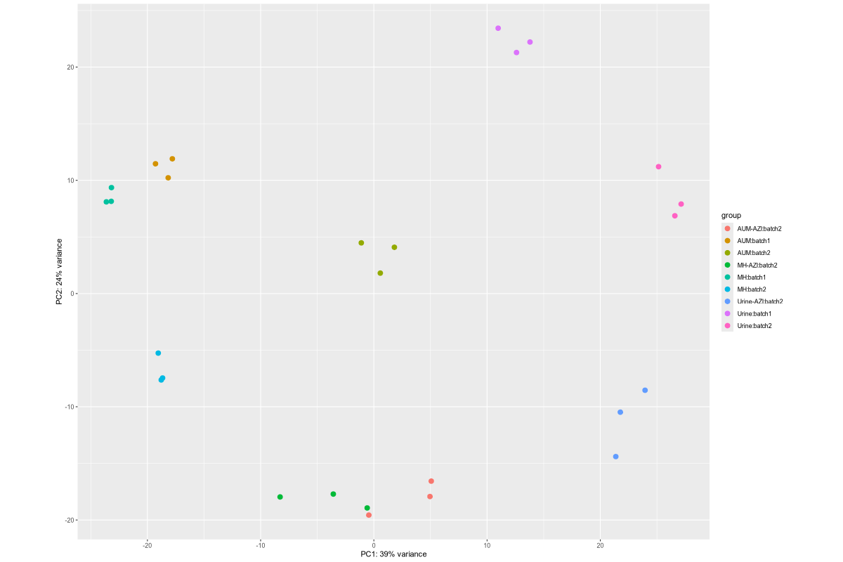
Data_Tam_RNAseq_2025_LB-AB_IJ_W1_Y1_WT_vs_Mac-AB_IJ_W1_Y1_WT_on_ATCC19606LB-AB-1..3, LB-IJ-(1,2,4), LB-W1-1..3, LB-WT19606-2..4, LB-Y1-2..4Mac-AB-1..3, Mac-IJ-(1,2,4), Mac-W1-1..3, Mac-WT19606-2..4, Mac-Y1-2..4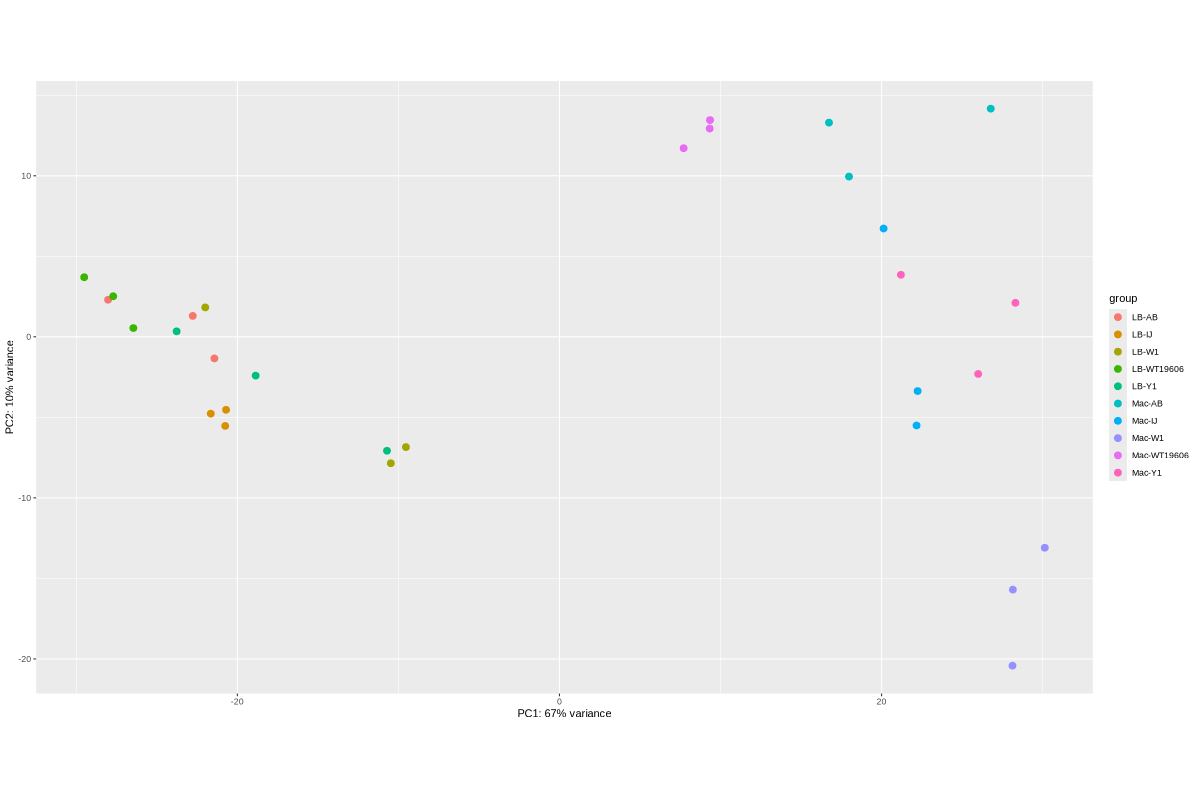
Data_Tam_RNAseq_2025_subMIC_exposure_on_ATCC19606Each with reps -1..-3 (all PE):
0_5ΔIJ-17, 0_5ΔIJ-24preWT-17, preWT-24preΔIJ-17, preΔIJ-24WT0_5-17, WT0_5-24WT-17, WT-24ΔIJ-17, ΔIJ-24
Data_Tam_DNAseq_2023_lab_strainsData_Tam_DNAseq_2025_AYE-WT_Q_S_craA-Tig4_craA-1-Cm200_craA-2-Cm200AYE-Q, AYE-S, AYE-WTonTig4, AYE-craAonTig4, AYE-craA-1onCm200, AYE-craA-2onCm200, clinical (all PE)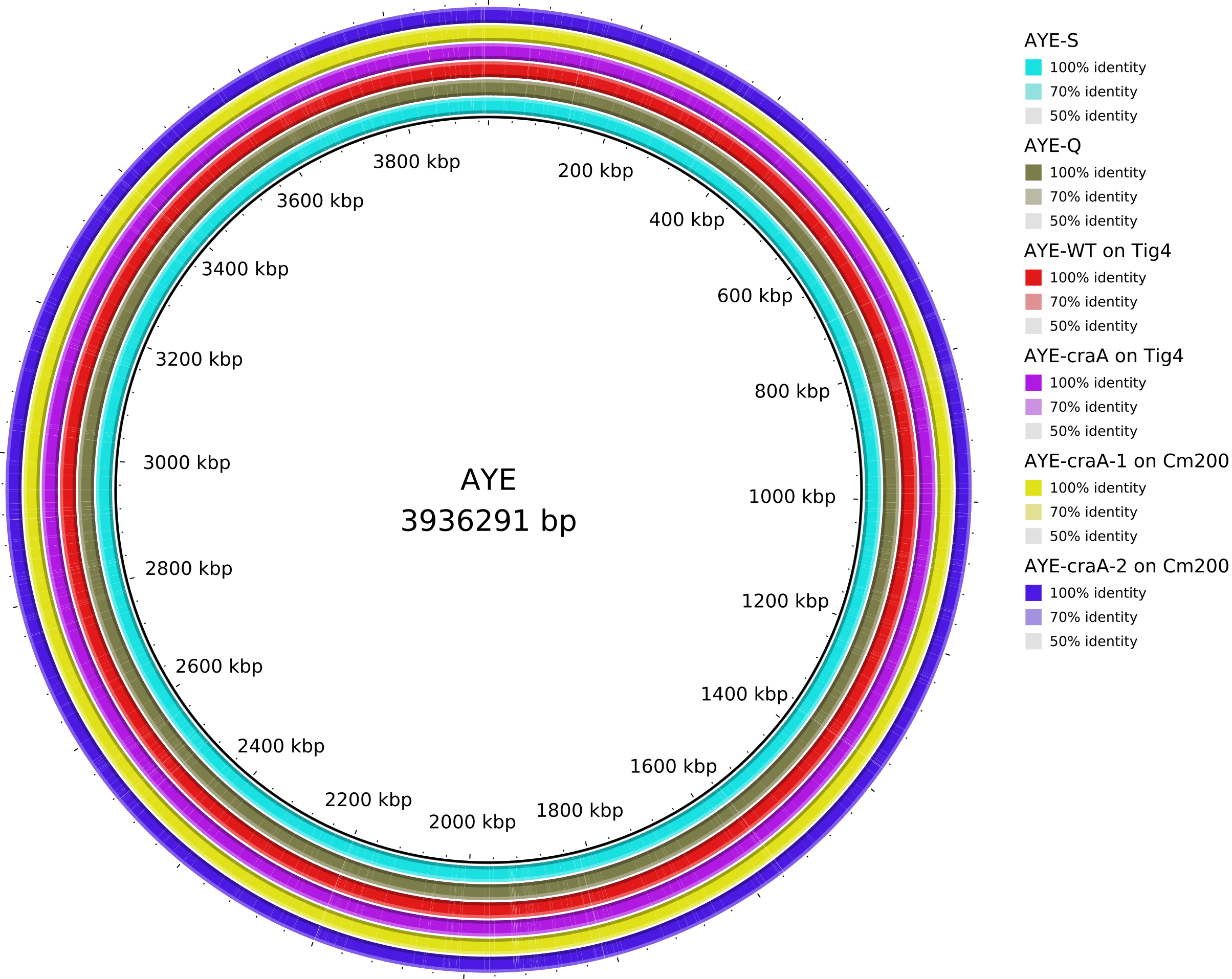
Data_Tam_DNAseq_2025_E.hormaechei-adeABadeIJ_adeIJK_CM1_CM2_on_ATCC19606adeABadeIJ, adeIJK, CM1, CM2, HF (all PE)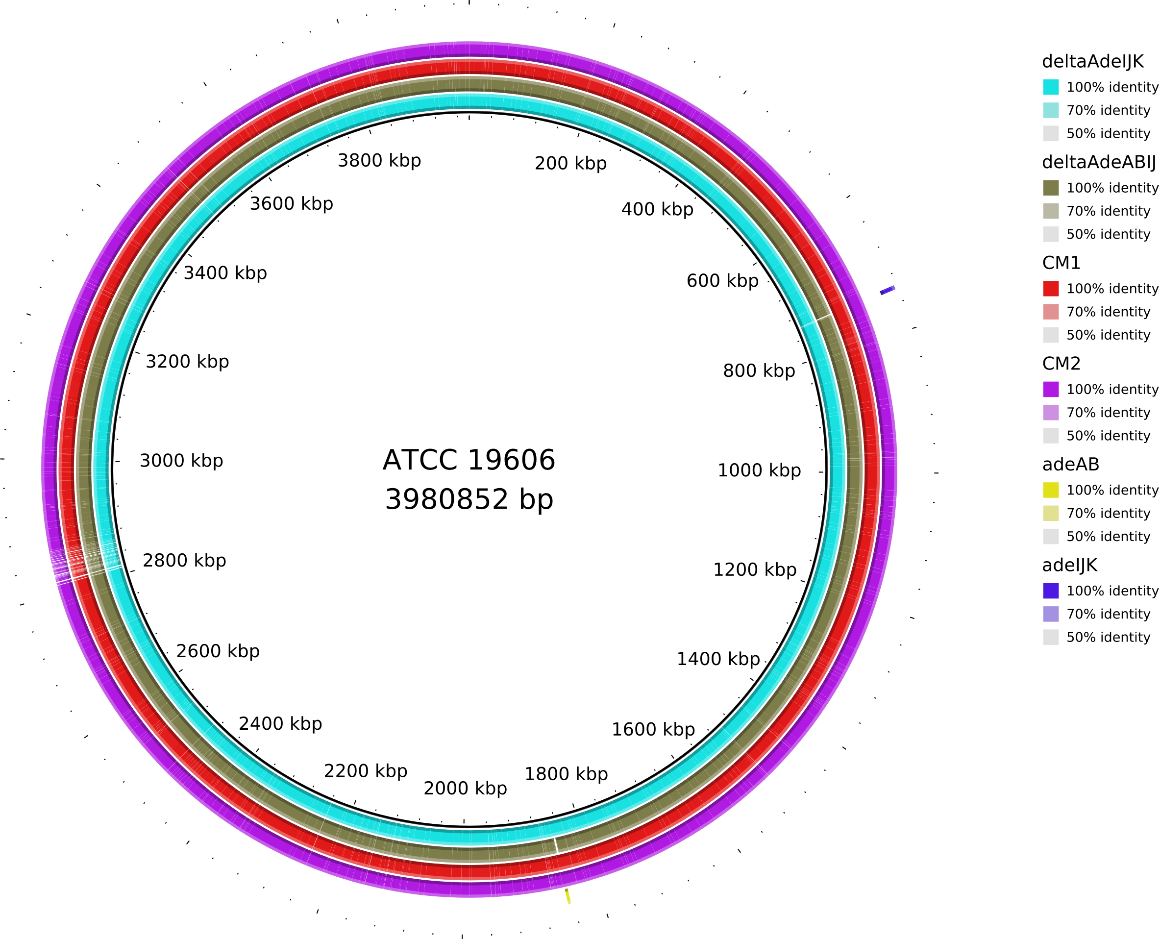
Data_Tam_DNAseq_2025_ATCC19606-Y1Y2Y3Y4W1W2W3W4△adeIJ, Tig1, Tig2, W, W2, W3, W4, Y, Y2, Y3, Y4Nanopore (*_fastq_pass.tar):
W1 (3 tar files), W2 (1), W3 (2), W4 (1)Y1 (3), Y2 (1), Y3 (1), Y4 (1)Data_Tam_DNAseq_2026_19606deltaIJfluEAll PE; grouped by background:
19606△ABfluE: cef-1, cipro-2, dori-2, nitro-3, pip-1, polyB-3, tet-119606△IJfluE: cef-4, cipro-3, dori-1, nitro-3, pip-4, polyB-419606wtfluE: cef-1, cipro-2, dori-1, nitro-1, pip-4, polyB-4, tet-2Data_Tam_DNAseq_2026_Acinetobacter_harbinensisAn6 (PE)Data_Tam_Metagenomics_2026A1, A1a, A2, B1, B2 (PE)Data_Foong_RNAseq_2021_ATCC19606_Cm (mapping list provided)WT_1, WT_2B, C_1B, C_2, J_1, J_2Control, WT_1B, WT_2B, WT_3B, Cra_1, Cra_2, Cra_3, IJ_1B, IJ_2B, IJ_3adIJ_1, adIJ_2, crA2, crA_ab_1, crA_ab_2, crA_ab_3, adAB_1, adAB_2, adAB_ab1, adAB_ab2, adAB_ab3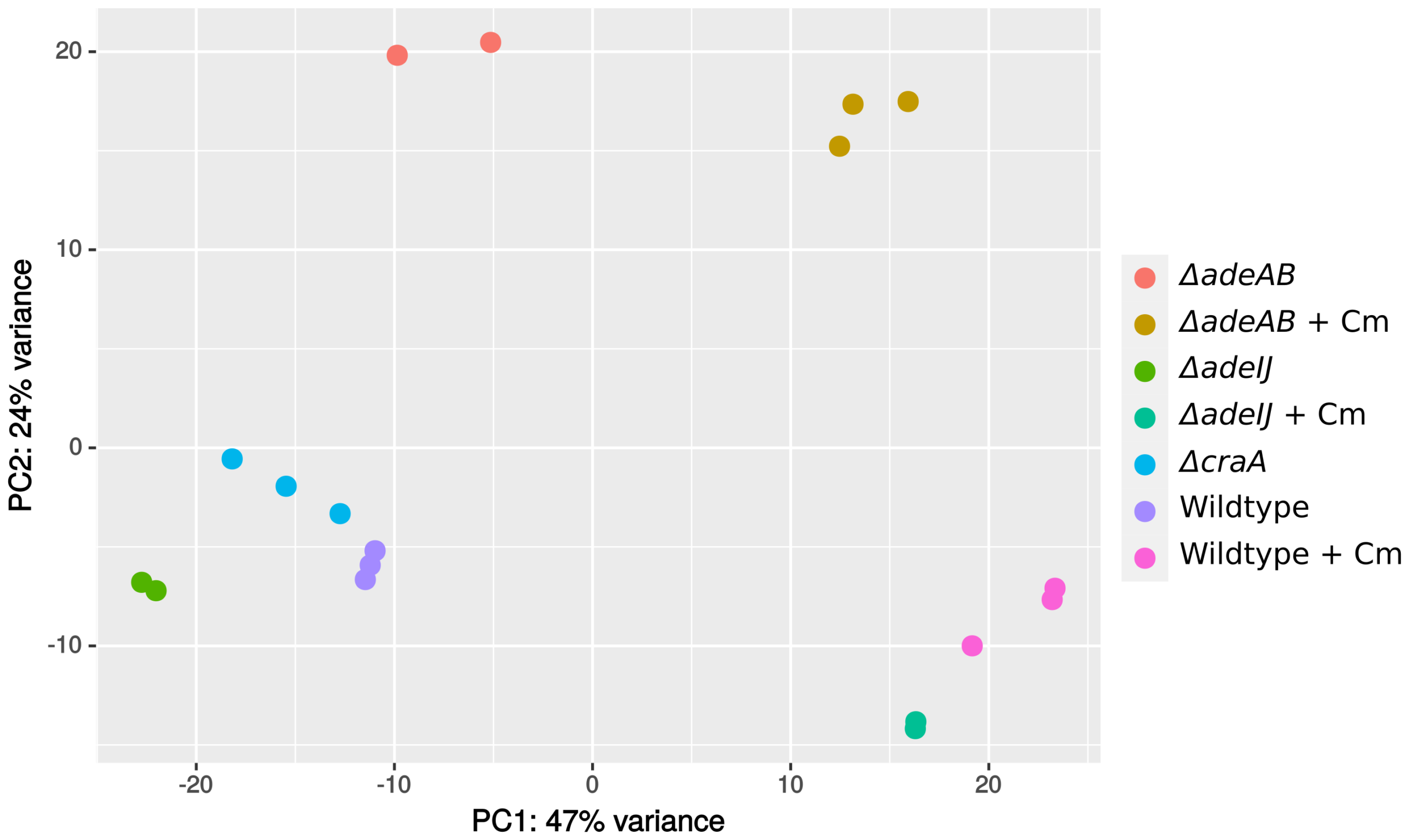
Data_Foong_DNAseq_2025_AYE_Dark_vs_LightDark, Light (PE)| Dataset folder | Year | Data type | Platform / format | Run / project IDs present | Samples (n) | Files (n) | Sample groups / notes |
|---|---|---|---|---|---|---|---|
Data_Tam_RNAseq_2024_AUM_MHB_Urine_on_ATCC19606/ |
2024 | RNA-seq | Illumina PE (*_1.fq.gz, *_2.fq.gz) |
X101SC24105589-Z01-J001, X101SC25062155-Z01-J002 |
27 | 54 | J001: AUM/MHB/Urine (each 1–3). J002: AUM, AUM-AZI, MH, MH-AZI, Urine, Urine-AZI (each 1–3). |
Data_Tam_RNAseq_2025_LB-AB_IJ_W1_Y1_WT_vs_Mac-AB_IJ_W1_Y1_WT_on_ATCC19606/ |
2025 | RNA-seq | Illumina PE | X101SC25015922-Z02-J002 |
30 | 60 | LB vs Mac sets; conditions AB, IJ, W1, Y1, WT19606 with listed replicates (mostly 1–3 or 2–4; IJ uses 1,2,4). |
Data_Tam_RNAseq_2025_subMIC_exposure_on_ATCC19606/ |
2025 | RNA-seq | Illumina PE | X101SC25062155-Z01-J001 |
36 | 72 | 12 condition blocks × 3 reps: preWT, preΔIJ, WT, ΔIJ, WT0_5, 0_5ΔIJ at timepoints 17 and 24. |
Data_Tam_DNAseq_2025_ATCC19606-Y1Y2Y3Y4W1W2W3W4/ |
2025 | DNA-seq | Illumina PE + Nanopore (*_fastq_pass.tar) |
Illumina: X101SC24065637-Z01-J001/J002; Nanopore: X101SC25080408-Z01-J001 |
11 (Illumina) + 13 tar archives | 22 + 13 | Illumina: △adeIJ, Tig1, Tig2, W, W2–W4, Y, Y2–Y4. Nanopore: W1(3), W2(1), W3(2), W4(1), Y1(3), Y2(1), Y3(1), Y4(1) tar files. |
Data_Tam_DNAseq_2025_AYE-WT_Q_S_craA-Tig4_craA-1-Cm200_craA-2-Cm200/ |
2025 | DNA-seq | Illumina PE | X101SC25015922-Z01-J001 |
7 | 14 | AYE variants: AYE-Q, AYE-S, AYE-WTonTig4, AYE-craAonTig4, AYE-craA-1onCm200, AYE-craA-2onCm200, plus clinical. |
Data_Tam_DNAseq_2025_E.hormaechei-adeABadeIJ_adeIJK_CM1_CM2 |
2025 | DNA-seq | Illumina PE | X101SC24115801-Z01-J001 |
5 | 10 | adeABadeIJ, adeIJK, CM1, CM2, HF. |
Data_Tam_DNAseq_2026_19606deltaIJfluE/ |
2026 | DNA-seq | Illumina PE | X101SC25116512-Z01-J003 |
20 | 40 | Three backgrounds: 19606△ABfluE* (7), 19606△IJfluE* (6), 19606wtfluE* (7) across drug tags (cef/cipro/dori/nitro/pip/polyB/tet) with replicate suffixes. |
Data_Tam_DNAseq_2026_Acinetobacter_harbinensis/ |
2026 | DNA-seq | Illumina PE | X101SC25116512-Z01-J002 |
1 | 2 | An6 (paired-end). |
Data_Tam_Metagenomics_2026/ |
2026 | Metagenomics | Illumina PE | X101SC25123808-Z01-J001 |
5 | 10 | A1, A1a, A2, B1, B2. |
Data_Foong_RNAseq_2021_ATCC19606_Cm/ |
2021 | RNA-seq | Illumina PE (symlink/mapping list shown) | (paths point to raw_data_batch1/2/3) |
27 | 54 | Batch1: WT/craA/adeIJ (each 2 reps). Batch2: Control + WT.abx + craA.abx + adeIJ.abx (various reps). Batch3: adeIJ, craA, craA.abx, adeAB, adeAB.abx (various reps). |
Data_Foong_DNAseq_2025_AYE_Dark_vs_Light/ |
2025 | DNA-seq | Illumina PE | X101SC25116512-Z01-J001 |
2 | 4 | Dark, Light. |
Data_Tam_RNAseq_2024_AUM_MHB_Urine_on_ATCC19606/

    ./X101SC24105589-Z01-J001/01.RawData/AUM-1/AUM-1_1.fq.gz
    ./X101SC24105589-Z01-J001/01.RawData/AUM-1/AUM-1_2.fq.gz
    ./X101SC24105589-Z01-J001/01.RawData/AUM-2/AUM-2_1.fq.gz
    ./X101SC24105589-Z01-J001/01.RawData/AUM-2/AUM-2_2.fq.gz
    ./X101SC24105589-Z01-J001/01.RawData/AUM-3/AUM-3_1.fq.gz
    ./X101SC24105589-Z01-J001/01.RawData/AUM-3/AUM-3_2.fq.gz
    ./X101SC24105589-Z01-J001/01.RawData/MHB-1/MHB-1_1.fq.gz
    ./X101SC24105589-Z01-J001/01.RawData/MHB-1/MHB-1_2.fq.gz
    ./X101SC24105589-Z01-J001/01.RawData/MHB-2/MHB-2_1.fq.gz
    ./X101SC24105589-Z01-J001/01.RawData/MHB-2/MHB-2_2.fq.gz
    ./X101SC24105589-Z01-J001/01.RawData/MHB-3/MHB-3_1.fq.gz
    ./X101SC24105589-Z01-J001/01.RawData/MHB-3/MHB-3_2.fq.gz
    ./X101SC24105589-Z01-J001/01.RawData/Urine-1/Urine-1_1.fq.gz
    ./X101SC24105589-Z01-J001/01.RawData/Urine-1/Urine-1_2.fq.gz
    ./X101SC24105589-Z01-J001/01.RawData/Urine-2/Urine-2_1.fq.gz
    ./X101SC24105589-Z01-J001/01.RawData/Urine-2/Urine-2_2.fq.gz
    ./X101SC24105589-Z01-J001/01.RawData/Urine-3/Urine-3_1.fq.gz
    ./X101SC24105589-Z01-J001/01.RawData/Urine-3/Urine-3_2.fq.gz
    ./X101SC25062155-Z01-J002/01.RawData/AUM-1/AUM-1_1.fq.gz
    ./X101SC25062155-Z01-J002/01.RawData/AUM-1/AUM-1_2.fq.gz
    ./X101SC25062155-Z01-J002/01.RawData/AUM-2/AUM-2_1.fq.gz
    ./X101SC25062155-Z01-J002/01.RawData/AUM-2/AUM-2_2.fq.gz
    ./X101SC25062155-Z01-J002/01.RawData/AUM-3/AUM-3_1.fq.gz
    ./X101SC25062155-Z01-J002/01.RawData/AUM-3/AUM-3_2.fq.gz
    ./X101SC25062155-Z01-J002/01.RawData/AUM-AZI-1/AUM-AZI-1_1.fq.gz
    ./X101SC25062155-Z01-J002/01.RawData/AUM-AZI-1/AUM-AZI-1_2.fq.gz
    ./X101SC25062155-Z01-J002/01.RawData/AUM-AZI-2/AUM-AZI-2_1.fq.gz
    ./X101SC25062155-Z01-J002/01.RawData/AUM-AZI-2/AUM-AZI-2_2.fq.gz
    ./X101SC25062155-Z01-J002/01.RawData/AUM-AZI-3/AUM-AZI-3_1.fq.gz
    ./X101SC25062155-Z01-J002/01.RawData/AUM-AZI-3/AUM-AZI-3_2.fq.gz
    ./X101SC25062155-Z01-J002/01.RawData/MH-1/MH-1_1.fq.gz
    ./X101SC25062155-Z01-J002/01.RawData/MH-1/MH-1_2.fq.gz
    ./X101SC25062155-Z01-J002/01.RawData/MH-2/MH-2_1.fq.gz
    ./X101SC25062155-Z01-J002/01.RawData/MH-2/MH-2_2.fq.gz
    ./X101SC25062155-Z01-J002/01.RawData/MH-3/MH-3_1.fq.gz
    ./X101SC25062155-Z01-J002/01.RawData/MH-3/MH-3_2.fq.gz
    ./X101SC25062155-Z01-J002/01.RawData/MH-AZI-1/MH-AZI-1_1.fq.gz
    ./X101SC25062155-Z01-J002/01.RawData/MH-AZI-1/MH-AZI-1_2.fq.gz
    ./X101SC25062155-Z01-J002/01.RawData/MH-AZI-2/MH-AZI-2_1.fq.gz
    ./X101SC25062155-Z01-J002/01.RawData/MH-AZI-2/MH-AZI-2_2.fq.gz
    ./X101SC25062155-Z01-J002/01.RawData/MH-AZI-3/MH-AZI-3_1.fq.gz
    ./X101SC25062155-Z01-J002/01.RawData/MH-AZI-3/MH-AZI-3_2.fq.gz
    ./X101SC25062155-Z01-J002/01.RawData/Urine-1/Urine-1_1.fq.gz
    ./X101SC25062155-Z01-J002/01.RawData/Urine-1/Urine-1_2.fq.gz
    ./X101SC25062155-Z01-J002/01.RawData/Urine-2/Urine-2_1.fq.gz
    ./X101SC25062155-Z01-J002/01.RawData/Urine-2/Urine-2_2.fq.gz
    ./X101SC25062155-Z01-J002/01.RawData/Urine-3/Urine-3_1.fq.gz
    ./X101SC25062155-Z01-J002/01.RawData/Urine-3/Urine-3_2.fq.gz
    ./X101SC25062155-Z01-J002/01.RawData/Urine-AZI-1/Urine-AZI-1_1.fq.gz
    ./X101SC25062155-Z01-J002/01.RawData/Urine-AZI-1/Urine-AZI-1_2.fq.gz
    ./X101SC25062155-Z01-J002/01.RawData/Urine-AZI-2/Urine-AZI-2_1.fq.gz
    ./X101SC25062155-Z01-J002/01.RawData/Urine-AZI-2/Urine-AZI-2_2.fq.gz
    ./X101SC25062155-Z01-J002/01.RawData/Urine-AZI-3/Urine-AZI-3_1.fq.gz
    ./X101SC25062155-Z01-J002/01.RawData/Urine-AZI-3/Urine-AZI-3_2.fq.gz

Data_Tam_RNAseq_2025_LB-AB_IJ_W1_Y1_WT_vs_Mac-AB_IJ_W1_Y1_WT_on_ATCC19606/

    ./X101SC25015922-Z02-J002/01.RawData/LB-AB-1/LB-AB-1_1.fq.gz
    ./X101SC25015922-Z02-J002/01.RawData/LB-AB-1/LB-AB-1_2.fq.gz
    ./X101SC25015922-Z02-J002/01.RawData/LB-AB-2/LB-AB-2_1.fq.gz
    ./X101SC25015922-Z02-J002/01.RawData/LB-AB-2/LB-AB-2_2.fq.gz
    ./X101SC25015922-Z02-J002/01.RawData/LB-AB-3/LB-AB-3_1.fq.gz
    ./X101SC25015922-Z02-J002/01.RawData/LB-AB-3/LB-AB-3_2.fq.gz
    ./X101SC25015922-Z02-J002/01.RawData/LB-IJ-1/LB-IJ-1_1.fq.gz
    ./X101SC25015922-Z02-J002/01.RawData/LB-IJ-1/LB-IJ-1_2.fq.gz
    ./X101SC25015922-Z02-J002/01.RawData/LB-IJ-2/LB-IJ-2_1.fq.gz
    ./X101SC25015922-Z02-J002/01.RawData/LB-IJ-2/LB-IJ-2_2.fq.gz
    ./X101SC25015922-Z02-J002/01.RawData/LB-IJ-4/LB-IJ-4_1.fq.gz
    ./X101SC25015922-Z02-J002/01.RawData/LB-IJ-4/LB-IJ-4_2.fq.gz
    ./X101SC25015922-Z02-J002/01.RawData/LB-W1-1/LB-W1-1_1.fq.gz
    ./X101SC25015922-Z02-J002/01.RawData/LB-W1-1/LB-W1-1_2.fq.gz
    ./X101SC25015922-Z02-J002/01.RawData/LB-W1-2/LB-W1-2_1.fq.gz
    ./X101SC25015922-Z02-J002/01.RawData/LB-W1-2/LB-W1-2_2.fq.gz
    ./X101SC25015922-Z02-J002/01.RawData/LB-W1-3/LB-W1-3_1.fq.gz
    ./X101SC25015922-Z02-J002/01.RawData/LB-W1-3/LB-W1-3_2.fq.gz
    ./X101SC25015922-Z02-J002/01.RawData/LB-WT19606-2/LB-WT19606-2_1.fq.gz
    ./X101SC25015922-Z02-J002/01.RawData/LB-WT19606-2/LB-WT19606-2_2.fq.gz
    ./X101SC25015922-Z02-J002/01.RawData/LB-WT19606-3/LB-WT19606-3_1.fq.gz
    ./X101SC25015922-Z02-J002/01.RawData/LB-WT19606-3/LB-WT19606-3_2.fq.gz
    ./X101SC25015922-Z02-J002/01.RawData/LB-WT19606-4/LB-WT19606-4_1.fq.gz
    ./X101SC25015922-Z02-J002/01.RawData/LB-WT19606-4/LB-WT19606-4_2.fq.gz
    ./X101SC25015922-Z02-J002/01.RawData/LB-Y1-2/LB-Y1-2_1.fq.gz
    ./X101SC25015922-Z02-J002/01.RawData/LB-Y1-2/LB-Y1-2_2.fq.gz
    ./X101SC25015922-Z02-J002/01.RawData/LB-Y1-3/LB-Y1-3_1.fq.gz
    ./X101SC25015922-Z02-J002/01.RawData/LB-Y1-3/LB-Y1-3_2.fq.gz
    ./X101SC25015922-Z02-J002/01.RawData/LB-Y1-4/LB-Y1-4_1.fq.gz
    ./X101SC25015922-Z02-J002/01.RawData/LB-Y1-4/LB-Y1-4_2.fq.gz
    ./X101SC25015922-Z02-J002/01.RawData/Mac-AB-1/Mac-AB-1_1.fq.gz
    ./X101SC25015922-Z02-J002/01.RawData/Mac-AB-1/Mac-AB-1_2.fq.gz
    ./X101SC25015922-Z02-J002/01.RawData/Mac-AB-2/Mac-AB-2_1.fq.gz
    ./X101SC25015922-Z02-J002/01.RawData/Mac-AB-2/Mac-AB-2_2.fq.gz
    ./X101SC25015922-Z02-J002/01.RawData/Mac-AB-3/Mac-AB-3_1.fq.gz
    ./X101SC25015922-Z02-J002/01.RawData/Mac-AB-3/Mac-AB-3_2.fq.gz
    ./X101SC25015922-Z02-J002/01.RawData/Mac-IJ-1/Mac-IJ-1_1.fq.gz
    ./X101SC25015922-Z02-J002/01.RawData/Mac-IJ-1/Mac-IJ-1_2.fq.gz
    ./X101SC25015922-Z02-J002/01.RawData/Mac-IJ-2/Mac-IJ-2_1.fq.gz
    ./X101SC25015922-Z02-J002/01.RawData/Mac-IJ-2/Mac-IJ-2_2.fq.gz
    ./X101SC25015922-Z02-J002/01.RawData/Mac-IJ-4/Mac-IJ-4_1.fq.gz
    ./X101SC25015922-Z02-J002/01.RawData/Mac-IJ-4/Mac-IJ-4_2.fq.gz
    ./X101SC25015922-Z02-J002/01.RawData/Mac-W1-1/Mac-W1-1_1.fq.gz
    ./X101SC25015922-Z02-J002/01.RawData/Mac-W1-1/Mac-W1-1_2.fq.gz
    ./X101SC25015922-Z02-J002/01.RawData/Mac-W1-2/Mac-W1-2_1.fq.gz
    ./X101SC25015922-Z02-J002/01.RawData/Mac-W1-2/Mac-W1-2_2.fq.gz
    ./X101SC25015922-Z02-J002/01.RawData/Mac-W1-3/Mac-W1-3_1.fq.gz
    ./X101SC25015922-Z02-J002/01.RawData/Mac-W1-3/Mac-W1-3_2.fq.gz
    ./X101SC25015922-Z02-J002/01.RawData/Mac-WT19606-2/Mac-WT19606-2_1.fq.gz
    ./X101SC25015922-Z02-J002/01.RawData/Mac-WT19606-2/Mac-WT19606-2_2.fq.gz
    ./X101SC25015922-Z02-J002/01.RawData/Mac-WT19606-3/Mac-WT19606-3_1.fq.gz
    ./X101SC25015922-Z02-J002/01.RawData/Mac-WT19606-3/Mac-WT19606-3_2.fq.gz
    ./X101SC25015922-Z02-J002/01.RawData/Mac-WT19606-4/Mac-WT19606-4_1.fq.gz
    ./X101SC25015922-Z02-J002/01.RawData/Mac-WT19606-4/Mac-WT19606-4_2.fq.gz
    ./X101SC25015922-Z02-J002/01.RawData/Mac-Y1-2/Mac-Y1-2_1.fq.gz
    ./X101SC25015922-Z02-J002/01.RawData/Mac-Y1-2/Mac-Y1-2_2.fq.gz
    ./X101SC25015922-Z02-J002/01.RawData/Mac-Y1-3/Mac-Y1-3_1.fq.gz
    ./X101SC25015922-Z02-J002/01.RawData/Mac-Y1-3/Mac-Y1-3_2.fq.gz
    ./X101SC25015922-Z02-J002/01.RawData/Mac-Y1-4/Mac-Y1-4_1.fq.gz
    ./X101SC25015922-Z02-J002/01.RawData/Mac-Y1-4/Mac-Y1-4_2.fq.gz

Data_Tam_RNAseq_2025_subMIC_exposure_on_ATCC19606/

    ./X101SC25062155-Z01-J001/01.RawData/0_5ΔIJ-17-1/0_5ΔIJ-17-1_1.fq.gz
    ./X101SC25062155-Z01-J001/01.RawData/0_5ΔIJ-17-1/0_5ΔIJ-17-1_2.fq.gz
    ./X101SC25062155-Z01-J001/01.RawData/0_5ΔIJ-17-2/0_5ΔIJ-17-2_1.fq.gz
    ./X101SC25062155-Z01-J001/01.RawData/0_5ΔIJ-17-2/0_5ΔIJ-17-2_2.fq.gz
    ./X101SC25062155-Z01-J001/01.RawData/0_5ΔIJ-17-3/0_5ΔIJ-17-3_1.fq.gz
    ./X101SC25062155-Z01-J001/01.RawData/0_5ΔIJ-17-3/0_5ΔIJ-17-3_2.fq.gz
    ./X101SC25062155-Z01-J001/01.RawData/0_5ΔIJ-24-1/0_5ΔIJ-24-1_1.fq.gz
    ./X101SC25062155-Z01-J001/01.RawData/0_5ΔIJ-24-1/0_5ΔIJ-24-1_2.fq.gz
    ./X101SC25062155-Z01-J001/01.RawData/0_5ΔIJ-24-2/0_5ΔIJ-24-2_1.fq.gz
    ./X101SC25062155-Z01-J001/01.RawData/0_5ΔIJ-24-2/0_5ΔIJ-24-2_2.fq.gz
    ./X101SC25062155-Z01-J001/01.RawData/0_5ΔIJ-24-3/0_5ΔIJ-24-3_1.fq.gz
    ./X101SC25062155-Z01-J001/01.RawData/0_5ΔIJ-24-3/0_5ΔIJ-24-3_2.fq.gz
    ./X101SC25062155-Z01-J001/01.RawData/preWT-17-1/preWT-17-1_1.fq.gz
    ./X101SC25062155-Z01-J001/01.RawData/preWT-17-1/preWT-17-1_2.fq.gz
    ./X101SC25062155-Z01-J001/01.RawData/preWT-17-2/preWT-17-2_1.fq.gz
    ./X101SC25062155-Z01-J001/01.RawData/preWT-17-2/preWT-17-2_2.fq.gz
    ./X101SC25062155-Z01-J001/01.RawData/preWT-17-3/preWT-17-3_1.fq.gz
    ./X101SC25062155-Z01-J001/01.RawData/preWT-17-3/preWT-17-3_2.fq.gz
    ./X101SC25062155-Z01-J001/01.RawData/preWT-24-1/preWT-24-1_1.fq.gz
    ./X101SC25062155-Z01-J001/01.RawData/preWT-24-1/preWT-24-1_2.fq.gz
    ./X101SC25062155-Z01-J001/01.RawData/preWT-24-2/preWT-24-2_1.fq.gz
    ./X101SC25062155-Z01-J001/01.RawData/preWT-24-2/preWT-24-2_2.fq.gz
    ./X101SC25062155-Z01-J001/01.RawData/preWT-24-3/preWT-24-3_1.fq.gz
    ./X101SC25062155-Z01-J001/01.RawData/preWT-24-3/preWT-24-3_2.fq.gz
    ./X101SC25062155-Z01-J001/01.RawData/preΔIJ-17-1/preΔIJ-17-1_1.fq.gz
    ./X101SC25062155-Z01-J001/01.RawData/preΔIJ-17-1/preΔIJ-17-1_2.fq.gz
    ./X101SC25062155-Z01-J001/01.RawData/preΔIJ-17-2/preΔIJ-17-2_1.fq.gz
    ./X101SC25062155-Z01-J001/01.RawData/preΔIJ-17-2/preΔIJ-17-2_2.fq.gz
    ./X101SC25062155-Z01-J001/01.RawData/preΔIJ-17-3/preΔIJ-17-3_1.fq.gz
    ./X101SC25062155-Z01-J001/01.RawData/preΔIJ-17-3/preΔIJ-17-3_2.fq.gz
    ./X101SC25062155-Z01-J001/01.RawData/preΔIJ-24-1/preΔIJ-24-1_1.fq.gz
    ./X101SC25062155-Z01-J001/01.RawData/preΔIJ-24-1/preΔIJ-24-1_2.fq.gz
    ./X101SC25062155-Z01-J001/01.RawData/preΔIJ-24-2/preΔIJ-24-2_1.fq.gz
    ./X101SC25062155-Z01-J001/01.RawData/preΔIJ-24-2/preΔIJ-24-2_2.fq.gz
    ./X101SC25062155-Z01-J001/01.RawData/preΔIJ-24-3/preΔIJ-24-3_1.fq.gz
    ./X101SC25062155-Z01-J001/01.RawData/preΔIJ-24-3/preΔIJ-24-3_2.fq.gz
    ./X101SC25062155-Z01-J001/01.RawData/WT0_5-17-1/WT0_5-17-1_1.fq.gz
    ./X101SC25062155-Z01-J001/01.RawData/WT0_5-17-1/WT0_5-17-1_2.fq.gz
    ./X101SC25062155-Z01-J001/01.RawData/WT0_5-17-2/WT0_5-17-2_1.fq.gz
    ./X101SC25062155-Z01-J001/01.RawData/WT0_5-17-2/WT0_5-17-2_2.fq.gz
    ./X101SC25062155-Z01-J001/01.RawData/WT0_5-17-3/WT0_5-17-3_1.fq.gz
    ./X101SC25062155-Z01-J001/01.RawData/WT0_5-17-3/WT0_5-17-3_2.fq.gz
    ./X101SC25062155-Z01-J001/01.RawData/WT0_5-24-1/WT0_5-24-1_1.fq.gz
    ./X101SC25062155-Z01-J001/01.RawData/WT0_5-24-1/WT0_5-24-1_2.fq.gz
    ./X101SC25062155-Z01-J001/01.RawData/WT0_5-24-2/WT0_5-24-2_1.fq.gz
    ./X101SC25062155-Z01-J001/01.RawData/WT0_5-24-2/WT0_5-24-2_2.fq.gz
    ./X101SC25062155-Z01-J001/01.RawData/WT0_5-24-3/WT0_5-24-3_1.fq.gz
    ./X101SC25062155-Z01-J001/01.RawData/WT0_5-24-3/WT0_5-24-3_2.fq.gz
    ./X101SC25062155-Z01-J001/01.RawData/WT-17-1/WT-17-1_1.fq.gz
    ./X101SC25062155-Z01-J001/01.RawData/WT-17-1/WT-17-1_2.fq.gz
    ./X101SC25062155-Z01-J001/01.RawData/WT-17-2/WT-17-2_1.fq.gz
    ./X101SC25062155-Z01-J001/01.RawData/WT-17-2/WT-17-2_2.fq.gz
    ./X101SC25062155-Z01-J001/01.RawData/WT-17-3/WT-17-3_1.fq.gz
    ./X101SC25062155-Z01-J001/01.RawData/WT-17-3/WT-17-3_2.fq.gz
    ./X101SC25062155-Z01-J001/01.RawData/WT-24-1/WT-24-1_1.fq.gz
    ./X101SC25062155-Z01-J001/01.RawData/WT-24-1/WT-24-1_2.fq.gz
    ./X101SC25062155-Z01-J001/01.RawData/WT-24-2/WT-24-2_1.fq.gz
    ./X101SC25062155-Z01-J001/01.RawData/WT-24-2/WT-24-2_2.fq.gz
    ./X101SC25062155-Z01-J001/01.RawData/WT-24-3/WT-24-3_1.fq.gz
    ./X101SC25062155-Z01-J001/01.RawData/WT-24-3/WT-24-3_2.fq.gz
    ./X101SC25062155-Z01-J001/01.RawData/ΔIJ-17-1/ΔIJ-17-1_1.fq.gz
    ./X101SC25062155-Z01-J001/01.RawData/ΔIJ-17-1/ΔIJ-17-1_2.fq.gz
    ./X101SC25062155-Z01-J001/01.RawData/ΔIJ-17-2/ΔIJ-17-2_1.fq.gz
    ./X101SC25062155-Z01-J001/01.RawData/ΔIJ-17-2/ΔIJ-17-2_2.fq.gz
    ./X101SC25062155-Z01-J001/01.RawData/ΔIJ-17-3/ΔIJ-17-3_1.fq.gz
    ./X101SC25062155-Z01-J001/01.RawData/ΔIJ-17-3/ΔIJ-17-3_2.fq.gz
    ./X101SC25062155-Z01-J001/01.RawData/ΔIJ-24-1/ΔIJ-24-1_1.fq.gz
    ./X101SC25062155-Z01-J001/01.RawData/ΔIJ-24-1/ΔIJ-24-1_2.fq.gz
    ./X101SC25062155-Z01-J001/01.RawData/ΔIJ-24-2/ΔIJ-24-2_1.fq.gz
    ./X101SC25062155-Z01-J001/01.RawData/ΔIJ-24-2/ΔIJ-24-2_2.fq.gz
    ./X101SC25062155-Z01-J001/01.RawData/ΔIJ-24-3/ΔIJ-24-3_1.fq.gz
    ./X101SC25062155-Z01-J001/01.RawData/ΔIJ-24-3/ΔIJ-24-3_2.fq.gz

Data_Tam_DNAseq_2025_ATCC19606-Y1Y2Y3Y4W1W2W3W4/

    Illumina short-sequencing:

        ./X101SC24065637-Z01-J001/01.RawData/△adeIJ/△adeIJ_1.fq.gz
        ./X101SC24065637-Z01-J001/01.RawData/△adeIJ/△adeIJ_2.fq.gz
        ./X101SC24065637-Z01-J001/01.RawData/Tig1/Tig1_1.fq.gz
        ./X101SC24065637-Z01-J001/01.RawData/Tig1/Tig1_2.fq.gz
        ./X101SC24065637-Z01-J001/01.RawData/Tig2/Tig2_1.fq.gz
        ./X101SC24065637-Z01-J001/01.RawData/Tig2/Tig2_2.fq.gz
        ./X101SC24065637-Z01-J001/01.RawData/W/W_1.fq.gz
        ./X101SC24065637-Z01-J001/01.RawData/W/W_2.fq.gz
        ./X101SC24065637-Z01-J002/01.RawData/W2/W2_1.fq.gz
        ./X101SC24065637-Z01-J002/01.RawData/W2/W2_2.fq.gz
        ./X101SC24065637-Z01-J002/01.RawData/W3/W3_1.fq.gz
        ./X101SC24065637-Z01-J002/01.RawData/W3/W3_2.fq.gz
        ./X101SC24065637-Z01-J002/01.RawData/W4/W4_1.fq.gz
        ./X101SC24065637-Z01-J002/01.RawData/W4/W4_2.fq.gz
        ./X101SC24065637-Z01-J001/01.RawData/Y/Y_1.fq.gz
        ./X101SC24065637-Z01-J001/01.RawData/Y/Y_2.fq.gz
        ./X101SC24065637-Z01-J002/01.RawData/Y2/Y2_1.fq.gz
        ./X101SC24065637-Z01-J002/01.RawData/Y2/Y2_2.fq.gz
        ./X101SC24065637-Z01-J002/01.RawData/Y3/Y3_1.fq.gz
        ./X101SC24065637-Z01-J002/01.RawData/Y3/Y3_2.fq.gz
        ./X101SC24065637-Z01-J002/01.RawData/Y4/Y4_1.fq.gz
        ./X101SC24065637-Z01-J002/01.RawData/Y4/Y4_2.fq.gz

Nanopore long-sequencing:

        ./X101SC25080408-Z01-J001/Release-X101SC25080408-Z01-J001-20251009/Data-X101SC25080408-Z01-J001/W1/0710_2F_PBG50143_74807b09/W1_fastq_pass.tar
        ./X101SC25080408-Z01-J001/Release-X101SC25080408-Z01-J001-20251009/Data-X101SC25080408-Z01-J001/W1/0629_2H_PBG55359_f19e323f/W1_fastq_pass.tar
        ./X101SC25080408-Z01-J001/Release-X101SC25080408-Z01-J001-20251009/Data-X101SC25080408-Z01-J001/W1/0631_2C_PBG05153_55abe88b/W1_fastq_pass.tar
        ./X101SC25080408-Z01-J001/Release-X101SC25080408-Z01-J001-20251009/Data-X101SC25080408-Z01-J001/W2/0620_2C_PBG17000_6bfd0048/W2_fastq_pass.tar
        ./X101SC25080408-Z01-J001/Release-X101SC25080408-Z01-J001-20251009/Data-X101SC25080408-Z01-J001/W3/0710_2F_PBG50143_74807b09/W3_fastq_pass.tar
        ./X101SC25080408-Z01-J001/Release-X101SC25080408-Z01-J001-20251009/Data-X101SC25080408-Z01-J001/W3/0629_2H_PBG55359_f19e323f/W3_fastq_pass.tar
        ./X101SC25080408-Z01-J001/Release-X101SC25080408-Z01-J001-20251009/Data-X101SC25080408-Z01-J001/W4/0620_2C_PBG17000_6bfd0048/W4_fastq_pass.tar
        ./X101SC25080408-Z01-J001/Release-X101SC25080408-Z01-J001-20251009/Data-X101SC25080408-Z01-J001/Y1/0655_3B_PBE70655_6bbd09a4/Y1_fastq_pass.tar
        ./X101SC25080408-Z01-J001/Release-X101SC25080408-Z01-J001-20251009/Data-X101SC25080408-Z01-J001/Y1/0620_2C_PBG17000_6bfd0048/Y1_fastq_pass.tar
        ./X101SC25080408-Z01-J001/Release-X101SC25080408-Z01-J001-20251009/Data-X101SC25080408-Z01-J001/Y1/0631_2C_PBG05153_55abe88b/Y1_fastq_pass.tar
        ./X101SC25080408-Z01-J001/Release-X101SC25080408-Z01-J001-20251009/Data-X101SC25080408-Z01-J001/Y2/0620_2C_PBG17000_6bfd0048/Y2_fastq_pass.tar
        ./X101SC25080408-Z01-J001/Release-X101SC25080408-Z01-J001-20251009/Data-X101SC25080408-Z01-J001/Y3/0620_2C_PBG17000_6bfd0048/Y3_fastq_pass.tar
        ./X101SC25080408-Z01-J001/Release-X101SC25080408-Z01-J001-20251009/Data-X101SC25080408-Z01-J001/Y4/0620_2C_PBG17000_6bfd0048/Y4_fastq_pass.tar

Data_Tam_DNAseq_2025_AYE-WT_Q_S_craA-Tig4_craA-1-Cm200_craA-2-Cm200/

    ./X101SC25015922-Z01-J001/01.RawData/AYE-craA-1onCm200/AYE-craA-1onCm200_1.fq.gz
    ./X101SC25015922-Z01-J001/01.RawData/AYE-craA-1onCm200/AYE-craA-1onCm200_2.fq.gz
    ./X101SC25015922-Z01-J001/01.RawData/AYE-craA-2onCm200/AYE-craA-2onCm200_1.fq.gz
    ./X101SC25015922-Z01-J001/01.RawData/AYE-craA-2onCm200/AYE-craA-2onCm200_2.fq.gz
    ./X101SC25015922-Z01-J001/01.RawData/AYE-craAonTig4/AYE-craAonTig4_1.fq.gz
    ./X101SC25015922-Z01-J001/01.RawData/AYE-craAonTig4/AYE-craAonTig4_2.fq.gz
    ./X101SC25015922-Z01-J001/01.RawData/AYE-Q/AYE-Q_1.fq.gz
    ./X101SC25015922-Z01-J001/01.RawData/AYE-Q/AYE-Q_2.fq.gz
    ./X101SC25015922-Z01-J001/01.RawData/AYE-S/AYE-S_1.fq.gz
    ./X101SC25015922-Z01-J001/01.RawData/AYE-S/AYE-S_2.fq.gz
    ./X101SC25015922-Z01-J001/01.RawData/AYE-WTonTig4/AYE-WTonTig4_1.fq.gz
    ./X101SC25015922-Z01-J001/01.RawData/AYE-WTonTig4/AYE-WTonTig4_2.fq.gz
    ./X101SC25015922-Z01-J001/01.RawData/clinical/clinical_1.fq.gz
    ./X101SC25015922-Z01-J001/01.RawData/clinical/clinical_2.fq.gz

Data_Tam_DNAseq_2025_E.hormaechei-adeABadeIJ_adeIJK_CM1_CM2

    ./X101SC24115801-Z01-J001/01.RawData/adeABadeIJ/adeABadeIJ_1.fq.gz
    ./X101SC24115801-Z01-J001/01.RawData/adeABadeIJ/adeABadeIJ_2.fq.gz
    ./X101SC24115801-Z01-J001/01.RawData/adeIJK/adeIJK_1.fq.gz
    ./X101SC24115801-Z01-J001/01.RawData/adeIJK/adeIJK_2.fq.gz
    ./X101SC24115801-Z01-J001/01.RawData/CM1/CM1_1.fq.gz
    ./X101SC24115801-Z01-J001/01.RawData/CM1/CM1_2.fq.gz
    ./X101SC24115801-Z01-J001/01.RawData/CM2/CM2_1.fq.gz
    ./X101SC24115801-Z01-J001/01.RawData/CM2/CM2_2.fq.gz
    ./X101SC24115801-Z01-J001/01.RawData/HF/HF_1.fq.gz
    ./X101SC24115801-Z01-J001/01.RawData/HF/HF_2.fq.gz

Data_Tam_DNAseq_2026_19606deltaIJfluE/

    ./X101SC25116512-Z01-J003/01.RawData/19606△ABfluEcef-1/19606△ABfluEcef-1_1.fq.gz
    ./X101SC25116512-Z01-J003/01.RawData/19606△ABfluEcef-1/19606△ABfluEcef-1_2.fq.gz
    ./X101SC25116512-Z01-J003/01.RawData/19606△ABfluEcipro-2/19606△ABfluEcipro-2_1.fq.gz
    ./X101SC25116512-Z01-J003/01.RawData/19606△ABfluEcipro-2/19606△ABfluEcipro-2_2.fq.gz
    ./X101SC25116512-Z01-J003/01.RawData/19606△ABfluEdori-2/19606△ABfluEdori-2_1.fq.gz
    ./X101SC25116512-Z01-J003/01.RawData/19606△ABfluEdori-2/19606△ABfluEdori-2_2.fq.gz
    ./X101SC25116512-Z01-J003/01.RawData/19606△ABfluEnitro-3/19606△ABfluEnitro-3_1.fq.gz
    ./X101SC25116512-Z01-J003/01.RawData/19606△ABfluEnitro-3/19606△ABfluEnitro-3_2.fq.gz
    ./X101SC25116512-Z01-J003/01.RawData/19606△ABfluEpip-1/19606△ABfluEpip-1_1.fq.gz
    ./X101SC25116512-Z01-J003/01.RawData/19606△ABfluEpip-1/19606△ABfluEpip-1_2.fq.gz
    ./X101SC25116512-Z01-J003/01.RawData/19606△ABfluEpolyB-3/19606△ABfluEpolyB-3_1.fq.gz
    ./X101SC25116512-Z01-J003/01.RawData/19606△ABfluEpolyB-3/19606△ABfluEpolyB-3_2.fq.gz
    ./X101SC25116512-Z01-J003/01.RawData/19606△ABfluEtet-1/19606△ABfluEtet-1_1.fq.gz
    ./X101SC25116512-Z01-J003/01.RawData/19606△ABfluEtet-1/19606△ABfluEtet-1_2.fq.gz
    ./X101SC25116512-Z01-J003/01.RawData/19606△IJfluEcef-4/19606△IJfluEcef-4_1.fq.gz
    ./X101SC25116512-Z01-J003/01.RawData/19606△IJfluEcef-4/19606△IJfluEcef-4_2.fq.gz
    ./X101SC25116512-Z01-J003/01.RawData/19606△IJfluEcipro-3/19606△IJfluEcipro-3_1.fq.gz
    ./X101SC25116512-Z01-J003/01.RawData/19606△IJfluEcipro-3/19606△IJfluEcipro-3_2.fq.gz
    ./X101SC25116512-Z01-J003/01.RawData/19606△IJfluEdori-1/19606△IJfluEdori-1_1.fq.gz
    ./X101SC25116512-Z01-J003/01.RawData/19606△IJfluEdori-1/19606△IJfluEdori-1_2.fq.gz
    ./X101SC25116512-Z01-J003/01.RawData/19606△IJfluEnitro-3/19606△IJfluEnitro-3_1.fq.gz
    ./X101SC25116512-Z01-J003/01.RawData/19606△IJfluEnitro-3/19606△IJfluEnitro-3_2.fq.gz
    ./X101SC25116512-Z01-J003/01.RawData/19606△IJfluEpip-4/19606△IJfluEpip-4_1.fq.gz
    ./X101SC25116512-Z01-J003/01.RawData/19606△IJfluEpip-4/19606△IJfluEpip-4_2.fq.gz
    ./X101SC25116512-Z01-J003/01.RawData/19606△IJfluEpolyB-4/19606△IJfluEpolyB-4_1.fq.gz
    ./X101SC25116512-Z01-J003/01.RawData/19606△IJfluEpolyB-4/19606△IJfluEpolyB-4_2.fq.gz
    ./X101SC25116512-Z01-J003/01.RawData/19606wtfluEcef-1/19606wtfluEcef-1_1.fq.gz
    ./X101SC25116512-Z01-J003/01.RawData/19606wtfluEcef-1/19606wtfluEcef-1_2.fq.gz
    ./X101SC25116512-Z01-J003/01.RawData/19606wtfluEcipro-2/19606wtfluEcipro-2_1.fq.gz
    ./X101SC25116512-Z01-J003/01.RawData/19606wtfluEcipro-2/19606wtfluEcipro-2_2.fq.gz
    ./X101SC25116512-Z01-J003/01.RawData/19606wtfluEdori-1/19606wtfluEdori-1_1.fq.gz
    ./X101SC25116512-Z01-J003/01.RawData/19606wtfluEdori-1/19606wtfluEdori-1_2.fq.gz
    ./X101SC25116512-Z01-J003/01.RawData/19606wtfluEnitro-1/19606wtfluEnitro-1_1.fq.gz
    ./X101SC25116512-Z01-J003/01.RawData/19606wtfluEnitro-1/19606wtfluEnitro-1_2.fq.gz
    ./X101SC25116512-Z01-J003/01.RawData/19606wtfluEpip-4/19606wtfluEpip-4_1.fq.gz
    ./X101SC25116512-Z01-J003/01.RawData/19606wtfluEpip-4/19606wtfluEpip-4_2.fq.gz
    ./X101SC25116512-Z01-J003/01.RawData/19606wtfluEpolyB-4/19606wtfluEpolyB-4_1.fq.gz
    ./X101SC25116512-Z01-J003/01.RawData/19606wtfluEpolyB-4/19606wtfluEpolyB-4_2.fq.gz
    ./X101SC25116512-Z01-J003/01.RawData/19606wtfluEtet-2/19606wtfluEtet-2_1.fq.gz
    ./X101SC25116512-Z01-J003/01.RawData/19606wtfluEtet-2/19606wtfluEtet-2_2.fq.gz

Data_Tam_DNAseq_2026_Acinetobacter_harbinensis/

    ./X101SC25116512-Z01-J002/01.RawData/An6/An6_1.fq.gz
    ./X101SC25116512-Z01-J002/01.RawData/An6/An6_2.fq.gz

Data_Tam_Metagenomics_2026/

    ./X101SC25123808-Z01-J001/01.RawData/A1/A1_1.fq.gz
    ./X101SC25123808-Z01-J001/01.RawData/A1/A1_2.fq.gz
    ./X101SC25123808-Z01-J001/01.RawData/A1a/A1a_1.fq.gz
    ./X101SC25123808-Z01-J001/01.RawData/A1a/A1a_2.fq.gz
    ./X101SC25123808-Z01-J001/01.RawData/A2/A2_1.fq.gz
    ./X101SC25123808-Z01-J001/01.RawData/A2/A2_2.fq.gz
    ./X101SC25123808-Z01-J001/01.RawData/B1/B1_1.fq.gz
    ./X101SC25123808-Z01-J001/01.RawData/B1/B1_2.fq.gz
    ./X101SC25123808-Z01-J001/01.RawData/B2/B2_1.fq.gz
    ./X101SC25123808-Z01-J001/01.RawData/B2/B2_2.fq.gz

Data_Foong_RNAseq_2021_ATCC19606_Cm/

    wt_r1_R1.fq.gz -> ../raw_data_batch1/WT_1_1.fq.gz
    wt_r1_R2.fq.gz -> ../raw_data_batch1/WT_1_2.fq.gz
    wt_r2_R1.fq.gz -> ../raw_data_batch1/WT_2B_1.fq.gz
    wt_r2_R2.fq.gz -> ../raw_data_batch1/WT_2B_2.fq.gz
    craA_r1_R1.fq.gz -> ../raw_data_batch1/C_1B_1.fq.gz
    craA_r1_R2.fq.gz -> ../raw_data_batch1/C_1B_2.fq.gz
    craA_r2_R1.fq.gz -> ../raw_data_batch1/C_2_1.fq.gz
    craA_r2_R2.fq.gz -> ../raw_data_batch1/C_2_2.fq.gz
    adeIJ_r1_R1.fq.gz -> ../raw_data_batch1/J_1_1.fq.gz
    adeIJ_r1_R2.fq.gz -> ../raw_data_batch1/J_1_2.fq.gz
    adeIJ_r2_R1.fq.gz -> ../raw_data_batch1/J_2_1.fq.gz
    adeIJ_r2_R2.fq.gz -> ../raw_data_batch1/J_2_2.fq.gz
    wt_r3_R1.fq.gz -> ../raw_data_batch2/Control_1.fq.gz
    wt_r3_R2.fq.gz -> ../raw_data_batch2/Control_2.fq.gz
    wt.abx_r1_R1.fq.gz -> ../raw_data_batch2/WT_1B_1.fq.gz
    wt.abx_r1_R2.fq.gz -> ../raw_data_batch2/WT_1B_2.fq.gz
    wt.abx_r2_R1.fq.gz -> ../raw_data_batch2/WT_2B_1.fq.gz
    wt.abx_r2_R2.fq.gz -> ../raw_data_batch2/WT_2B_2.fq.gz
    wt.abx_r3_R1.fq.gz -> ../raw_data_batch2/WT_3B_1.fq.gz
    wt.abx_r3_R2.fq.gz -> ../raw_data_batch2/WT_3B_2.fq.gz
    craA.abx_r1_R1.fq.gz -> ../raw_data_batch2/Cra_1_1.fq.gz
    craA.abx_r1_R2.fq.gz -> ../raw_data_batch2/Cra_1_2.fq.gz
    craA.abx_r2_R1.fq.gz -> ../raw_data_batch2/Cra_2_1.fq.gz
    craA.abx_r2_R2.fq.gz -> ../raw_data_batch2/Cra_2_2.fq.gz
    craA.abx_r3_R1.fq.gz -> ../raw_data_batch2/Cra_3_1.fq.gz
    craA.abx_r3_R2.fq.gz -> ../raw_data_batch2/Cra_3_2.fq.gz
    adeIJ.abx_r1_R1.fq.gz -> ../raw_data_batch2/IJ_1B_1.fq.gz
    adeIJ.abx_r1_R2.fq.gz -> ../raw_data_batch2/IJ_1B_2.fq.gz
    adeIJ.abx_r2_R1.fq.gz -> ../raw_data_batch2/IJ_2B_1.fq.gz
    adeIJ.abx_r2_R2.fq.gz -> ../raw_data_batch2/IJ_2B_2.fq.gz
    adeIJ.abx_r3_R1.fq.gz -> ../raw_data_batch2/IJ_3_1.fq.gz
    adeIJ.abx_r3_R2.fq.gz -> ../raw_data_batch2/IJ_3_2.fq.gz
    adeIJ_r3_R1.fq.gz -> ../raw_data_batch3/adIJ_1_1.fq.gz
    adeIJ_r3_R2.fq.gz -> ../raw_data_batch3/adIJ_1_2.fq.gz
    adeIJ_r4_R1.fq.gz -> ../raw_data_batch3/adIJ_2_1.fq.gz
    adeIJ_r4_R2.fq.gz -> ../raw_data_batch3/adIJ_2_2.fq.gz
    craA_r3_R1.fq.gz -> ../raw_data_batch3/crA2_1.fq.gz
    craA_r3_R2.fq.gz -> ../raw_data_batch3/crA2_2.fq.gz
    craA.abx_r4_R1.fq.gz -> ../raw_data_batch3/crA_ab_1_1.fq.gz
    craA.abx_r4_R2.fq.gz -> ../raw_data_batch3/crA_ab_1_2.fq.gz
    craA.abx_r5_R1.fq.gz -> ../raw_data_batch3/crA_ab_2_1.fq.gz
    craA.abx_r5_R2.fq.gz -> ../raw_data_batch3/crA_ab_2_2.fq.gz
    craA.abx_r6_R1.fq.gz -> ../raw_data_batch3/crA_ab_3_1.fq.gz
    craA.abx_r6_R2.fq.gz -> ../raw_data_batch3/crA_ab_3_2.fq.gz
    adeAB_r1_R1.fq.gz -> ../raw_data_batch3/adAB_1_1.fq.gz
    adeAB_r1_R2.fq.gz -> ../raw_data_batch3/adAB_1_2.fq.gz
    adeAB_r2_R1.fq.gz -> ../raw_data_batch3/adAB_2_1.fq.gz
    adeAB_r2_R2.fq.gz -> ../raw_data_batch3/adAB_2_2.fq.gz
    adeAB.abx_r1_R1.fq.gz -> ../raw_data_batch3/adAB_ab1_1.fq.gz
    adeAB.abx_r1_R2.fq.gz -> ../raw_data_batch3/adAB_ab1_2.fq.gz
    adeAB.abx_r2_R1.fq.gz -> ../raw_data_batch3/adAB_ab2_1.fq.gz
    adeAB.abx_r2_R2.fq.gz -> ../raw_data_batch3/adAB_ab2_2.fq.gz
    adeAB.abx_r3_R1.fq.gz -> ../raw_data_batch3/adAB_ab3_1.fq.gz
    adeAB.abx_r3_R2.fq.gz -> ../raw_data_batch3/adAB_ab3_2.fq.gz

Data_Foong_DNAseq_2025_AYE_Dark_vs_Light/

    ./X101SC25116512-Z01-J001/01.RawData/Dark/Dark_1.fq.gz
    ./X101SC25116512-Z01-J001/01.RawData/Dark/Dark_2.fq.gz
    ./X101SC25116512-Z01-J001/01.RawData/Light/Light_1.fq.gz
./X101SC25116512-Z01-J001/01.RawData/Light/Light_2.fq.gz(empty; data now on
~/DATA_Intenso)
| # | Name |
|---|---|
| 1 | (empty) |
| # | Name |
|---|---|
| 1 | Data_Ute_MKL1 |
| 2 | Data_Ute_RNA_4_2022-11_test |
| 3 | Data_Ute_RNA_3 |
| 4 | Data_Susanne_Carotis_RNASeq_PUBLISHING |
| 5 | Data_Jiline_Yersinia_SNP |
| 6 | Data_Tam_ABAYE_RS05070_on_A_calcoaceticus_baumannii_complex_DUPLICATED_DEL |
| 7 | Data_Nicole_CRC1648 |
| 8 | Mouse_HS3ST1_12373_out |
| 9 | Mouse_HS3ST1_12175_out |
| 10 | Data_Biobakery |
| 11 | Data_Xiaobo_10x_2 |
| 12 | Data_Xiaobo_10x_3 |
| 13 | Talk_Nicole_CRC1648 |
| 14 | Talks_Bioinformatics_Meeting |
| 15 | Talks_resources |
| 16 | Data_Susanne_MPox_DAMIAN |
| 17 | Data_host_transcriptional_response |
| 18 | Talks_including_DEEP-DV |
| 19 | DOKTORARBEIT |
| 20 | Data_Susanne_MPox |
| 21 | Data_Jiline_Transposon |
| 22 | Data_Jiline_Transposon2 |
| 23 | Data_Matlab |
| 24 | deepseek-ai |
| 25 | Stick_Mi_DEL |
| 26 | TODO_shares |
| 27 | Data_Ute_RNA_4 |
| 28 | Data_Liu_PCA_plot |
| 29 | README_run_viral-ngs_inside_Docker |
| 30 | README_compare_genomes |
| 31 | mapped.bam |
| 32 | Data_Serpapi |
| 33 | Data_Ute_RNA_1_2 |
| 34 | Data_Marc_RNAseq_2024 |
| 35 | Data_Nicole_CaptureProbeSequencing |
| 36 | LOG_mapping |
| 37 | Data_Huang_Human_herpesvirus_3 |
| 38 | Data_Nicole_DAMIAN_Post-processing_Pathoprobe_FluB_Links |
| 39 | Access_to_Win7 |
| 40 | Data_DAMIAN_Post-processing_Flavivirus_and_FSME_and_Haemophilus |
| 41 | Data_Luise_Sepi_STKN |
| 42 | Data_Patricia_Sepi_7samples |
| 43 | Data_Soeren_2025_PUBLISHING |
| 44 | Data_Ben_RNAseq_2025 |
| 45 | Data_Tam_DNAseq_2025_AYE-WT_Q_S_craA-Tig4_craA-1-Cm200_craA-2-Cm200 |
| 46 | Data_Patricia_Transposon |
| 47 | Data_Patricia_Transposon_2025 |
| 48 | Colocation_Space |
| 49 | Data_Tam_Methylation_2025_empty |
| 50 | 2025-11-03_eVB-Schreiben_12-57.pdf |
| 51 | DEGs_Group1_A1-A3+A8-A10_vs_Group2_B10-B16.png |
| 52 | README.pdf |
| 53 | Data_Hannes_JCM00612 |
| 54 | 167_redundant_DEL |
| 55 | Lehre_Bioinformatik |
| 56 | Data_Ben_Boruta_Analysis |
| 57 | Data_Childrensclinic_16S_2025_DEL |
| 58 | Data_Ben_Mycobacterium_pseudoscrofulaceum |
| 59 | Foong_RNA_mSystems_Huang_Changed.txt |
| 60 | Data_Pietro_Scatturo_and_Charlotte_Uetrecht_16S_2025 |
| 61 | Data_JuliaBerger_RNASeq_SARS-CoV-2 |
| 62 | Data_PaulBongarts_S.epidermidis_HDRNA |
| 63 | Data_Ute |
| 64 | Data_Foong_DNAseq_2025_AYE_Dark_vs_Light_TODO |
| 65 | Data_Foong_RNAseq_2021_ATCC19606_Cm |
| 66 | Data_Tam_Funding |
| 67 | Data_Tam_RNAseq_2025_LB-AB_IJ_W1_Y1_WT_vs_Mac-AB_IJ_W1_Y1_WT_on_ATCC19606 |
| 68 | Data_Tam_RNAseq_2025_subMIC_exposure_on_ATCC19606 |
| 69 | Data_Tam.txt |
| 70 | Data_Tam_RNAseq_2024_AUM_MHB_Urine_on_ATCC19606 |
| 71 | Data_Tam_Metagenomics_2026 |
| 72 | Data_Michelle |
| 73 | Data_Nicole_16S_2025_Childrensclinic |
| 74 | Data_Sophie_HDV_Sequences |
| 75 | Data_Tam_DNAseq_2026_19606deltaIJfluE |
| 76 | README_nf-core |
| 77 | Data_Vero_Kymographs |
| 78 | Access_to_Win10 |
| 79 | Data_Patricia_AMRFinderPlus_2025 |
| 80 | Data_Tam_DNAseq_2025_Unknown-adeABadeIJ_adeIJK_CM1_CM2 |
| 81 | Data_Damian |
| 82 | Data_Karoline_16S |
| 83 | Data_JuliaFuchs_RNAseq_2025 |
| 84 | Data_Tam_DNAseq_2025_ATCC19606-Y1Y2Y3Y4W1W2W3W4_TODO |
| 85 | Data_Tam_DNAseq_2026_Acinetobacter_harbinensis |
| 86 | Data_Benjamin_DNAseq_2026_GE11174 |
| 87 | Data_Susanne_spatialRNA_2022.9.1_backup |
| 88 | Data_Susanne_spatialRNA |
| # | Name |
|---|---|
| 1 | Data_Damian_NEW_CREATED |
| 2 | Data_R_bubbleplots |
| 3 | Data_Ute_TRANSFERED_DEL |
| 4 | Paper_Target_capture_sequencing_MHH_PUBLISHED |
| 5 | Data_Nicole8_Lamprecht_new_PUBLISHED |
| 6 | Data_Samira_RNAseq |
| # | Name |
|---|---|
| 1 | Data_DAMIAN_endocarditis_encephalitis |
| 2 | Data_Denise_sT_PUBLISHING |
| 3 | Data_Fran2_16S_func |
| 4 | Data_Holger_5179-R1_vs_5179 |
| 5 | Antraege_ |
| 6 | Data_16S_Nicole_210222 |
| 7 | Data_Adam_Influenza_A_virus |
| 8 | Data_Anna_Efaecium_assembly |
| 9 | Data_Bactopia |
| 10 | Data_Ben_RNAseq |
| 11 | Data_Johannes_PIV3 |
| 12 | Data_Luise_Epidome_longitudinal_nose |
| 13 | Data_Manja_Hannes_Probedesign |
| 14 | Data_Marc_AD_PUBLISHING |
| 15 | Data_Marc_RNA-seq_Saureus_Review |
| 16 | Data_Nicole_16S |
| 17 | Data_Nicole_cfDNA_pathogens |
| 18 | Data_Ring_and_CSF_PegivirusC_DAMIAN |
| 19 | Data_Song_Microarray |
| 20 | Data_Susanne_Omnikron |
| 21 | Data_Viro |
| 22 | Doktorarbeit |
| 23 | Poster_Rohde_20230724 |
| 24 | Data_Django |
| 25 | Data_Holger_S.epidermidis_1585_5179_HD05 |
| 26 | Data_Manja_RNAseq_Organoids_Virus |
| 27 | Data_Holger_MT880870_MT880872_Annotation |
| 28 | Data_Soeren_RNA-seq_2022 |
| 29 | Data_Manja_RNAseq_Organoids_Merged |
| 30 | Data_Gunnar_Yersiniomics |
| 31 | Data_Manja_RNAseq_Organoids |
| 32 | Data_Susanne_Carotis_MS |
(names only; as listed)
| # | Name |
|---|---|
| 1 | 2022-10-27_IRI_manuscript_v03_JH.docx |
| 2 | 16304905.fasta |
| 3 | ’16S data manuscript_NF.docx’ |
| 4 | 180820_2_supp_4265595_sw6zjk.docx |
| 5 | 180820_2_supp_4265596_sw6zjk.docx |
| 6 | 1a_vs_3.csv |
| 7 | ‘2.05.01.05-A01 Urlaubsantrag-Shuting-beantragt.pdf’ |
| 8 | 2014SawickaBBA.pdf |
| 9 | 20160509Manuscript_NDM_OXA_mitKomm.doc |
| 10 | 220607_Agenda_monthly_meeting.pdf |
| 11 | ‘20221129 Table mutations.docx’ |
| 12 | 230602_NB501882_0428_AHKG53BGXT.zip |
| 13 | 362383173.rar |
| 14 | 562.9459.1.fa |
| 15 | 562.9459.1_rc.fa |
| 16 | ASA3P.pdf |
| 17 | All_indels_annotated_vHR.xlsx |
| 18 | ‘Amplikon_indeces_Susanne +groups.xlsx’ |
| 19 | Amplikon_indeces_Susanne.xlsx |
| 20 | GAMOLA2 |
| 21 | Data_Susanne_Carotis_spatialRNA_PUBLISHING (dead link) |
| 22 | Data_Paul_Staphylococcus_epidermidis |
| 23 | Data_Nicola_Schaltenberg_PICRUSt |
| 24 | Data_Nicola_Schaltenberg |
| 25 | Data_Nicola_Gagliani |
| 26 | Data_methylome_MMc |
| 27 | Data_Jingang |
| 28 | Data_Indra_RNASeq_GSM2262901 |
| 29 | Data_Holger_VRE |
| 30 | Data_Holger_Pseudomonas_aeruginosa_SNP |
| 31 | Data_Hannes_ChIPSeq |
| 32 | Data_Emilia_MeDIP |
| 33 | Data_ChristophFR_HepE_published |
| 34 | Data_Christopher_MeDIP_MMc_published |
| 35 | Data_Anna_Kieler_Sepi_Staemme |
| 36 | Data_Anna12_HAPDICS_final |
| 37 | Data_Anastasia_RNASeq_PUBLISHING |
| 38 | Aufnahmeantrag_komplett_10_2022.pdf |
| 39 | Astrovirus.pdf |
| 40 | COMMANDS |
| 41 | Bacterial_pipelines.txt |
| 42 | COMPSRA_uke_DEL.jar |
| 43 | ChIPSeq_pipeline_desc.docx |
| 44 | ChIPSeq_pipeline_desc.pdf |
| 45 | Comparative_genomic_analysis_of_eight_novel_haloal.pdf |
| 46 | CvO_Klassenliste_7_3.pdf |
| 47 | ‘Copy of pool_b1_CGATGT_300.xlsx’ |
| 48 | Fran_16S_Exp8-17-21-27.txt |
| 49 | HPI_DRIVE |
| 50 | HEV_aligned.fasta |
| 51 | INTENSO_DIR |
| 52 | HPI_samples_for_NGS_29.09.22.xlsx |
| 53 | Hotmail_to_Gmail |
| 54 | Indra_Thesis_161020.pdf |
| 55 | ‘LT K331A.gbk’ |
| 56 | LOG_p954_stat |
| 57 | LOG |
| 58 | Manuscript_10_02_2021.docx |
| 59 | Metagenomics_Tools_and_Insights.pdf |
| 60 | ‘Miseq Amplikon LAuf April.xlsx’ |
| 61 | NGS.tar.gz |
| 62 | Nachweis_Bakterien_Viren_im_Hochdurchsatz.pdf |
| 63 | Nicole8_Lamprecht_logs |
| 64 | Nanopore.handouts.pdf |
| 65 | ‘Norovirus paper Susanne 191105.docx’ |
| 66 | PhyloRNAalifold.pdf |
| 67 | README_R |
| 68 | README_RNAHiSwitch_DEL |
| 69 | RNA-NGS_Analysis_modul3_NanoStringNorm.zip |
| 70 | RNAConSLOptV1.2.tar.gz |
| 71 | ‘RSV GFP5 including 3`UTR.docx’ |
| 72 | SNPs_on_pangenome.txt |
| 73 | SERVER |
| 74 | R_tutorials-master.zip |
| 75 | Rawdata_Readme.pdf |
| 76 | SUB10826945_record_preview.txt |
| 77 | S_staphylococcus_annotated_diff_expr.xls |
| 78 | Snakefile_list |
| 79 | Source_Classification_Code.rds |
| 80 | Supplementary_Table_S3.xlsx |
| 81 | Untitled.ipynb |
| 82 | UniproUGENE_UserManual.pdf |
| 83 | Untitled1.ipynb |
| 84 | Untitled2.ipynb |
| 85 | Untitled3.ipynb |
| 86 | WAC6h_vs_WAP6h_down.txt |
| 87 | damian_nodbs |
| 88 | WAC6h_vs_WAP6h_up.txt |
| 89 | ‘add. Figures Hamburg_UKE.pptx’ |
| 90 | all_gene_counts_with_annotation.xlsx |
| 91 | app_flask.py |
| 92 | bengal-bay-0.1.json |
| 93 | bengal3_ac3.yml |
| 94 | call_shell_from_Ruby.png |
| 95 | bengal3ac3.yml |
| 96 | empty.fasta |
| 97 | coefficients_csaw_vs_diffreps.xlsx |
| 98 | exchange.txt |
| 99 | exdata-data-NEI_data.zip |
| 100 | genes_wac6_wap6.xls |
| 101 | go1.13.linux-amd64.tar.gz.1 |
| 102 | hev_p2-p5.fa |
| 103 | map_corrected_backup.txt |
| 104 | install_nginx_on_hamm |
| 105 | hg19.rmsk.bed |
| 106 | metadata-9563675-processed-ok.tsv |
| 107 | mkg_sprechstundenflyer_ver1b_dezember_2019.pdf |
| 108 | multiqc_config.yaml |
| 109 | p11326_OMIKRON3398_corsurv.gb |
| 110 | p11326_OMIKRON3398_corsurv.gb_converted.fna |
| 111 | parseGenbank_reformat.py |
| 112 | pangenome-snakemake-master.zip |
| 113 | ‘phylo tree draft.pdf’ |
| 114 | qiime_params.txt |
| 115 | pool_b1_CGATGT_300.zip |
| 116 | qiime_params_backup.txt |
| 117 | qiime_params_s16_s18.txt |
| 118 | snakePipes |
| 119 | results_description.html |
| 120 | rnaalihishapes.tar.gz |
| 121 | rnaseq_length_bias.pdf |
| 122 | 3932-Leber |
| 123 | BioPython |
| 124 | Biopython |
| 125 | DEEP-DV |
| 126 | DOKTORARBEIT |
| 127 | Data_16S_Arck_vaginal_stool |
| 128 | Data_16S_BS052 |
| 129 | Data_16S_Birgit |
| 130 | Data_16S_Christner |
| 131 | Data_16S_Leonie |
| 132 | Data_16S_PatientA-G_CSF |
| 133 | Data_16S_Schaltenberg |
| 134 | Data_16S_benchmark |
| 135 | Data_16S_benchmark2 |
| 136 | Data_16S_gcdh_BKV |
| 137 | Data_Alex1_Amplicon |
| 138 | Data_Alex1_SNP |
| 139 | Data_Analysis_for_Life_Science |
| 140 | Data_Anna13_vanA-Element |
| 141 | Data_Anna14_PACBIO_methylation |
| 142 | Data_Anna_C.acnes2_old_DEL |
| 143 | Data_Anna_MT880872_update |
| 144 | Data_Anna_gap_filling_agrC |
| 145 | Data_Baechlein_Hepacivirus_2018 |
| 146 | Data_Bornavirus |
| 147 | Data_CSF |
| 148 | Data_Christine_cz19-178-rothirsch-bovines-hepacivirus |
| 149 | Data_Daniela_adenovirus_WGS |
| 150 | Data_Emilia_MeDIP_DEL |
| 151 | Data_Francesco2021_16S |
| 152 | Data_Francesco2021_16S_re |
| 153 | Data_Gunnar_MS |
| 154 | Data_Hannes_RNASeq |
| 155 | Data_Holger_Efaecium_variants_PUBLISHED |
| 156 | Data_Holger_VRE_DEL |
| 157 | Data_Icebear_Damian |
| 158 | Data_Indra3_H3K4_p2_DEL |
| 159 | Data_Indra6_RNASeq_ChipSeq_Integration_DEL |
| 160 | Data_Indra_Figures |
| 161 | Data_KatjaGiersch_new_HDV |
| 162 | Data_MHH_Encephalitits_DAMIAN |
| 163 | Data_Manja_RPAChIPSeq_public |
| 164 | Data_Manuel_WGS_Yersinia |
| 165 | Data_Manuel_WGS_Yersinia2_DEL |
| 166 | Data_Manuel_WGS_Yersinia_DEL |
| 167 | Data_Marcus_tracrRNA_structures |
| 168 | Data_Mausmaki_Damian |
| 169 | Data_Nicole1_Tropheryma_whipplei |
| 170 | Data_Nicole5 |
| 171 | Data_Nicole5_77-92 |
| 172 | Data_PaulBecher_Rotavirus |
| 173 | Data_Pietschmann_HCV_Amplicon_bigFile |
| 174 | Data_Piscine_Orthoreovirus_3_in_Brown_Trout |
| 175 | Data_Proteomics |
| 176 | Data_RNABioinformatics |
| 177 | Data_RNAKinetics |
| 178 | Data_R_courses |
| 179 | Data_SARS-CoV-2 |
| 180 | Data_SARS-CoV-2_Genome_Announcement_PUBLISHED |
| 181 | Data_Seite |
| 182 | Data_Song_aggregate_sum |
| 183 | Data_Susanne_Amplicon_RdRp_orf1_2_re |
| 184 | Data_Tabea_RNASeq |
| 185 | Data_Thaiss1_Microarray_new |
| 186 | Data_Tintelnot_16S |
| 187 | Data_Wuenee_Plots |
| 188 | Data_Yang_Poster |
| 189 | Data_jupnote |
| 190 | Data_parainfluenza |
| 191 | Data_snakemake_recipe |
| 192 | Data_temp |
| 193 | Data_viGEN |
| 194 | Genomic_Data_Science |
| 195 | Learn_UGENE |
| 196 | MMcPaper |
| 197 | Manuscript_Epigenetics_Macrophage_Yersinia |
| 198 | Manuscript_RNAHiSwitch |
| 199 | MeDIP_Emilia_copy_DEL |
| 200 | Method_biopython |
| 201 | NGS |
| 202 | Okazaki-Seq_Processing |
| 203 | RNA-NGS_Analysis_modul3_NanoStringNorm |
| 204 | RNAConSLOptV1.2 |
| 205 | RNAHeliCes |
| 206 | RNA_li_HeliCes |
| 207 | RNAliHeliCes |
| 208 | RNAliHeliCes_Relatedshapes_modified |
| 209 | R_refcard |
| 210 | R_DataCamp |
| 211 | R_cats_package |
| 212 | R_tutorials-master |
| 213 | SnakeChunks |
| 214 | align_4l_on_FJ705359 |
| 215 | align_4p_on_FJ705359 |
| 216 | assembly |
| 217 | bacto |
| 218 | bam2fastq_mapping_again |
| 219 | chipster |
| 220 | damian_GUI |
| 221 | enhancer-snakemake-demo |
| 222 | hg19_gene_annotations |
| 223 | interlab_comparison_DEL |
| 224 | my_flask |
| 225 | papers |
| 226 | pangenome-snakemake_zhaoc1 |
| 227 | pyflow-epilogos |
| 228 | raw_data_rnaseq_Indra |
| 229 | test_raw_data_dnaseq |
| 230 | test_raw_data_rnaseq |
| 231 | to_Francesco |
| 232 | ukepipe |
| 233 | ukepipe_nf |
| 234 | var_www_DjangoApp_mysite2_2023-05 |
| 235 | roentgenpass.pdf |
| 236 | salmon_tx2gene_GRCh38.tsv |
| 237 | salmon_tx2gene_chrHsv1.tsv |
| 238 | ‘sample IDs_Lamprecht.xlsx’ |
| 239 | summarySCC_PM25.rds |
| 240 | untitled.py |
| 241 | tutorial-rnaseq.pdf |
| 242 | x.log |
| 243 | webapp.tar.gz |
| 244 | temp |
| 245 | temp2 |
| 246 | Data_Susanne_Amplicon_haplotype_analyses_RdRp_orf1_2_re |
| 247 | Data_Susanne_WGS_unbiased |
| # | Name |
|---|---|
| 1 | Data_Soeren_RNA-seq_2023_PUBLISHING |
| 2 | Data_Ute |
| 3 | Data_Marc_RNA-seq_Sepidermidis |
| 4 | Data_Patricia_Transposon |
| 5 | Books_DA_for_Life |
| 6 | Data_Sven |
| 7 | Datasize_calculation_based_on_coverage.txt |
| 8 | Data_Paul_HD46_1-wt_resequencing |
| 9 | Data_Sanam_DAMIAN |
| 10 | Data_Tam_variant_calling |
| 11 | Data_Samira_Manuscripts |
| 12 | Data_Silvia_VoltRon_Debug |
| 13 | Data_Pietschmann_229ECoronavirus_Mutations_2024 |
| 14 | Data_Pietschmann_229ECoronavirus_Mutations_2025 |
| 15 | Data_Birthe_Svenja_RSV_Probe3_PUBLISHING |
| # | Name |
|---|---|
| 1 | j_huang_until_201904 |
| 2 | Data_2019_April |
| 3 | Data_2019_May |
| 4 | Data_2019_June |
| 5 | Data_2019_July |
| 6 | Data_2019_August |
| 7 | Data_2019_September |
| 8 | Data_Song_RNASeq_PUBLISHED |
| 9 | Data_Laura_MP_RNASeq |
| 10 | Data_Nicole6_HEV_Swantje2 |
| 11 | Data_Becher_Damian_Picornavirus_BovHepV |
| 12 | bacteria_refseq.zip |
| 13 | bacteria_refseq |
| 14 | Data_Rotavirus |
| 15 | Data_Xiaobo_10x |
| 16 | Data_Becher_Damian_Picornavirus_BovHepV_INCOMPLETE_DEL |
| # | Name |
|---|---|
| 1 | HOME_FREIBURG_DEL |
| 2 | 150810_M03701_0019_000000000-AFJFK |
| 3 | Data_Thaiss2_Microarray |
| 4 | VirtualBox_VMs_DEL |
| 5 | ‘VirtualBox VMs_DEL’ |
| 6 | ‘VirtualBox VMs2_DEL’ |
| 7 | websites |
| 8 | DATA |
| 9 | Data_Laura |
| 10 | Data_Laura_2 |
| 11 | Data_Laura_3 |
| 12 | galaxy_tools |
| 13 | Downloads2 |
| 14 | Downloads |
| 15 | mom-baby_com_cn |
| 16 | ‘VirtualBox VMs2’ |
| 17 | VirtualBox_VMs |
| 18 | CLC_Data |
| 19 | Work_Dir2 |
| 20 | Work_Dir2_SGE |
| 21 | Data_SPANDx1_Kpneumoniae_vs_Assembly1 |
| 22 | MauveOutput |
| 23 | Fastqs |
| 24 | Data_Anna3_VRE_Ausbruch |
| 25 | Work_Dir_mock_broad_mockinput |
| 26 | Work_Dir_dM_broad_mockinput |
| 27 | Data_Anna8_RNASeq_static_shake_deprecated |
| 28 | PENDRIVE_cont |
| 29 | Work_Dir_WAP_broad_mockinput |
| 30 | Work_Dir_WAC_broad_mockinput |
| 31 | Work_Dir_dP_broad_mockinput |
| 32 | Data_Nicole10_16S_interlab |
| 33 | PAPERS |
| 34 | TB |
| 35 | Data_Anna4_SNP |
| 36 | Data_Carolin1_16S |
| 37 | ChipSeq_Raw_Data3_171009_NB501882_0024_AHNGTYBGX3 |
| 38 | m_aepfelbacher_DEL.zip |
| 39 | Data_Anna7_RNASeq_Cytoscape |
| 40 | Data_Nicole9_Hund_Katze_Mega |
| 41 | Data_Anna2_CO6114 |
| 42 | Data_Nicole3_TH17_orig |
| 43 | Data_Nicole1_Tropheryma_whipplei |
| 44 | results_K27 |
| 45 | ‘VirtualBox VMs’ |
| 46 | Data_Anna6_RNASeq |
| 47 | Data_Anna1_1585_RNAseq |
| 48 | Data_Thaiss1_Microarray |
| 49 | Data_Nicole7_Anelloviruses_Polyomavirus |
| 50 | Data_Nina1_Nicole5_1-76 |
| 51 | Data_Nina1_merged |
| 52 | Data_Nicole8_Lamprecht |
| 53 | Data_Anna5_SNP |
| 54 | chipseq |
| 55 | Downloads_DEL |
| 56 | Data_Gagliani2_enriched_16S |
| 57 | Data_Gagliani1_18S_16S |
| 58 | m_aepfelbacher |
| 59 | Data_Susanne_WGS_3amplicons |
| # | Name |
|---|---|
| 1 | Data_Anna4_SNP |
| 2 | Data_Anna5_SNP_rsync_error |
| 3 | TRASH |
| 4 | Data_Nicole6_HEV_4_SNP_calling_PE_DEL |
| 5 | Data_Nina1_Nicole7 |
| 6 | Data_Nicole6_HEV_4_SNP_calling_SE_DEL |
| 7 | 180119_M03701_0115_000000000-BFG46.zip |
| 8 | Data_Nicole10_16S_interlab_PUBLISHED |
| 9 | Anna11_assemblies |
| 10 | Anna11_trees |
| 11 | Data_Nicole6_HEV_new_orig_fastqs |
| 12 | Data_Anna9_OXA-48_or_OXA-181 |
| 13 | bengal_results_v1_2018 |
| 14 | DO.pdf |
| 15 | damian_DEL |
| 16 | MAGpy_db |
| 17 | UGENE_v1_32_data_cistrome |
| 18 | UGENE_v1_32_data_ngs_classification |
| 19 | Data_Nicole6_HEV_Swantje |
| 20 | Data_Nico_Gagliani |
| 21 | GAMOLA2_prototyp |
| 22 | Thomas_methylation_EPIC_DO |
| 23 | Data_Nicola_Schaltenberg |
| 24 | Data_Nicola_Schaltenberg_PICRUSt |
| 25 | HOME_FREIBURG |
| 26 | Data_Francesco_16S |
| 27 | 3rd_party |
| 28 | ConsPred_prokaryotic_genome_annotation |
| 29 | ‘System Volume Information’ |
| 30 | damian_v201016 |
| 31 | Data_Holger_VRE |
| 32 | Data_Holger_Pseudomonas_aeruginosa_SNP |
| 33 | Eigene_Ordner_HR |
| 34 | GAMOLA2 |
| 35 | Data_Anastasia_RNASeq |
| 36 | Data_Amir_PUBLISHED |
| 37 | ‘$RECYCLE.BIN’ |
| 38 | Data_Xiaobo_10x_3 |
| 39 | Data_Tam_DNAseq_2023_Comparative_ATCC19606_AYE_ATCC17978 |
| 40 | Data_Holger_S.epidermidis_short |
| 41 | TEMP |
| 42 | Data_Holger_S.epidermidis_long |
| # | Name |
|---|---|
| 1 | Data_Denise_LTtrunc_H3K27me3_2_results_DEL |
| 2 | Data_Denise_LTtrunc_H3K4me3_2_results_DEL |
| 3 | Data_Anna12_HAPDICS_final_not_finished_DEL |
| 4 | m_aepfelbacher_DEL |
| 5 | Data_Damian |
| 6 | ST772_DEL |
| 7 | ALL_trimmed_part_DEL |
| 8 | Data_Denise_ChIPSeq_Protocol1 |
| 9 | Data_Pietschmann_HCV_Amplicon |
| 10 | Data_Nicole6_HEV_ownMethod_new |
| 11 | HD04-1.fasta |
| 12 | RNAHiSwitch_ |
| 13 | RNAHiSwitch__ |
| 14 | RNAHiSwitch___ |
| 15 | RNAHiSwitchpaper |
| 16 | RNAHiSwitch_milestone1_DELETED |
| 17 | RNAHiSwitch_paper.tar.gz |
| 18 | RNAHiSwitch_paper_DELETED |
| 19 | RNAHiSwitch_milestone1 |
| 20 | RNAHiSwitch_paper |
| 21 | Ute_RNASeq_results |
| 22 | Ute_miRNA_results_38 |
| 23 | RNAHiSwitch |
| 24 | Data_HepE_Freiburg_PUBLISHED |
| 25 | Data_INTENSO_2022-06 |
| 26 | ‘$RECYCLE.BIN’ |
| 27 | ‘System Volume Information’ |
| 28 | Data_Anna_Mixta_hanseatica_PUBLISHED |
| 29 | coi_disclosure.docx |
| 30 | Data_Jingang |
| 31 | **Data_Susanne_16S_re_UNPUBLISHED *** |
| 32 | Data_Denise_ChIPSeq_Protocol2 |
| 33 | Data_Caroline_RNAseq_wt_timecourse |
| 34 | Data_Caroline_RNAseq_brain_organoids |
| 35 | Data_Amir_PUBLISHED_DEL |
| 36 | Data_download_virus_fam |
| 37 | Data_Gunnar_Yersiniomics_COPYFAILED_DEL |
| 38 | Data_Paul_and_Marc_Epidome_batch3 |
| 39 | ifconfig_hamm.txt |
| 40 | Data_Soeren_2023_PUBLISHING |
| 41 | Data_Birthe_Svenja_RSV_Probe3_PUBLISHING |
| 42 | Data_Ute |
| 43 | **Data_Susanne_16S_UNPUBLISHED *** |
| # | Name |
|---|---|
| 1 | SeagateExpansion.ico |
| 2 | Autorun.inf |
| 3 | Start_Here_Win.exe |
| 4 | Warranty.pdf |
| 5 | Start_Here_Mac.app |
| 6 | Seagate |
| 7 | HomeOffice_DIR (Data_Anna_HAPDICS_RNASeq, From_Samsung_T5) |
| 8 | DATA_COPY_FROM_178528 (copy_and_clean.sh, logfile_jhuang.log, jhuang) |
| 9 | ‘System Volume Information’ |
| 10 | ‘$RECYCLE.BIN’ |
| # | Name |
|---|---|
| 1 | Data_Swantje_HEV_using_viral-ngs |
| 2 | VIPER_static_DEL |
| 3 | Data_Nicole6_HEV_Swantje1_blood |
| 4 | Data_Nicole6_HEV_benchmark |
| 5 | Data_Denise_RNASeq_GSE79958 |
| 6 | Data_16S_Leonie_from_Nico_Gaglianis |
| 7 | Fastqs_19-21 |
| 8 | ‘System Volume Information’ |
| 9 | Data_Luise_Epidome_test |
| 10 | Data_Anna_C.acnes_PUBLISHED |
| 11 | Data_Denise_LT_DNA_Bindung |
| 12 | Data_Denise_LT_K331A_RNASeq |
| 13 | Data_Luise_Epidome_batch1 |
| 14 | Data_Luise_Pseudomonas_aeruginosa_PUBLISHED |
| 15 | Data_Luise_Epidome_batch2 |
| 16 | picrust2_out_2024_2 |
| 17 | ‘$RECYCLE.BIN’ |
| # | Name |
|---|---|
| 1 | Autorun.inf |
| 2 | Start_Here_Win.exe |
| 3 | Warranty.pdf |
| 4 | Start_Here_Mac.app |
| 5 | Seagate |
| 6 | DATA_COPY_TRANSFER_INCOMPLETE_DEL |
| 7 | DATA_COPY_FROM_hamburg |
| # | Name |
|---|---|
| 1 | RNA_seq_analysis_tools_2013 |
| 2 | Data_Laura0 |
| 3 | Data_Petra_Arck |
| 4 | Data_Martin_mycoplasma |
| 5 | chromhmm-enhancers |
| 6 | ChromHMM_Dir |
| 7 | Data_Denise_sT_H3K4me3 |
| 8 | Data_Denise_sT_H3K27me3 |
| 9 | Start_Here_Mac.app |
| 10 | Seagate |
| 11 | Data_Nicole16_parapoxvirus |
| 12 | Project_h_rohde_Susanne_WGS_unbiased_DEL.zip |
| 13 | Data_Denise_ChIPSeq_Protocol1 |
| 14 | Data_ENNGS_pathogen_detection_pipeline_comparison |
| 15 | j_huang_201904_202002 |
| 16 | Data_Laura_ChIPseq_GSE120945 |
| 17 | batch_200314_incomplete |
| 18 | m_aepfelbacher.zip |
| 19 | m_error_DEL |
| 20 | batch_200325 |
| 21 | batch_200319 |
| 22 | GAMOLA2_prototyp |
| 23 | Data_Nicola_Gagliani |
| 24 | 2017-18_raw_data |
| 25 | Data_Arck_MeDIP |
| 26 | trimmed |
| 27 | Data_Nicole_16S_Christmas_2020_2 |
| 28 | j_huang_202007_202012 |
| 29 | Data_Nicole_16S_Christmas_2020 |
| 30 | Downloads_2021-01-18_DEL |
| 31 | Data_Laura_plasmid |
| 32 | Data_Laura_16S_2_re |
| 33 | Data_Laura_16S_2 |
| 34 | Data_Laura_16S_2re |
| 35 | Data_Laura_16S_merged |
| 36 | Downloads_DEL |
| 37 | Data_Laura_16S |
| 38 | Data_Anna12_HAPDICS_final |
| 39 | ‘$RECYCLE.BIN’ |
| 40 | ‘System Volume Information’ |
| # | Name |
|---|---|
| 1 | Data_Nicole4_TH17 |
| 2 | Start_Here_Win.exe |
| 3 | Autorun.inf |
| 4 | Warranty.pdf |
| 5 | Start_Here_Mac.app |
| 6 | Seagate |
| 7 | Data_Denise_RNASeq_trimmed_DEL |
| 8 | HD12 |
| 9 | Qi_panGenome |
| 10 | ALL |
| 11 | fastq_HPI_bw_2019_08_and_2020_02 |
| 12 | f1_R1_link.sh |
| 13 | f1_R2_link.sh |
| 14 | rtpd_files |
| 15 | m_aepfelbacher.zip |
| 16 | Data_Nicole_16S_Hamburg_Odense_Cornell_Muenster |
| 17 | HyAsP_incomplete_genomes |
| 18 | HyAsP_normal_sampled_input |
| 19 | HyAsP_complete_genomes |
| 20 | video.zip |
| 21 | sam2bedgff.pl |
| 22 | HD04.infection.hS_vs_HD04.nose.hS_annotated_degenes.xls |
| 23 | ALL83 |
| 24 | Data_Pietschmann_RSV_Probe_PUBLISHED |
| 25 | HyAsP_normal |
| 26 | Data_Manthey_16S |
| 27 | rtpd_files_DEL |
| 28 | HyAsP_bold |
| 29 | Data_HEV |
| 30 | Seq_VRE_hybridassembly |
| 31 | Data_Anna12_HAPDICS_raw_data_shovill_prokka |
| 32 | Data_Anna_HAPDICS_WGS_ALL |
| 33 | Data_HEV_Freiburg_2020 |
| 34 | Data_Nicole_HDV_Recombination_PUBLISHED |
| 35 | s_hero2x |
| 36 | 201030_M03701_0207_000000000-J57B4.zip |
| 37 | README |
| 38 | ‘README(1)’ |
| 39 | dna2.fasta.fai |
| 40 | 91.pep |
| 41 | 91.orf |
| 42 | 91.orf.fai |
| 43 | dgaston-dec-06-2012-121211124858-phpapp01.pdf |
| 44 | tileshop.fcgi |
| 45 | ppat.1009304.s016.tif |
| 46 | sequence.txt |
| 47 | ‘sequence(1).txt’ |
| 48 | GSE128169_series_matrix.txt.gz |
| 49 | GSE128169_family.soft.gz |
| 50 | Data_Anna_HAPDICS_RNASeq |
| 51 | Data_Christopher_MeDIP_MMc_PUBLISHED |
| 52 | Data_Gunnar_Yersiniomics_IMCOMPLETE_DEL |
| 53 | Data_Denise_RNASeq |
| 54 | ‘System Volume Information’ |
| 55 | ‘$RECYCLE.BIN’ |
| # | Name |
|---|---|
| 1 | Data_Anna10_RP62A |
| 2 | Data_Nicole12_16S_Kluwe_Bunders |
| 3 | chromhmm-enhancers |
| 4 | Data_Denise_sT_Methylation |
| 5 | Data_Denise_LTtrunc_Methylation |
| 6 | Data_16S_arckNov |
| 7 | Data_Tabea_RNASeq |
| 8 | nr_gz_README |
| 9 | j_huang_raw_fq |
| 10 | ‘System Volume Information’ |
| 11 | ‘$RECYCLE.BIN’ |
| 12 | host_refs |
| 13 | Vraw |
| 14 | **Data_Susanne_Amplicon_RdRp_orf1_2 *** |
| 15 | tmp |
| 16 | Data_RNA188_Paul_Becher |
| 17 | Data_ChIPSeq_Laura |
| 18 | Data_16S_arckNov_review_PUBLISHED |
| 19 | Data_16S_arckNov_re |
| 20 | Fastqs |
| 21 | Data_Tabea_RNASeq_submission |
| 22 | Data_Anna_Cutibacterium_acnes_DEL |
| 23 | Data_Silvia_RNASeq_SUBMISSION |
| 24 | Data_Hannes_ChIPSeq |
| 25 | Data_Anna14_RNASeq_to_be_DEL |
| 26 | Data_Pietschmann_RSV_Probe2_PUBLISHED |
| 27 | Data_Holger_Klebsiella_pneumoniae_SNP_PUBLISHING |
| 28 | Data_Anna14_RNASeq_plus_public |
| # | Name |
|---|---|
| 1 | Data_Anna11_Sepdermidis_DEL |
| 2 | HD15_without_10 |
| 3 | HD31 |
| 4 | HD33 |
| 5 | HD39 |
| 6 | HD43 |
| 7 | HD46 |
| 8 | HD15_with_10 |
| 9 | HD26 |
| 10 | HD59 |
| 11 | HD25 |
| 12 | HD21 |
| 13 | HD17 |
| 14 | HD04 |
| 15 | Data_Anna11_Pair1-6_P6 |
| 16 | Data_Anna12_HAPDICS_HyAsP |
| 17 | HAPDICS_hyasp_plasmids |
| 18 | Data_Anna_HAPDICS_review |
| 19 | data_overview.txt |
| 20 | align_assem_res_DEL |
| 21 | ‘System Volume Information’ |
| 22 | EXCHANGE_DEL |
| 23 | Data_Indra_H3K4me3_public |
| 24 | Data_Gunnar_MS |
| 25 | ‘$RECYCLE.BIN’ |
| 26 | UKE_DELLWorkstation_C_Users_indbe_Desktop |
| 27 | Linux_DELLWorkstation_C_Users_indbe_VirtualBoxVMs |
| 28 | Data_Anna_HAPDICS_RNASeq_rawdata |
| 29 | Data_Indra_H3K27ac_public |
| 30 | Data_Holger_Klebsiella_pneumoniae_SNP_PUBLISHING |
| 31 | DATA_INDRA_RNASEQ |
| 32 | DATA_INDRA_CHIPSEQ |
| # | Name |
|---|---|
| 1 | ‘Install Western Digital Software for Windows.exe’ |
| 2 | ‘Install Western Digital Software for Mac.dmg’ |
| 3 | ‘System Volume Information’ |
| 4 | ‘$RECYCLE.BIN’ |
| 5 | 20250203_FS10003086_95_BTR67811-0621 |
| # | Name |
|---|---|
| 1 | lost+found |
| 2 | Blast_db |
| 3 | temporary_files_DEL |
| 4 | ALIGN_ASSEM |
| 5 | Data_Paul_Staphylococcus_epidermidis |
| 6 | Data_16S_Degenhardt_Marius_DEL |
| 7 | Data_Gunnar_Yersiniomics_DEL |
| 8 | Data_Manja_RNAseq_Organoids_Virus |
| 9 | Data_Emilia_MeDIP |
| 10 | DjangoApp_Backup_2023-10-30 |
| 11 | ref |
| 12 | Data_Michelle_RNAseq_2025_raw_data_DEL_AFTER_UPLOAD_GEO |
/media/jhuang/INTENSO is empty --> Now the data are on ~/DATA_Intenso
/dev/sdg1       3,7T  512K  3,7T   1% /media/jhuang/INTENSO

jhuang@WS-2290C:~/DATA$ ls -tlrh
total 1,6M
drwxrwxrwx   6 jhuang jhuang 4,0K Okt 26  2022 Data_Ute_MKL1
drwxrwxrwx   8 jhuang jhuang 4,0K Jan 13  2023 Data_Ute_RNA_4_2022-11_test
drwxrwxr-x   7 jhuang jhuang 4,0K Mär  8  2023 Data_Ute_RNA_3
drwxr-xr-x  11 jhuang jhuang 4,0K Dez 19  2023 Data_Susanne_Carotis_RNASeq_PUBLISHING
drwxr-xr-x  21 jhuang jhuang 4,0K Jun 18  2024 Data_Jiline_Yersinia_SNP
drwxrwxr-x   5 jhuang jhuang 4,0K Jul 22  2024 Data_Tam_ABAYE_RS05070_on_A_calcoaceticus_baumannii_complex_DUPLICATED_DEL
drwxr-xr-x   2 jhuang jhuang 4,0K Jul 23  2024 Data_Nicole_CRC1648
drwxr-xr-x   4 jhuang jhuang 4,0K Sep  6  2024 Mouse_HS3ST1_12373_out
drwxr-xr-x   4 jhuang jhuang 4,0K Sep  6  2024 Mouse_HS3ST1_12175_out
drwxrwxr-x  10 jhuang jhuang 4,0K Sep 12  2024 Data_Biobakery
drwxrwxr-x   6 jhuang jhuang 4,0K Sep 23  2024 Data_Xiaobo_10x_2
drwxr-xr-x   4 jhuang jhuang 4,0K Sep 23  2024 Data_Xiaobo_10x_3
drwxr-xr-x   3 jhuang jhuang 4,0K Sep 26  2024 Talk_Nicole_CRC1648
drwxr-xr-x   2 jhuang jhuang 4,0K Sep 26  2024 Talks_Bioinformatics_Meeting
drwxr-xr-x   2 jhuang jhuang  12K Sep 26  2024 Talks_resources
drwxrwxr-x   6 jhuang jhuang  12K Okt 10  2024 Data_Susanne_MPox_DAMIAN
drwxrwxr-x   3 jhuang jhuang 4,0K Okt 14  2024 Data_host_transcriptional_response
drwxr-xr-x  13 jhuang jhuang 4,0K Okt 23  2024 Talks_including_DEEP-DV
drwxrwxr-x   2 jhuang jhuang 4,0K Okt 24  2024 DOKTORARBEIT
drwxrwxr-x  18 jhuang jhuang 4,0K Nov 11  2024 Data_Susanne_MPox
drwxrwxr-x  25 jhuang jhuang  12K Nov 11  2024 Data_Jiline_Transposon
drwxrwxr-x  16 jhuang jhuang  20K Nov 25  2024 Data_Jiline_Transposon2
drwxrwxr-x   3 jhuang jhuang 4,0K Dez 13  2024 Data_Matlab
drwxrwxr-x   5 jhuang jhuang 4,0K Jan 28  2025 deepseek-ai
drwx------   4 jhuang jhuang 4,0K Feb  5  2025 Stick_Mi_DEL
-rw-rw-r--   1 jhuang jhuang 1,1K Feb 18  2025 TODO_shares
drwxrwxrwx  13 jhuang jhuang 4,0K Mär  3  2025 Data_Ute_RNA_4
drwxrwxr-x   2 jhuang jhuang 4,0K Mär 31  2025 Data_Liu_PCA_plot
-rw-rw-r--   1 jhuang jhuang  43K Apr  3  2025 README_run_viral-ngs_inside_Docker
-rw-rw-r--   1 jhuang jhuang 8,7K Apr  9  2025 README_compare_genomes
-rw-rw-r--   1 jhuang jhuang    0 Apr 11  2025 mapped.bam
drwxrwxr-x   3 jhuang jhuang 4,0K Apr 24  2025 Data_Serpapi
drwxrwxrwx  22 jhuang jhuang 4,0K Apr 30  2025 Data_Ute_RNA_1_2
drwxrwxr-x  15 jhuang jhuang 4,0K Apr 30  2025 Data_Marc_RNAseq_2024
drwxrwxr-x  45 jhuang jhuang  12K Mai 15  2025 Data_Nicole_CaptureProbeSequencing
-rw-rw-r--   1 jhuang jhuang  657 Mai 23  2025 LOG_mapping
drwxrwxr-x  46 jhuang jhuang 4,0K Mai 26  2025 Data_Huang_Human_herpesvirus_3
drwxrwxr-x   8 jhuang jhuang 4,0K Jun 13  2025 Data_Nicole_DAMIAN_Post-processing_Pathoprobe_FluB_Links
lrwxrwxrwx   1 jhuang jhuang   37 Jun 16  2025 Access_to_Win7 -> ./Data_Marius_16S/picrust2_out_2024_2
drwxrwxr-x  17 jhuang jhuang 4,0K Jun 18  2025 Data_DAMIAN_Post-processing_Flavivirus_and_FSME_and_Haemophilus
drwxr-xr-x  42 jhuang jhuang  36K Jun 23  2025 Data_Luise_Sepi_STKN
drwxrwxr-x  29 jhuang jhuang  20K Jul 22  2025 Data_Patricia_Sepi_7samples
drwxr-xr-x   9 jhuang jhuang 4,0K Aug  8  2025 Data_Soeren_2025_PUBLISHING
drwxrwxr-x   9 jhuang jhuang 4,0K Aug 13  2025 Data_Ben_RNAseq_2025
drwxrwxr-x  34 jhuang jhuang  12K Sep  3 12:18 Data_Tam_DNAseq_2025_AYE-WT_Q_S_craA-Tig4_craA-1-Cm200_craA-2-Cm200
drwxrwxr-x  50 jhuang jhuang  16K Okt  6 17:59 Data_Patricia_Transposon
drwxrwxr-x  23 jhuang jhuang  12K Okt 20 13:27 Data_Patricia_Transposon_2025
drwxrwxr-x   2 jhuang jhuang 4,0K Okt 23 12:21 Colocation_Space
drwxrwxr-x   2 jhuang jhuang 4,0K Okt 27 12:56 Data_Tam_Methylation_2025_empty
-rw-rw-r--   1 jhuang jhuang 151K Nov  3 13:01 2025-11-03_eVB-Schreiben_12-57.pdf
-rw-rw-r--   1 jhuang jhuang  67K Nov  5 16:59 DEGs_Group1_A1-A3+A8-A10_vs_Group2_B10-B16.png
-rw-rw-r--   1 jhuang jhuang 687K Nov 14 09:55 README.pdf
drwxrwxr-x   2 jhuang jhuang 4,0K Nov 24 15:43 Data_Hannes_JCM00612
drwxrwxr-x   3 jhuang jhuang 4,0K Dez  4 17:03 167_redundant_DEL
drwxrwxr-x   2 jhuang jhuang 4,0K Dez  8 10:33 Lehre_Bioinformatik
drwxrwxr-x  27 jhuang jhuang  12K Dez  8 11:29 Data_Ben_Boruta_Analysis
drwxrwxr-x  18 jhuang jhuang 4,0K Dez  8 17:39 Data_Childrensclinic_16S_2025_DEL
drwxrwxr-x   2 jhuang jhuang 4,0K Dez 10 10:05 Data_Ben_Mycobacterium_pseudoscrofulaceum
-rw-rw-r--   1 jhuang jhuang 8,9K Dez 15 12:42 Foong_RNA_mSystems_Huang_Changed.txt
drwxrwxr-x  22 jhuang jhuang 4,0K Dez 17 13:07 Data_Pietro_Scatturo_and_Charlotte_Uetrecht_16S_2025
drwxrwxr-x   8 jhuang jhuang 4,0K Dez 18 10:45 Data_JuliaBerger_RNASeq_SARS-CoV-2
drwxrwxr-x  19 jhuang jhuang 4,0K Jan  3 17:42 Data_PaulBongarts_S.epidermidis_HDRNA
lrwxrwxrwx   1 jhuang jhuang   31 Jan 12 14:30 Data_Ute -> /media/jhuang/Elements/Data_Ute
drwxrwxr-x  12 jhuang jhuang 4,0K Jan 16 12:44 Data_Foong_DNAseq_2025_AYE_Dark_vs_Light_TODO
drwxrwxrwx  22 jhuang jhuang 4,0K Jan 16 12:48 Data_Foong_RNAseq_2021_ATCC19606_Cm
drwxrwxr-x   2 jhuang jhuang 4,0K Jan 16 13:02 Data_Tam_Funding
drwxrwxr-x   9 jhuang jhuang 4,0K Jan 16 13:32 Data_Tam_RNAseq_2025_LB-AB_IJ_W1_Y1_WT_vs_Mac-AB_IJ_W1_Y1_WT_on_ATCC19606
drwxrwxr-x  12 jhuang jhuang 4,0K Jan 16 13:32 Data_Tam_RNAseq_2025_subMIC_exposure_on_ATCC19606
-rw-rw-r--   1 jhuang jhuang 1,2K Jan 16 13:34 Data_Tam.txt
drwxrwxr-x  16 jhuang jhuang 4,0K Jan 16 13:37 Data_Tam_RNAseq_2024_AUM_MHB_Urine_on_ATCC19606
drwxrwxr-x  10 jhuang jhuang 4,0K Jan 16 18:22 Data_Tam_Metagenomics_2026
drwxrwxr-x   6 jhuang jhuang  16K Jan 23 16:35 Data_Michelle
drwxrwxr-x  38 jhuang jhuang  12K Jan 28 15:20 Data_Nicole_16S_2025_Childrensclinic
drwxr-xr-x 145 jhuang jhuang  36K Jan 29 10:49 Data_Sophie_HDV_Sequences
drwxrwxr-x   4 jhuang jhuang 4,0K Jan 30 11:44 Data_Tam_DNAseq_2026_19606deltaIJfluE
-rw-rw-r--   1 jhuang jhuang  63K Jan 30 17:53 README_nf-core
drwxrwxr-x  22 jhuang jhuang 4,0K Feb  4 10:43 Data_Vero_Kymographs
drwxrwxr-x  13 jhuang jhuang 4,0K Feb  4 14:06 Access_to_Win10
drwxrwxr-x   7 jhuang jhuang 4,0K Feb  5 11:59 Data_Patricia_AMRFinderPlus_2025
drwxrwxr-x  45 jhuang jhuang 4,0K Feb  6 11:54 Data_Tam_DNAseq_2025_Unknown-adeABadeIJ_adeIJK_CM1_CM2
drwxrwxr-x  41 jhuang jhuang  12K Feb  9 15:11 Data_Damian
drwxrwxr-x   6 jhuang jhuang 4,0K Feb 13 12:48 Data_Karoline_16S
drwxrwxr-x  13 jhuang jhuang  12K Feb 13 18:09 Data_JuliaFuchs_RNAseq_2025
drwxrwxr-x  18 jhuang jhuang 4,0K Feb 16 11:19 Data_Tam_DNAseq_2025_ATCC19606-Y1Y2Y3Y4W1W2W3W4_TODO
drwxrwxr-x  34 jhuang jhuang 4,0K Feb 16 15:54 Data_Tam_DNAseq_2026_Acinetobacter_harbinensis
drwxrwxr-x  19 jhuang jhuang 4,0K Feb 16 17:13 Data_Benjamin_DNAseq_2026_GE11174
drwxrwxrwx  36 jhuang jhuang  12K Feb 17 15:02 Data_Susanne_spatialRNA_2022.9.1_backup
drwxrwxr-x  39 jhuang jhuang  12K Feb 17 15:12 Data_Susanne_spatialRNA

jhuang@WS-2290C:~/DATA_A$ ls -ltrh
total 24K
drwxr-xr-x  7 jhuang jhuang 4,0K Jun 18  2024 Data_Damian_NEW_CREATED
drwxr-xr-x  2 jhuang jhuang 4,0K Jun 18  2024 Data_R_bubbleplots
drwxr-xr-x 16 jhuang jhuang 4,0K Jun 18  2024 Data_Ute_TRANSFERED_DEL
drwxr-xr-x  2 jhuang jhuang 4,0K Okt  7  2024 Paper_Target_capture_sequencing_MHH_PUBLISHED
drwxr-xr-x 20 jhuang jhuang 4,0K Okt  8  2024 Data_Nicole8_Lamprecht_new_PUBLISHED
drwxrwxrwx  8 jhuang jhuang 4,0K Mai 21  2025 Data_Samira_RNAseq

jhuang@WS-2290C:~/DATA_B$ ls -tlrh
total 136K
drwxr-xr-x  3 jhuang jhuang 4,0K Jun 18  2024 Data_DAMIAN_endocarditis_encephalitis
drwxr-xr-x  8 jhuang jhuang 4,0K Jun 18  2024 Data_Denise_sT_PUBLISHING
drwxr-xr-x 12 jhuang jhuang 4,0K Jun 18  2024 Data_Fran2_16S_func
drwxr-xr-x  2 jhuang jhuang 4,0K Jun 18  2024 Data_Holger_5179-R1_vs_5179
drwxr-xr-x 16 jhuang jhuang 4,0K Jun 18  2024 Antraege_
drwxr-xr-x 18 jhuang jhuang 4,0K Jun 18  2024 Data_16S_Nicole_210222
drwxr-xr-x  6 jhuang jhuang 4,0K Jun 18  2024 Data_Adam_Influenza_A_virus
drwxr-xr-x 14 jhuang jhuang  12K Jun 18  2024 Data_Anna_Efaecium_assembly
drwxr-xr-x  2 jhuang jhuang 4,0K Jun 18  2024 Data_Bactopia
drwxr-xr-x  5 jhuang jhuang 4,0K Jun 18  2024 Data_Ben_RNAseq
drwxr-xr-x  7 jhuang jhuang 4,0K Jun 18  2024 Data_Johannes_PIV3
drwxr-xr-x 19 jhuang jhuang 4,0K Jun 18  2024 Data_Luise_Epidome_longitudinal_nose
drwxr-xr-x  6 jhuang jhuang 4,0K Jun 18  2024 Data_Manja_Hannes_Probedesign
drwxr-xr-x  2 jhuang jhuang 4,0K Jun 18  2024 Data_Marc_AD_PUBLISHING
drwxr-xr-x  2 jhuang jhuang 4,0K Jun 18  2024 Data_Marc_RNA-seq_Saureus_Review
drwxr-xr-x 17 jhuang jhuang 4,0K Jun 18  2024 Data_Nicole_16S
drwxr-xr-x  3 jhuang jhuang 4,0K Jun 18  2024 Data_Nicole_cfDNA_pathogens
drwxr-xr-x 16 jhuang jhuang 4,0K Jun 18  2024 Data_Ring_and_CSF_PegivirusC_DAMIAN
drwxr-xr-x  4 jhuang jhuang 4,0K Jun 18  2024 Data_Song_Microarray
drwxr-xr-x 11 jhuang jhuang 4,0K Jun 18  2024 Data_Susanne_Omnikron
drwxr-xr-x  3 jhuang jhuang 4,0K Jun 18  2024 Data_Viro
drwxr-xr-x  2 jhuang jhuang 4,0K Jun 18  2024 Doktorarbeit
drwxr-xr-x  2 jhuang jhuang 4,0K Jun 18  2024 Poster_Rohde_20230724
drwxr-xr-x  6 jhuang jhuang 4,0K Jul 12  2024 Data_Django
drwxr-xr-x 35 jhuang jhuang 4,0K Okt 21  2024 Data_Holger_S.epidermidis_1585_5179_HD05
drwxr-xr-x  9 jhuang jhuang 4,0K Nov 18  2024 Data_Manja_RNAseq_Organoids_Virus
drwxr-xr-x  2 jhuang jhuang 4,0K Feb 21  2025 Data_Holger_MT880870_MT880872_Annotation
drwxr-xr-x 12 jhuang jhuang 4,0K Apr  8  2025 Data_Soeren_RNA-seq_2022
drwxr-xr-x  5 jhuang jhuang 4,0K Apr 11  2025 Data_Manja_RNAseq_Organoids_Merged
drwxr-xr-x 24 jhuang jhuang 4,0K Apr 25  2025 Data_Gunnar_Yersiniomics
drwxr-xr-x 10 jhuang jhuang 4,0K Jan 16 17:14 Data_Manja_RNAseq_Organoids
drwxr-xr-x  3 jhuang jhuang 4,0K Feb 17 12:11 Data_Susanne_Carotis_MS

jhuang@WS-2290C:~/DATA_C$ ls -tlrh
total 13G
-rwxr-xr-x  1 jhuang jhuang 1,7M Jun 18  2024  2022-10-27_IRI_manuscript_v03_JH.docx
-rwxr-xr-x  1 jhuang jhuang 7,1K Jun 18  2024  16304905.fasta
-rwxr-xr-x  1 jhuang jhuang  55K Jun 18  2024 '16S data manuscript_NF.docx'
-rwxr-xr-x  1 jhuang jhuang 792K Jun 18  2024  180820_2_supp_4265595_sw6zjk.docx
-rwxr-xr-x  1 jhuang jhuang  17K Jun 18  2024  180820_2_supp_4265596_sw6zjk.docx
-rwxr-xr-x  1 jhuang jhuang  12K Jun 18  2024  1a_vs_3.csv
-rwxr-xr-x  1 jhuang jhuang  90K Jun 18  2024 '2.05.01.05-A01 Urlaubsantrag-Shuting-beantragt.pdf'
-rwxr-xr-x  1 jhuang jhuang 708K Jun 18  2024  2014SawickaBBA.pdf
-rwxr-xr-x  1 jhuang jhuang  61K Jun 18  2024  20160509Manuscript_NDM_OXA_mitKomm.doc
-rwxr-xr-x  1 jhuang jhuang 289K Jun 18  2024  220607_Agenda_monthly_meeting.pdf
-rwxr-xr-x  1 jhuang jhuang  14K Jun 18  2024 '20221129 Table mutations.docx'
-rwxr-xr-x  1 jhuang jhuang  12G Jun 18  2024  230602_NB501882_0428_AHKG53BGXT.zip
-rwxr-xr-x  1 jhuang jhuang 107K Jun 18  2024  362383173.rar
-rwxr-xr-x  1 jhuang jhuang 128K Jun 18  2024  562.9459.1.fa
-rwxr-xr-x  1 jhuang jhuang 126K Jun 18  2024  562.9459.1_rc.fa
-rwxr-xr-x  1 jhuang jhuang 1,6M Jun 18  2024  ASA3P.pdf
-rwxr-xr-x  1 jhuang jhuang  21K Jun 18  2024  All_indels_annotated_vHR.xlsx
-rwxr-xr-x  1 jhuang jhuang  11K Jun 18  2024 'Amplikon_indeces_Susanne +groups.xlsx'
-rwxr-xr-x  1 jhuang jhuang 9,6K Jun 18  2024  Amplikon_indeces_Susanne.xlsx
-rwxr-xr-x  1 jhuang jhuang   68 Jun 18  2024  GAMOLA2
-rwxr-xr-x  1 jhuang jhuang   88 Jun 18  2024  Data_Susanne_Carotis_spatialRNA_PUBLISHING
-rwxr-xr-x  1 jhuang jhuang  112 Jun 18  2024  Data_Paul_Staphylococcus_epidermidis
-rwxr-xr-x  1 jhuang jhuang  118 Jun 18  2024  Data_Nicola_Schaltenberg_PICRUSt
-rwxr-xr-x  1 jhuang jhuang  100 Jun 18  2024  Data_Nicola_Schaltenberg
-rwxr-xr-x  1 jhuang jhuang   94 Jun 18  2024  Data_Nicola_Gagliani
-rwxr-xr-x  1 jhuang jhuang   96 Jun 18  2024  Data_methylome_MMc
-rwxr-xr-x  1 jhuang jhuang   78 Jun 18  2024  Data_Jingang
-rwxr-xr-x  1 jhuang jhuang  112 Jun 18  2024  Data_Indra_RNASeq_GSM2262901
-rwxr-xr-x  1 jhuang jhuang   84 Jun 18  2024  Data_Holger_VRE
-rwxr-xr-x  1 jhuang jhuang  128 Jun 18  2024  Data_Holger_Pseudomonas_aeruginosa_SNP
-rwxr-xr-x  1 jhuang jhuang   92 Jun 18  2024  Data_Hannes_ChIPSeq
-rwxr-xr-x  1 jhuang jhuang   76 Jun 18  2024  Data_Emilia_MeDIP
-rwxr-xr-x  1 jhuang jhuang   88 Jun 18  2024  Data_ChristophFR_HepE_published
-rwxr-xr-x  1 jhuang jhuang  158 Jun 18  2024  Data_Christopher_MeDIP_MMc_published
-rwxr-xr-x  1 jhuang jhuang  104 Jun 18  2024  Data_Anna_Kieler_Sepi_Staemme
-rwxr-xr-x  1 jhuang jhuang  136 Jun 18  2024  Data_Anna12_HAPDICS_final
-rwxr-xr-x  1 jhuang jhuang   96 Jun 18  2024  Data_Anastasia_RNASeq_PUBLISHING
-rwxr-xr-x  1 jhuang jhuang 169K Jun 18  2024  Aufnahmeantrag_komplett_10_2022.pdf
-rwxr-xr-x  1 jhuang jhuang 1,2M Jun 18  2024  Astrovirus.pdf
-rwxr-xr-x  1 jhuang jhuang  732 Jun 18  2024  COMMANDS
-rwxr-xr-x  1 jhuang jhuang  690 Jun 18  2024  Bacterial_pipelines.txt
-rwxr-xr-x  1 jhuang jhuang  16M Jun 18  2024  COMPSRA_uke_DEL.jar
-rwxr-xr-x  1 jhuang jhuang 239K Jun 18  2024  ChIPSeq_pipeline_desc.docx
-rwxr-xr-x  1 jhuang jhuang 385K Jun 18  2024  ChIPSeq_pipeline_desc.pdf
-rwxr-xr-x  1 jhuang jhuang 2,1M Jun 18  2024  Comparative_genomic_analysis_of_eight_novel_haloal.pdf
-rwxr-xr-x  1 jhuang jhuang  64K Jun 18  2024  CvO_Klassenliste_7_3.pdf
-rwxr-xr-x  1 jhuang jhuang 649K Jun 18  2024 'Copy of pool_b1_CGATGT_300.xlsx'
-rwxr-xr-x  1 jhuang jhuang 3,9K Jun 18  2024  Fran_16S_Exp8-17-21-27.txt
-rwxr-xr-x  1 jhuang jhuang  463 Jun 18  2024  HPI_DRIVE
-rwxr-xr-x  1 jhuang jhuang 179K Jun 18  2024  HEV_aligned.fasta
-rwxr-xr-x  1 jhuang jhuang 4,1K Jun 18  2024  INTENSO_DIR
-rwxr-xr-x  1 jhuang jhuang  14K Jun 18  2024  HPI_samples_for_NGS_29.09.22.xlsx
-rwxr-xr-x  1 jhuang jhuang 4,3K Jun 18  2024  Hotmail_to_Gmail
-rwxr-xr-x  1 jhuang jhuang  13M Jun 18  2024  Indra_Thesis_161020.pdf
-rwxr-xr-x  1 jhuang jhuang 5,2K Jun 18  2024 'LT K331A.gbk'
-rwxr-xr-x  1 jhuang jhuang    0 Jun 18  2024  LOG_p954_stat
-rwxr-xr-x  1 jhuang jhuang 684K Jun 18  2024  LOG
-rwxr-xr-x  1 jhuang jhuang 197K Jun 18  2024  Manuscript_10_02_2021.docx
-rwxr-xr-x  1 jhuang jhuang 595K Jun 18  2024  Metagenomics_Tools_and_Insights.pdf
-rwxr-xr-x  1 jhuang jhuang  14K Jun 18  2024 'Miseq Amplikon LAuf April.xlsx'
-rwxr-xr-x  1 jhuang jhuang 2,2M Jun 18  2024  NGS.tar.gz
-rwxr-xr-x  1 jhuang jhuang 586K Jun 18  2024  Nachweis_Bakterien_Viren_im_Hochdurchsatz.pdf
-rwxr-xr-x  1 jhuang jhuang 1,2K Jun 18  2024  Nicole8_Lamprecht_logs
-rwxr-xr-x  1 jhuang jhuang  24M Jun 18  2024  Nanopore.handouts.pdf
-rwxr-xr-x  1 jhuang jhuang 113K Jun 18  2024 'Norovirus paper Susanne 191105.docx'
-rwxr-xr-x  1 jhuang jhuang 503K Jun 18  2024  PhyloRNAalifold.pdf
-rwxr-xr-x  1 jhuang jhuang  19K Jun 18  2024  README_R
-rwxr-xr-x  1 jhuang jhuang 137K Jun 18  2024  README_RNAHiSwitch_DEL
-rwxr-xr-x  1 jhuang jhuang 8,3M Jun 18  2024  RNA-NGS_Analysis_modul3_NanoStringNorm.zip
-rwxr-xr-x  1 jhuang jhuang  57K Jun 18  2024  RNAConSLOptV1.2.tar.gz
-rwxr-xr-x  1 jhuang jhuang  17K Jun 18  2024 'RSV GFP5 including 3`UTR.docx'
-rwxr-xr-x  1 jhuang jhuang  238 Jun 18  2024  SNPs_on_pangenome.txt
-rwxr-xr-x  1 jhuang jhuang   55 Jun 18  2024  SERVER
-rwxr-xr-x  1 jhuang jhuang  26M Jun 18  2024  R_tutorials-master.zip
-rwxr-xr-x  1 jhuang jhuang 182K Jun 18  2024  Rawdata_Readme.pdf
-rwxr-xr-x  1 jhuang jhuang  40K Jun 18  2024  SUB10826945_record_preview.txt
-rwxr-xr-x  1 jhuang jhuang 283K Jun 18  2024  S_staphylococcus_annotated_diff_expr.xls
-rwxr-xr-x  1 jhuang jhuang 2,0K Jun 18  2024  Snakefile_list
-rwxr-xr-x  1 jhuang jhuang 160K Jun 18  2024  Source_Classification_Code.rds
-rwxr-xr-x  1 jhuang jhuang  61K Jun 18  2024  Supplementary_Table_S3.xlsx
-rwxr-xr-x  1 jhuang jhuang  617 Jun 18  2024  Untitled.ipynb
-rwxr-xr-x  1 jhuang jhuang 127M Jun 18  2024  UniproUGENE_UserManual.pdf
-rwxr-xr-x  1 jhuang jhuang  14M Jun 18  2024  Untitled1.ipynb
-rwxr-xr-x  1 jhuang jhuang 110K Jun 18  2024  Untitled2.ipynb
-rwxr-xr-x  1 jhuang jhuang 2,9K Jun 18  2024  Untitled3.ipynb
-rwxr-xr-x  1 jhuang jhuang  18K Jun 18  2024  WAC6h_vs_WAP6h_down.txt
-rwxr-xr-x  1 jhuang jhuang  100 Jun 18  2024  damian_nodbs
-rwxr-xr-x  1 jhuang jhuang  45K Jun 18  2024  WAC6h_vs_WAP6h_up.txt
-rwxr-xr-x  1 jhuang jhuang 635K Jun 18  2024 'add. Figures Hamburg_UKE.pptx'
-rwxr-xr-x  1 jhuang jhuang 3,7M Jun 18  2024  all_gene_counts_with_annotation.xlsx
-rwxr-xr-x  1 jhuang jhuang  22K Jun 18  2024  app_flask.py
-rwxr-xr-x  1 jhuang jhuang 1,8K Jun 18  2024  bengal-bay-0.1.json
-rwxr-xr-x  1 jhuang jhuang  16K Jun 18  2024  bengal3_ac3.yml
-rwxr-xr-x  1 jhuang jhuang 246K Jun 18  2024  call_shell_from_Ruby.png
-rwxr-xr-x  1 jhuang jhuang 8,1K Jun 18  2024  bengal3_ac3_.yml
-rwxr-xr-x  1 jhuang jhuang   12 Jun 18  2024  empty.fasta
-rwxr-xr-x  1 jhuang jhuang  32K Jun 18  2024  coefficients_csaw_vs_diffreps.xlsx
-rwxr-xr-x  1 jhuang jhuang 4,3K Jun 18  2024  exchange.txt
-rwxr-xr-x  1 jhuang jhuang  30M Jun 18  2024  exdata-data-NEI_data.zip
-rwxr-xr-x  1 jhuang jhuang 6,6K Jun 18  2024  genes_wac6_wap6.xls
-rwxr-xr-x  1 jhuang jhuang 115M Jun 18  2024  go1.13.linux-amd64.tar.gz.1
-rwxr-xr-x  1 jhuang jhuang  29K Jun 18  2024  hev_p2-p5.fa
-rwxr-xr-x  1 jhuang jhuang 3,8K Jun 18  2024  map_corrected_backup.txt
-rwxr-xr-x  1 jhuang jhuang  325 Jun 18  2024  install_nginx_on_hamm
-rwxr-xr-x  1 jhuang jhuang  20M Jun 18  2024  hg19.rmsk.bed
-rwxr-xr-x  1 jhuang jhuang 107K Jun 18  2024  metadata-9563675-processed-ok.tsv
-rwxr-xr-x  1 jhuang jhuang 288K Jun 18  2024  mkg_sprechstundenflyer_ver1b_dezember_2019.pdf
-rwxr-xr-x  1 jhuang jhuang  588 Jun 18  2024  multiqc_config.yaml
-rwxr-xr-x  1 jhuang jhuang  38K Jun 18  2024  p11326_OMIKRON3398_corsurv.gb
-rwxr-xr-x  1 jhuang jhuang  30K Jun 18  2024  p11326_OMIKRON3398_corsurv.gb_converted.fna
-rwxr-xr-x  1 jhuang jhuang 3,9K Jun 18  2024  parseGenbank_reformat.py
-rwxr-xr-x  1 jhuang jhuang 222K Jun 18  2024  pangenome-snakemake-master.zip
-rwxr-xr-x  1 jhuang jhuang 283K Jun 18  2024 'phylo tree draft.pdf'
-rwxr-xr-x  1 jhuang jhuang  125 Jun 18  2024  qiime_params.txt
-rwxr-xr-x  1 jhuang jhuang 2,3M Jun 18  2024  pool_b1_CGATGT_300.zip
-rwxr-xr-x  1 jhuang jhuang 5,5K Jun 18  2024  qiime_params_backup.txt
-rwxr-xr-x  1 jhuang jhuang 4,5K Jun 18  2024  qiime_params_s16_s18.txt
-rwxr-xr-x  1 jhuang jhuang   68 Jun 18  2024  snakePipes
-rwxr-xr-x  1 jhuang jhuang  25K Jun 18  2024  results_description.html
-rwxr-xr-x  1 jhuang jhuang 139M Jun 18  2024  rnaalihishapes.tar.gz
-rwxr-xr-x  1 jhuang jhuang 3,4M Jun 18  2024  rnaseq_length_bias.pdf
drwxr-xr-x  2 jhuang jhuang 4,0K Jun 18  2024  3932-Leber
drwxr-xr-x  6 jhuang jhuang 4,0K Jun 18  2024  BioPython
drwxr-xr-x  2 jhuang jhuang 4,0K Jun 18  2024  Biopython
drwxr-xr-x  2 jhuang jhuang 4,0K Jun 18  2024  DEEP-DV
drwxr-xr-x 13 jhuang jhuang 4,0K Jun 18  2024  DOKTORARBEIT
drwxr-xr-x 17 jhuang jhuang 4,0K Jun 18  2024  Data_16S_Arck_vaginal_stool
drwxr-xr-x 22 jhuang jhuang 4,0K Jun 18  2024  Data_16S_BS052
drwxr-xr-x 13 jhuang jhuang 4,0K Jun 18  2024  Data_16S_Birgit
drwxr-xr-x  3 jhuang jhuang 4,0K Jun 18  2024  Data_16S_Christner
drwxr-xr-x  9 jhuang jhuang 4,0K Jun 18  2024  Data_16S_Leonie
drwxr-xr-x 11 jhuang jhuang 4,0K Jun 18  2024  Data_16S_PatientA-G_CSF
drwxr-xr-x 14 jhuang jhuang 4,0K Jun 18  2024  Data_16S_Schaltenberg
drwxr-xr-x  7 jhuang jhuang 4,0K Jun 18  2024  Data_16S_benchmark
drwxr-xr-x  7 jhuang jhuang 4,0K Jun 18  2024  Data_16S_benchmark2
drwxr-xr-x  2 jhuang jhuang 4,0K Jun 18  2024  Data_16S_gcdh_BKV
drwxr-xr-x  2 jhuang jhuang 4,0K Jun 18  2024  Data_Alex1_Amplicon
drwxr-xr-x  2 jhuang jhuang 4,0K Jun 18  2024  Data_Alex1_SNP
drwxr-xr-x  5 jhuang jhuang 4,0K Jun 18  2024  Data_Analysis_for_Life_Science
drwxr-xr-x 19 jhuang jhuang 4,0K Jun 18  2024  Data_Anna13_vanA-Element
drwxr-xr-x  2 jhuang jhuang 4,0K Jun 18  2024  Data_Anna14_PACBIO_methylation
drwxr-xr-x  8 jhuang jhuang 4,0K Jun 18  2024  Data_Anna_C.acnes2_old_DEL
drwxr-xr-x  2 jhuang jhuang 4,0K Jun 18  2024  Data_Anna_MT880872_update
drwxr-xr-x  2 jhuang jhuang 4,0K Jun 18  2024  Data_Anna_gap_filling_agrC
drwxr-xr-x  4 jhuang jhuang 4,0K Jun 18  2024  Data_Baechlein_Hepacivirus_2018
drwxr-xr-x  2 jhuang jhuang 4,0K Jun 18  2024  Data_Bornavirus
drwxr-xr-x  3 jhuang jhuang 4,0K Jun 18  2024  Data_CSF
drwxr-xr-x  9 jhuang jhuang 4,0K Jun 18  2024  Data_Christine_cz19-178-rothirsch-bovines-hepacivirus
drwxr-xr-x  4 jhuang jhuang 4,0K Jun 18  2024  Data_Daniela_adenovirus_WGS
drwxr-xr-x  3 jhuang jhuang 4,0K Jun 18  2024  Data_Emilia_MeDIP_DEL
drwxr-xr-x 14 jhuang jhuang 4,0K Jun 18  2024  Data_Francesco2021_16S
drwxr-xr-x  9 jhuang jhuang 4,0K Jun 18  2024  Data_Francesco2021_16S_re
drwxr-xr-x  3 jhuang jhuang 4,0K Jun 18  2024  Data_Gunnar_MS
drwxr-xr-x 10 jhuang jhuang 4,0K Jun 18  2024  Data_Hannes_RNASeq
drwxr-xr-x 29 jhuang jhuang 4,0K Jun 18  2024  Data_Holger_Efaecium_variants_PUBLISHED
drwxr-xr-x  5 jhuang jhuang 4,0K Jun 18  2024  Data_Holger_VRE_DEL
drwxr-xr-x  3 jhuang jhuang 4,0K Jun 18  2024  Data_Icebear_Damian
drwxr-xr-x  2 jhuang jhuang 4,0K Jun 18  2024  Data_Indra3_H3K4_p2_DEL
drwxr-xr-x  4 jhuang jhuang 4,0K Jun 18  2024  Data_Indra6_RNASeq_ChipSeq_Integration_DEL
drwxr-xr-x  2 jhuang jhuang 4,0K Jun 18  2024  Data_Indra_Figures
drwxr-xr-x  2 jhuang jhuang 4,0K Jun 18  2024  Data_KatjaGiersch_new_HDV
drwxr-xr-x  3 jhuang jhuang 4,0K Jun 18  2024  Data_MHH_Encephalitits_DAMIAN
drwxr-xr-x  6 jhuang jhuang 4,0K Jun 18  2024  Data_Manja_RPAChIPSeq_public
drwxr-xr-x 72 jhuang jhuang  12K Jun 18  2024  Data_Manuel_WGS_Yersinia
drwxr-xr-x 32 jhuang jhuang 4,0K Jun 18  2024  Data_Manuel_WGS_Yersinia2_DEL
drwxr-xr-x  4 jhuang jhuang 4,0K Jun 18  2024  Data_Manuel_WGS_Yersinia_DEL
drwxr-xr-x 13 jhuang jhuang 4,0K Jun 18  2024  Data_Marcus_tracrRNA_structures
drwxr-xr-x  5 jhuang jhuang 4,0K Jun 18  2024  Data_Mausmaki_Damian
drwxr-xr-x  4 jhuang jhuang 4,0K Jun 18  2024  Data_Nicole1_Tropheryma_whipplei
drwxr-xr-x  2 jhuang jhuang 4,0K Jun 18  2024  Data_Nicole5
drwxr-xr-x  6 jhuang jhuang 4,0K Jun 18  2024  Data_Nicole5_77-92
drwxr-xr-x  3 jhuang jhuang 4,0K Jun 18  2024  Data_PaulBecher_Rotavirus
drwxr-xr-x 21 jhuang jhuang 4,0K Jun 18  2024  Data_Pietschmann_HCV_Amplicon_bigFile
drwxr-xr-x  2 jhuang jhuang 4,0K Jun 18  2024  Data_Piscine_Orthoreovirus_3_in_Brown_Trout
drwxr-xr-x  2 jhuang jhuang 4,0K Jun 18  2024  Data_Proteomics
drwxr-xr-x  2 jhuang jhuang 4,0K Jun 18  2024  Data_RNABioinformatics
drwxr-xr-x  2 jhuang jhuang 4,0K Jun 18  2024  Data_RNAKinetics
drwxr-xr-x  2 jhuang jhuang 4,0K Jun 18  2024  Data_R_courses
drwxr-xr-x  5 jhuang jhuang 4,0K Jun 18  2024  Data_SARS-CoV-2
drwxr-xr-x  9 jhuang jhuang 4,0K Jun 18  2024  Data_SARS-CoV-2_Genome_Announcement_PUBLISHED
drwxr-xr-x  2 jhuang jhuang 4,0K Jun 18  2024  Data_Seite
drwxr-xr-x  2 jhuang jhuang 4,0K Jun 18  2024  Data_Song_aggregate_sum
drwxr-xr-x  3 jhuang jhuang 4,0K Jun 18  2024  Data_Susanne_Amplicon_RdRp_orf1_2_re
drwxr-xr-x  2 jhuang jhuang 4,0K Jun 18  2024  Data_Tabea_RNASeq
drwxr-xr-x  5 jhuang jhuang 4,0K Jun 18  2024  Data_Thaiss1_Microarray_new
drwxr-xr-x 10 jhuang jhuang 4,0K Jun 18  2024  Data_Tintelnot_16S
drwxr-xr-x  2 jhuang jhuang 4,0K Jun 18  2024  Data_Wuenee_Plots
drwxr-xr-x  2 jhuang jhuang 4,0K Jun 18  2024  Data_Yang_Poster
drwxr-xr-x  4 jhuang jhuang 4,0K Jun 18  2024  Data_jupnote
drwxr-xr-x 21 jhuang jhuang 4,0K Jun 18  2024  Data_parainfluenza
drwxr-xr-x  9 jhuang jhuang 4,0K Jun 18  2024  Data_snakemake_recipe
drwxr-xr-x  2 jhuang jhuang 4,0K Jun 18  2024  Data_temp
drwxr-xr-x  3 jhuang jhuang 4,0K Jun 18  2024  Data_viGEN
drwxr-xr-x 19 jhuang jhuang 4,0K Jun 18  2024  Genomic_Data_Science
drwxr-xr-x  2 jhuang jhuang 4,0K Jun 18  2024  Learn_UGENE
drwxr-xr-x  5 jhuang jhuang 4,0K Jun 18  2024  MMcPaper
drwxr-xr-x  2 jhuang jhuang 4,0K Jun 18  2024  Manuscript_Epigenetics_Macrophage_Yersinia
drwxr-xr-x  6 jhuang jhuang 4,0K Jun 18  2024  Manuscript_RNAHiSwitch
drwxr-xr-x  4 jhuang jhuang 4,0K Jun 18  2024  MeDIP_Emilia_copy_DEL
drwxr-xr-x  5 jhuang jhuang 4,0K Jun 18  2024  Method_biopython
drwxr-xr-x  4 jhuang jhuang 4,0K Jun 18  2024  NGS
drwxr-xr-x  5 jhuang jhuang 4,0K Jun 18  2024  Okazaki-Seq_Processing
drwxr-xr-x  2 jhuang jhuang 4,0K Jun 18  2024  RNA-NGS_Analysis_modul3_NanoStringNorm
drwxr-xr-x  5 jhuang jhuang 4,0K Jun 18  2024  RNAConSLOptV1.2
drwxr-xr-x  9 jhuang jhuang 4,0K Jun 18  2024  RNAHeliCes
drwxr-xr-x 11 jhuang jhuang 4,0K Jun 18  2024  RNA_li_HeliCes
drwxr-xr-x 10 jhuang jhuang 4,0K Jun 18  2024  RNAliHeliCes
drwxr-xr-x 10 jhuang jhuang 4,0K Jun 18  2024  RNAliHeliCes_Relatedshapes_modified
drwxr-xr-x  2 jhuang jhuang 4,0K Jun 18  2024  R_refcard
drwxr-xr-x  2 jhuang jhuang 4,0K Jun 18  2024  R_DataCamp
drwxr-xr-x  3 jhuang jhuang 4,0K Jun 18  2024  R_cats_package
drwxr-xr-x  9 jhuang jhuang 4,0K Jun 18  2024  R_tutorials-master
drwxr-xr-x  7 jhuang jhuang 4,0K Jun 18  2024  SnakeChunks
drwxr-xr-x  6 jhuang jhuang 4,0K Jun 18  2024  align_4l_on_FJ705359
drwxr-xr-x  5 jhuang jhuang 4,0K Jun 18  2024  align_4p_on_FJ705359
drwxr-xr-x  2 jhuang jhuang 4,0K Jun 18  2024  assembly
drwxr-xr-x  6 jhuang jhuang 4,0K Jun 18  2024  bacto
drwxr-xr-x  2 jhuang jhuang 4,0K Jun 18  2024  bam2fastq_mapping_again
drwxr-xr-x  2 jhuang jhuang 4,0K Jun 18  2024  chipster
drwxr-xr-x  5 jhuang jhuang 4,0K Jun 18  2024  damian_GUI
drwxr-xr-x  4 jhuang jhuang 4,0K Jun 18  2024  enhancer-snakemake-demo
drwxr-xr-x  2 jhuang jhuang 4,0K Jun 18  2024  hg19_gene_annotations
drwxr-xr-x  2 jhuang jhuang 4,0K Jun 18  2024  interlab_comparison_DEL
drwxr-xr-x  5 jhuang jhuang 4,0K Jun 18  2024  my_flask
drwxr-xr-x  2 jhuang jhuang 4,0K Jun 18  2024  papers
drwxr-xr-x  6 jhuang jhuang 4,0K Jun 18  2024  pangenome-snakemake_zhaoc1
drwxr-xr-x 14 jhuang jhuang 4,0K Jun 18  2024  pyflow-epilogos
drwxr-xr-x  2 jhuang jhuang 4,0K Jun 18  2024  raw_data_rnaseq_Indra
drwxr-xr-x  2 jhuang jhuang 4,0K Jun 18  2024  test_raw_data_dnaseq
drwxr-xr-x  2 jhuang jhuang 4,0K Jun 18  2024  test_raw_data_rnaseq
drwxr-xr-x  6 jhuang jhuang 4,0K Jun 18  2024  to_Francesco
drwxr-xr-x 36 jhuang jhuang 4,0K Jun 18  2024  ukepipe
drwxr-xr-x 15 jhuang jhuang 4,0K Jun 18  2024  ukepipe_nf
drwxr-xr-x 17 jhuang jhuang 4,0K Jun 18  2024  var_www_DjangoApp_mysite2_2023-05
-rwxr-xr-x  1 jhuang jhuang  59K Jun 18  2024  roentgenpass.pdf
-rwxr-xr-x  1 jhuang jhuang 9,1M Jun 18  2024  salmon_tx2gene_GRCh38.tsv
-rwxr-xr-x  1 jhuang jhuang 4,1K Jun 18  2024  salmon_tx2gene_chrHsv1.tsv
-rwxr-xr-x  1 jhuang jhuang 8,9K Jun 18  2024 'sample IDs_Lamprecht.xlsx'
-rwxr-xr-x  1 jhuang jhuang  30M Jun 18  2024  summarySCC_PM25.rds
-rwxr-xr-x  1 jhuang jhuang    0 Jun 18  2024  untitled.py
-rwxr-xr-x  1 jhuang jhuang  11M Jun 18  2024  tutorial-rnaseq.pdf
-rwxr-xr-x  1 jhuang jhuang 1,3K Jun 18  2024  x.log
-rwxr-xr-x  1 jhuang jhuang 381M Jun 18  2024  webapp.tar.gz
-rw-rw-r--  1 jhuang jhuang 8,4K Okt  9  2024  temp
-rw-rw-r--  1 jhuang jhuang 2,7K Okt  9  2024  temp2
drwxr-xr-x 51 jhuang jhuang  12K Feb 17 12:23  Data_Susanne_Amplicon_haplotype_analyses_RdRp_orf1_2_re
drwxr-xr-x  6 jhuang jhuang 4,0K Feb 17 12:42  Data_Susanne_WGS_unbiased

jhuang@WS-2290C:~/DATA_D$ ls -tlrh
total 56K
lrwxrwxrwx  1 jhuang jhuang   59 Apr 11  2024 Data_Soeren_RNA-seq_2023_PUBLISHING -> /media/jhuang/Elements/Data_Soeren_RNA-seq_2023_PUBLISHING/
lrwxrwxrwx  1 jhuang jhuang   32 Apr 11  2024 Data_Ute -> /media/jhuang/Elements/Data_Ute/
lrwxrwxrwx  1 jhuang jhuang   52 Apr 23  2024 Data_Marc_RNA-seq_Sepidermidis -> /media/jhuang/Titisee/Data_Marc_RNA-seq_Sepidermidis
drwxrwxr-x  2 jhuang jhuang 4,0K Mai  2  2024 Data_Patricia_Transposon
drwxrwxr-x  2 jhuang jhuang 4,0K Mai 29  2024 Books_DA_for_Life
drwxr-xr-x  2 jhuang jhuang 4,0K Jun 18  2024 Data_Sven
-rw-rw-r--  1 jhuang jhuang 2,9K Jul 16  2024 Datasize_calculation_based_on_coverage.txt
drwxr-xr-x  6 jhuang jhuang 4,0K Jul 23  2024 Data_Paul_HD46_1-wt_resequencing
drwxrwxr-x  2 jhuang jhuang 4,0K Jul 26  2024 Data_Sanam_DAMIAN
drwxrwxr-x 26 jhuang jhuang  12K Jul 30  2024 Data_Tam_variant_calling
drwxrwxr-x  2 jhuang jhuang 4,0K Aug 26  2024 Data_Samira_Manuscripts
drwxrwxr-x  2 jhuang jhuang 4,0K Aug 27  2024 Data_Silvia_VoltRon_Debug
drwxrwxr-x 38 jhuang jhuang 4,0K Jun 10  2025 Data_Pietschmann_229ECoronavirus_Mutations_2024
drwxrwxr-x 23 jhuang jhuang 4,0K Jun 25  2025 Data_Pietschmann_229ECoronavirus_Mutations_2025
lrwxrwxrwx  1 jhuang jhuang   63 Nov 24 16:30 Data_Birthe_Svenja_RSV_Probe3_PUBLISHING -> /media/jhuang/Elements/Data_Birthe_Svenja_RSV_Probe3_PUBLISHING

jhuang@WS-2290C:~/DATA_E$ ls -tlrh
total 119M
drwxr-xr-x 10 jhuang jhuang 4,0K Apr 18  2019 j_huang_until_201904
drwxr-xr-x  2 jhuang jhuang 4,0K Apr 29  2019 Data_2019_April
drwxr-xr-x  2 jhuang jhuang 4,0K Mai 10  2019 Data_2019_May
drwxr-xr-x  2 jhuang jhuang 4,0K Jun 17  2019 Data_2019_June
drwxr-xr-x  2 jhuang jhuang 4,0K Jul 12  2019 Data_2019_July
drwxr-xr-x  3 jhuang jhuang 4,0K Aug 29  2019 Data_2019_August
drwxr-xr-x  3 jhuang jhuang 4,0K Sep  5  2019 Data_2019_September
drwxr-xr-x 11 jhuang jhuang 4,0K Apr 18  2023 Data_Song_RNASeq_PUBLISHED
drwxr-xr-x  7 jhuang jhuang 4,0K Okt 10  2023 Data_Laura_MP_RNASeq
drwxr-xr-x 22 jhuang jhuang  12K Nov  3  2023 Data_Nicole6_HEV_Swantje2
drwxr-xr-x 17 jhuang jhuang 4,0K Nov 13  2023 Data_Becher_Damian_Picornavirus_BovHepV
-rwxr-xr-x  1 jhuang jhuang 118M Nov 28  2023 bacteria_refseq.zip
drwxr-xr-x  3 jhuang jhuang 4,0K Nov 30  2023 bacteria_refseq
drwxr-xr-x  8 jhuang jhuang 4,0K Nov 30  2023 Data_Rotavirus
drwxr-xr-x  6 jhuang jhuang 4,0K Dez  6  2023 Data_Xiaobo_10x
drwx------ 17 jhuang jhuang 4,0K Feb  7  2025 Data_Becher_Damian_Picornavirus_BovHepV_INCOMPLETE_DEL

jhuang@WS-2290C:~/DATA_Intenso$ ls -ltrh
total 4,1G
drwxr-xr-x  15 jhuang jhuang 4,0K Mär 30  2015  HOME_FREIBURG_DEL
drwxr-xr-x   2 jhuang jhuang 4,0K Aug 12  2015  150810_M03701_0019_000000000-AFJFK
drwxr-xr-x   5 jhuang jhuang 4,0K Jan 31  2017  Data_Thaiss2_Microarray
drwxr-xr-x   9 jhuang jhuang 4,0K Apr 27  2017  VirtualBox_VMs_DEL
drwxr-xr-x   7 jhuang jhuang 4,0K Apr 27  2017 'VirtualBox VMs_DEL'
drwxr-xr-x   7 jhuang jhuang 4,0K Apr 27  2017 'VirtualBox VMs2_DEL'
drwxr-xr-x  16 jhuang jhuang 4,0K Mai 12  2017  websites
drwxr-xr-x   5 jhuang jhuang 4,0K Jun 29  2017  DATA
drwxr-xr-x 149 jhuang jhuang  36K Jun 30  2017  Data_Laura
drwxr-xr-x 149 jhuang jhuang  36K Jun 30  2017  Data_Laura_2
drwxr-xr-x   3 jhuang jhuang 4,0K Jun 30  2017  Data_Laura_3
drwxr-xr-x   7 jhuang jhuang 4,0K Jul 10  2017  galaxy_tools
drwxr-xr-x  45 jhuang jhuang  32K Jul 17  2017  Downloads2
drwxr-xr-x   3 jhuang jhuang 4,0K Jul 27  2017  Downloads
drwxr-xr-x   3 jhuang jhuang 4,0K Jul 28  2017  mom-baby_com_cn
drwxr-xr-x   3 jhuang jhuang 4,0K Aug  8  2017 'VirtualBox VMs2'
drwxr-xr-x   3 jhuang jhuang 4,0K Aug  9  2017  VirtualBox_VMs
drwxr-xr-x   3 jhuang jhuang 4,0K Aug 11  2017  CLC_Data
drwxr-xr-x   6 jhuang jhuang  12K Aug 14  2017  Work_Dir2
drwxr-xr-x   7 jhuang jhuang 4,0K Aug 15  2017  Work_Dir2_SGE
drwxr-xr-x  19 jhuang jhuang 4,0K Aug 24  2017  Data_SPANDx1_Kpneumoniae_vs_Assembly1
drwxr-xr-x   3 jhuang jhuang 4,0K Aug 24  2017  MauveOutput
drwxr-xr-x   3 jhuang jhuang 4,0K Aug 31  2017  Fastqs
drwxr-xr-x  20 jhuang jhuang 4,0K Sep  7  2017  Data_Anna3_VRE_Ausbruch
drwxr-xr-x   8 jhuang jhuang 4,0K Sep 19  2017  Work_Dir_mock_broad_mockinput
drwxr-xr-x   8 jhuang jhuang 4,0K Sep 19  2017  Work_Dir_dM_broad_mockinput
drwxr-xr-x   4 jhuang jhuang 4,0K Okt  6  2017  Data_Anna8_RNASeq_static_shake_deprecated
drwxr-xr-x  24 jhuang jhuang 4,0K Okt  9  2017  PENDRIVE_cont
drwxr-xr-x   8 jhuang jhuang 4,0K Okt 23  2017  Work_Dir_WAP_broad_mockinput
drwxr-xr-x  10 jhuang jhuang 4,0K Okt 23  2017  Work_Dir_WAC_broad_mockinput
drwxr-xr-x  11 jhuang jhuang 4,0K Okt 23  2017  Work_Dir_dP_broad_mockinput
drwxr-xr-x  52 jhuang jhuang 4,0K Nov  8  2017  Data_Nicole10_16S_interlab
drwxr-xr-x   6 jhuang jhuang 4,0K Dez  6  2017  PAPERS
drwxr-xr-x  14 jhuang jhuang  16K Dez 15  2017  TB
drwxr-xr-x   5 jhuang jhuang 4,0K Dez 19  2017  Data_Anna4_SNP
drwxr-xr-x  11 jhuang jhuang 4,0K Jan 16  2018  Data_Carolin1_16S
drwxr-xr-x   2 jhuang jhuang 4,0K Jan 22  2018  ChipSeq_Raw_Data3_171009_NB501882_0024_AHNGTYBGX3
-rw-r--r--   1 jhuang jhuang 4,0G Jan 23  2018  m_aepfelbacher_DEL.zip
drwxr-xr-x   7 jhuang jhuang 4,0K Jan 24  2018  Data_Anna7_RNASeq_Cytoscape
drwxr-xr-x   3 jhuang jhuang 4,0K Jan 24  2018  Data_Nicole9_Hund_Katze_Mega
drwxr-xr-x  39 jhuang jhuang  20K Jan 28  2018  Data_Anna2_CO6114
drwxr-xr-x   3 jhuang jhuang 4,0K Jan 28  2018  Data_Nicole3_TH17_orig
drwxr-xr-x  27 jhuang jhuang  28K Jan 28  2018  Data_Nicole1_Tropheryma_whipplei
drwxr-xr-x  16 jhuang jhuang 4,0K Jan 30  2018  results_K27
drwxr-xr-x   2 jhuang jhuang 4,0K Feb 19  2018 'VirtualBox VMs'
drwxr-xr-x  28 jhuang jhuang  12K Feb 27  2018  Data_Anna6_RNASeq
drwxr-xr-x  17 jhuang jhuang  12K Mär  1  2018  Data_Anna1_1585_RNAseq
drwxr-xr-x  21 jhuang jhuang 4,0K Mär  7  2018  Data_Thaiss1_Microarray
drwxr-xr-x  25 jhuang jhuang  12K Mär 27  2018  Data_Nicole7_Anelloviruses_Polyomavirus
drwxr-xr-x  13 jhuang jhuang 4,0K Mai 22  2018  Data_Nina1_Nicole5_1-76
drwxr-xr-x  11 jhuang jhuang 4,0K Mai 22  2018  Data_Nina1_merged
drwxr-xr-x  32 jhuang jhuang 4,0K Jun 14  2018  Data_Nicole8_Lamprecht
drwxr-xr-x  40 jhuang jhuang  16K Jul  5  2018  Data_Anna5_SNP
drwxr-xr-x  35 jhuang jhuang 4,0K Okt 12  2018  chipseq
drwxr-xr-x 107 jhuang jhuang  76K Mai 18  2019  Downloads_DEL
drwxr-xr-x   7 jhuang jhuang 4,0K Mär 17  2020  Data_Gagliani2_enriched_16S
drwxr-xr-x  17 jhuang jhuang 4,0K Mär 17  2020  Data_Gagliani1_18S_16S
drwxr-xr-x   2 jhuang jhuang 4,0K Apr  2  2020  m_aepfelbacher
drwxr-xr-x   4 jhuang jhuang 4,0K Feb 17 12:38  Data_Susanne_WGS_3amplicons

jhuang@WS-2290C:/media/jhuang/Titisee$ ls -tlrh
total 3,5G
drwxrwxrwx 1 jhuang jhuang    0 Dez 19  2017  Data_Anna4_SNP
drwxrwxrwx 1 jhuang jhuang 4,0K Jan 24  2018  Data_Anna5_SNP_rsync_error
-rwxrwxrwx 1 jhuang jhuang 9,9K Mär 21  2018  TRASH
drwxrwxrwx 1 jhuang jhuang  20K Mär 28  2018  Data_Nicole6_HEV_4_SNP_calling_PE_DEL
drwxrwxrwx 1 jhuang jhuang 4,0K Mai 22  2018  Data_Nina1_Nicole7
drwxrwxrwx 1 jhuang jhuang 8,0K Mai 24  2018  Data_Nicole6_HEV_4_SNP_calling_SE_DEL
-rwxrwxrwx 1 jhuang jhuang 3,5G Jun 14  2018  180119_M03701_0115_000000000-BFG46.zip
drwxrwxrwx 1 jhuang jhuang 4,0K Jul 10  2018  Data_Nicole10_16S_interlab_PUBLISHED
drwxrwxrwx 1 jhuang jhuang 4,0K Jul 10  2018  Anna11_assemblies
drwxrwxrwx 1 jhuang jhuang 4,0K Jul 11  2018  Anna11_trees
drwxrwxrwx 1 jhuang jhuang 4,0K Jul 24  2018  Data_Nicole6_HEV_new_orig_fastqs
drwxrwxrwx 1 jhuang jhuang 4,0K Nov 23  2018  Data_Anna9_OXA-48_or_OXA-181
drwxrwxrwx 1 jhuang jhuang 4,0K Feb 15  2019  bengal_results_v1_2018
-rwxrwxrwx 1 jhuang jhuang 9,8M Mär 22  2019  DO.pdf
drwxrwxrwx 1 jhuang jhuang 4,0K Mai  6  2019  damian_DEL
drwxrwxrwx 1 jhuang jhuang    0 Mai 20  2019  MAGpy_db
drwxrwxrwx 1 jhuang jhuang    0 Aug  3  2019  UGENE_v1_32_data_cistrome
drwxrwxrwx 1 jhuang jhuang 4,0K Aug  3  2019  UGENE_v1_32_data_ngs_classification
drwxrwxrwx 1 jhuang jhuang  52K Okt 25  2019  Data_Nicole6_HEV_Swantje
drwxrwxrwx 1 jhuang jhuang 8,0K Okt 25  2019  Data_Nico_Gagliani
drwxrwxrwx 1 jhuang jhuang 4,0K Mär 30  2020  GAMOLA2_prototyp
drwxrwxrwx 1 jhuang jhuang 8,0K Mär 31  2020  Thomas_methylation_EPIC_DO
drwxrwxrwx 1 jhuang jhuang 8,0K Jun 15  2020  Data_Nicola_Schaltenberg
drwxrwxrwx 1 jhuang jhuang  36K Jun 25  2020  Data_Nicola_Schaltenberg_PICRUSt
drwxrwxrwx 1 jhuang jhuang  12K Jan 25  2021  HOME_FREIBURG
drwxrwxrwx 1 jhuang jhuang 4,0K Okt 13  2021  Data_Francesco_16S
drwxrwxrwx 1 jhuang jhuang 4,0K Jun 14  2022  3rd_party
drwxrwxrwx 1 jhuang jhuang 4,0K Jul 29  2022  ConsPred_prokaryotic_genome_annotation
drwxrwxrwx 1 jhuang jhuang 4,0K Aug  2  2022 'System Volume Information'
drwxrwxrwx 1 jhuang jhuang    0 Sep 16  2022  damian_v201016
drwxrwxrwx 1 jhuang jhuang  36K Jan 12  2023  Data_Holger_VRE
drwxrwxrwx 1 jhuang jhuang  32K Feb  1  2023  Data_Holger_Pseudomonas_aeruginosa_SNP
drwxrwxrwx 1 jhuang jhuang 4,0K Sep  5  2023  Eigene_Ordner_HR
drwxrwxrwx 1 jhuang jhuang  24K Sep  6  2023  GAMOLA2
drwxrwxrwx 1 jhuang jhuang  24K Sep 27  2023  Data_Anastasia_RNASeq
drwxrwxrwx 1 jhuang jhuang  24K Okt 20  2023  Data_Amir_PUBLISHED
drwxrwxrwx 1 jhuang jhuang  44K Apr 25  2024  Data_Marc_RNA-seq_Sepidermidis
drwxrwxrwx 1 jhuang jhuang 4,0K Sep 23  2024 '$RECYCLE.BIN'
drwxrwxrwx 1 jhuang jhuang 4,0K Sep 23  2024  Data_Xiaobo_10x_3
drwxrwxrwx 1 jhuang jhuang  24K Nov 28  2024  Data_Tam_DNAseq_2023_Comparative_ATCC19606_AYE_ATCC17978
drwxrwxrwx 1 jhuang jhuang  48K Dez 19  2024  Data_Holger_S.epidermidis_short
-rwxrwxrwx 1 jhuang jhuang   31 Feb  4  2025  TEMP
drwxrwxrwx 1 jhuang jhuang  12K Aug 22 11:44  Data_Holger_S.epidermidis_long

jhuang@WS-2290C:/media/jhuang/Elements(Denise_ChIPseq)$ ls -tlrh
total 11M
drwxr-xr-x 1 jhuang jhuang 4,0K Jun  7  2019  Data_Denise_LTtrunc_H3K27me3_2_results_DEL
drwxr-xr-x 1 jhuang jhuang 4,0K Jun  7  2019  Data_Denise_LTtrunc_H3K4me3_2_results_DEL
drwxr-xr-x 1 jhuang jhuang  28K Aug 26  2019  Data_Anna12_HAPDICS_final_not_finished_DEL
drwxr-xr-x 1 jhuang jhuang 4,0K Okt 24  2019  m_aepfelbacher_DEL
drwxr-xr-x 1 jhuang jhuang  20K Jan 14  2020  Data_Damian
drwxr-xr-x 1 jhuang jhuang 4,0K Jan 25  2020  ST772_DEL
drwxr-xr-x 1 jhuang jhuang 160K Jan 25  2020  ALL_trimmed_part_DEL
drwxr-xr-x 1 jhuang jhuang    0 Mär 30  2020  Data_Denise_ChIPSeq_Protocol1
drwxr-xr-x 1 jhuang jhuang  44K Mai 19  2020  Data_Pietschmann_HCV_Amplicon
drwxr-xr-x 1 jhuang jhuang  60K Jun 26  2020  Data_Nicole6_HEV_ownMethod_new
-rwxr-xr-x 1 jhuang jhuang 2,5M Aug  5  2020  HD04-1.fasta
drwxr-xr-x 1 jhuang jhuang 4,0K Mai 31  2021  RNAHiSwitch_
drwxr-xr-x 1 jhuang jhuang 4,0K Mai 31  2021  RNAHiSwitch__
drwxr-xr-x 1 jhuang jhuang 8,0K Jun 17  2021  RNAHiSwitch___
drwxr-xr-x 1 jhuang jhuang 4,0K Jun 25  2021  RNAHiSwitch_paper_
drwxr-xr-x 1 jhuang jhuang    0 Jul  7  2021  RNAHiSwitch_milestone1_DELETED
-rwxr-xr-x 1 jhuang jhuang 7,2M Jul  7  2021  RNAHiSwitch_paper.tar.gz
drwxr-xr-x 1 jhuang jhuang 4,0K Jul 12  2021  RNAHiSwitch_paper_DELETED
drwxr-xr-x 1 jhuang jhuang  12K Jul 12  2021  RNAHiSwitch_milestone1
drwxr-xr-x 1 jhuang jhuang 4,0K Aug 23  2021  RNAHiSwitch_paper
drwxr-xr-x 1 jhuang jhuang 4,0K Sep 24  2021  Ute_RNASeq_results
drwxr-xr-x 1 jhuang jhuang 4,0K Sep 24  2021  Ute_miRNA_results_38
drwxr-xr-x 1 jhuang jhuang  88K Okt 27  2021  RNAHiSwitch
drwxr-xr-x 1 jhuang jhuang  48K Mär 31  2022  Data_HepE_Freiburg_PUBLISHED
drwxr-xr-x 1 jhuang jhuang 4,0K Jun  1  2022  Data_INTENSO_2022-06
drwxr-xr-x 1 jhuang jhuang    0 Sep 14  2022 '$RECYCLE.BIN'
drwxr-xr-x 1 jhuang jhuang 4,0K Sep 14  2022 'System Volume Information'
drwxr-xr-x 1 jhuang jhuang 4,0K Dez  7  2022  Data_Anna_Mixta_hanseatica_PUBLISHED
-rwxr-xr-x 1 jhuang jhuang  33K Dez  9  2022  coi_disclosure.docx
drwxr-xr-x 1 jhuang jhuang  20K Feb  8  2023  Data_Jingang
drwxr-xr-x 1 jhuang jhuang 4,0K Mai 30  2023  Data_Arck_16S_MMc_PUBLISHED
drwxr-xr-x 1 jhuang jhuang 4,0K Jun  5  2023  Data_Laura_ChIPseq_GSE120945
drwxr-xr-x 1 jhuang jhuang  80K Jun  5  2023  Data_Nicole6_HEV_ownMethod
drwxr-xr-x 1 jhuang jhuang 8,0K Jul  5  2023  Data_Susanne_16S_re_UNPUBLISHED *
drwxr-xr-x 1 jhuang jhuang 4,0K Okt 12  2023  Data_Denise_ChIPSeq_Protocol2
drwxr-xr-x 1 jhuang jhuang 4,0K Okt 20  2023  Data_Caroline_RNAseq_wt_timecourse
drwxr-xr-x 1 jhuang jhuang 4,0K Okt 20  2023  Data_Caroline_RNAseq_brain_organoids
drwxr-xr-x 1 jhuang jhuang  20K Okt 20  2023  Data_Amir_PUBLISHED_DEL
drwxr-xr-x 1 jhuang jhuang 4,0K Nov 24  2023  Data_download_virus_fam
drwxr-xr-x 1 jhuang jhuang  12K Feb 22  2024  Data_Gunnar_Yersiniomics_COPYFAILED_DEL
drwxr-xr-x 1 jhuang jhuang  20K Feb 27  2024  Data_Paul_and_Marc_Epidome_batch3
-rwxr-xr-x 1 jhuang jhuang 3,0K Okt 30  2024  ifconfig_hamm.txt
drwxr-xr-x 1 jhuang jhuang 8,0K Apr  8  2025  Data_Soeren_2023_PUBLISHING
drwxr-xr-x 1 jhuang jhuang  28K Nov 24 13:34  Data_Birthe_Svenja_RSV_Probe3_PUBLISHING
drwxr-xr-x 1 jhuang jhuang  20K Jan 13 17:46  Data_Ute
drwxr-xr-x 1 jhuang jhuang  12K Feb 17 12:48  Data_Susanne_16S_UNPUBLISHED *

jhuang@WS-2290C:/media/jhuang/Seagate Expansion Drive(HOffice)$ ls -tlrh
total 19M
-rwxrwxrwx 1 jhuang jhuang 550K Jan  8  2015  SeagateExpansion.ico
-rwxrwxrwx 1 jhuang jhuang   38 Mär 27  2015  Autorun.inf
-rwxrwxrwx 2 jhuang jhuang  18M Mai  4  2017  Start_Here_Win.exe
-rwxrwxrwx 1 jhuang jhuang 1,1M Jul  7  2017  Warranty.pdf
drwxrwxrwx 1 jhuang jhuang    0 Jan  9  2018  Start_Here_Mac.app
drwxrwxrwx 1 jhuang jhuang    0 Jan  9  2018  Seagate
drwxrwxrwx 1 jhuang jhuang    0 Jun  5  2024  HomeOffice_DIR (Data_Anna_HAPDICS_RNASeq, From_Samsung_T5)
drwxrwxrwx 1 jhuang jhuang 4,0K Jun 17  2024  DATA_COPY_FROM_178528 (copy_and_clean.sh, logfile_jhuang.log, jhuang)
drwxrwxrwx 1 jhuang jhuang    0 Sep  9 10:41 'System Volume Information'
drwxrwxrwx 1 jhuang jhuang    0 Sep  9 10:41 '$RECYCLE.BIN'

jhuang@WS-2290C:/media/jhuang/Elements(Anna_C.arnes)$ ls -trlh
total 236K
drwxrwxrwx 1 jhuang jhuang 8,0K Nov 14  2018  Data_Swantje_HEV_using_viral-ngs
drwxrwxrwx 1 jhuang jhuang    0 Dez  4  2018  VIPER_static_DEL
drwxrwxrwx 1 jhuang jhuang 4,0K Apr  4  2019  Data_Nicole6_HEV_Swantje1_blood
drwxrwxrwx 1 jhuang jhuang  24K Apr  5  2019  Data_Nicole6_HEV_benchmark
drwxrwxrwx 1 jhuang jhuang  20K Mär 12  2020  Data_Denise_RNASeq_GSE79958
drwxrwxrwx 1 jhuang jhuang 8,0K Jan 11  2022  Data_16S_Leonie_from_Nico_Gaglianis
drwxrwxrwx 1 jhuang jhuang 8,0K Jul 29  2022  Fastqs_19-21
drwxrwxrwx 1 jhuang jhuang 4,0K Aug  2  2022 'System Volume Information'
drwxrwxrwx 1 jhuang jhuang 8,0K Sep 23  2022  Data_Luise_Epidome_test
drwxrwxrwx 1 jhuang jhuang  48K Sep 27  2023  Data_Anna_C.acnes_PUBLISHED
drwxrwxrwx 1 jhuang jhuang  24K Dez  6  2023  Data_Denise_LT_DNA_Bindung
drwxrwxrwx 1 jhuang jhuang 4,0K Jan  9  2024  Data_Denise_LT_K331A_RNASeq
drwxrwxrwx 1 jhuang jhuang  12K Jan 10  2024  Data_Luise_Epidome_batch1
drwxrwxrwx 1 jhuang jhuang  28K Feb 26  2024  Data_Luise_Pseudomonas_aeruginosa_PUBLISHED
drwxrwxrwx 1 jhuang jhuang  28K Feb 27  2024  Data_Luise_Epidome_batch2
drwxrwxrwx 1 jhuang jhuang 4,0K Sep  5  2024  picrust2_out_2024_2
drwxrwxrwx 1 jhuang jhuang 4,0K Mär 11  2025 '$RECYCLE.BIN'

jhuang@WS-2290C:/media/jhuang/Seagate Expansion Drive(DATA_COPY_FROM_hamburg)$ ls -tlrh
total 19M
-rwxrwxrwx 1 jhuang jhuang   33 Feb 21  2018 Autorun.inf
-rwxrwxrwx 2 jhuang jhuang  18M Jun 21  2019 Start_Here_Win.exe
-rwxrwxrwx 1 jhuang jhuang 1,6M Jul  6  2020 Warranty.pdf
drwxrwxrwx 1 jhuang jhuang    0 Mär 10  2021 Start_Here_Mac.app
drwxrwxrwx 1 jhuang jhuang    0 Mär 10  2021 Seagate
drwxrwxrwx 1 jhuang jhuang  12K Jun 29  2022 DATA_COPY_TRANSFER_INCOMPLETE_DEL
drwxrwxrwx 1 jhuang jhuang 4,0K Dez 16  2024 DATA_COPY_FROM_hamburg

jhuang@WS-2290C:/media/jhuang/Seagate Expansion Drive(Seagate_1)$ ls -trlh
total 104G
drwxr-xr-x 1 jhuang jhuang 4,0K Okt  3  2013  RNA_seq_analysis_tools_2013
drwxr-xr-x 1 jhuang jhuang    0 Feb 28  2018  Data_Laura0
drwxr-xr-x 1 jhuang jhuang 8,0K Sep  6  2018  Data_Petra_Arck
drwxr-xr-x 1 jhuang jhuang 4,0K Sep 14  2018  Data_Martin_mycoplasma
drwxr-xr-x 1 jhuang jhuang 8,0K Dez  5  2018  chromhmm-enhancers
drwxr-xr-x 1 jhuang jhuang 4,0K Jan 15  2019  ChromHMM_Dir
drwxr-xr-x 1 jhuang jhuang 4,0K Jan 18  2019  Data_Denise_sT_H3K4me3
drwxr-xr-x 1 jhuang jhuang 4,0K Jan 18  2019  Data_Denise_sT_H3K27me3
drwxr-xr-x 1 jhuang jhuang    0 Feb 13  2019  Start_Here_Mac.app
drwxr-xr-x 1 jhuang jhuang    0 Feb 13  2019  Seagate
drwxr-xr-x 1 jhuang jhuang 4,0K Feb 19  2019  Data_Nicole16_parapoxvirus
-rwxr-xr-x 1 jhuang jhuang  39G Aug 20  2019  Project_h_rohde_Susanne_WGS_unbiased_DEL.zip
drwxr-xr-x 1 jhuang jhuang 4,0K Nov 11  2019  Data_Denise_ChIPSeq_Protocol1
drwxr-xr-x 1 jhuang jhuang 8,0K Nov 13  2019  Data_ENNGS_pathogen_detection_pipeline_comparison
drwxr-xr-x 1 jhuang jhuang 4,0K Feb 18  2020  j_huang_201904_202002
-rwxr-xr-x 1 jhuang jhuang  112 Mär  2  2020  Data_Laura_ChIPseq_GSE120945
drwxr-xr-x 1 jhuang jhuang 8,0K Mär 26  2020  batch_200314_incomplete
-rwxr-xr-x 1 jhuang jhuang  65G Mär 26  2020  m_aepfelbacher.zip
drwxr-xr-x 1 jhuang jhuang    0 Mär 26  2020  m_error_DEL
drwxr-xr-x 1 jhuang jhuang 4,0K Mär 28  2020  batch_200325
drwxr-xr-x 1 jhuang jhuang 4,0K Mär 28  2020  batch_200319
drwxr-xr-x 1 jhuang jhuang 4,0K Mär 30  2020  GAMOLA2_prototyp
drwxr-xr-x 1 jhuang jhuang 4,0K Jun 22  2020  Data_Nicola_Gagliani
drwxr-xr-x 1 jhuang jhuang 4,0K Sep  3  2020  2017-18_raw_data
drwxr-xr-x 1 jhuang jhuang 1,2M Sep 11  2020  Data_Arck_MeDIP
drwxr-xr-x 1 jhuang jhuang 4,0K Okt 16  2020  trimmed
drwxr-xr-x 1 jhuang jhuang 4,0K Dez 23  2020  Data_Nicole_16S_Christmas_2020_2
drwxr-xr-x 1 jhuang jhuang 4,0K Jan 14  2021  j_huang_202007_202012
drwxr-xr-x 1 jhuang jhuang 4,0K Jan 15  2021  Data_Nicole_16S_Christmas_2020
drwxr-xr-x 1 jhuang jhuang 184K Jan 18  2021  Downloads_2021-01-18_DEL
drwxr-xr-x 1 jhuang jhuang 4,0K Jan 28  2021  Data_Laura_plasmid
drwxr-xr-x 1 jhuang jhuang 4,0K Mär 18  2021  Data_Laura_16S_2_re
drwxr-xr-x 1 jhuang jhuang 8,0K Mär 22  2021  Data_Laura_16S_2
drwxr-xr-x 1 jhuang jhuang 4,0K Mär 22  2021  Data_Laura_16S_2_re_
drwxr-xr-x 1 jhuang jhuang 8,0K Mär 23  2021  Data_Laura_16S_merged
drwxr-xr-x 1 jhuang jhuang  32K Nov  7  2022  Downloads_DEL
drwxr-xr-x 1 jhuang jhuang  12K Nov  7  2022  Data_Laura_16S
drwxr-xr-x 1 jhuang jhuang  76K Nov  9  2023  Data_Anna12_HAPDICS_final
drwxr-xr-x 1 jhuang jhuang    0 Dez  4  2023 '$RECYCLE.BIN'
drwxr-xr-x 1 jhuang jhuang 4,0K Dez  4  2023 'System Volume Information'

jhuang@WS-2290C:/media/jhuang/Seagate Expansion Drive(Seagate_2)$ ls -trlh
total 70G
drwxr-xr-x 1 jhuang jhuang 4,0K Jan  5  2017  Data_Nicole4_TH17
-rwxr-xr-x 1 jhuang jhuang  18M Feb  9  2018  Start_Here_Win.exe
-rwxr-xr-x 1 jhuang jhuang   33 Feb 21  2018  Autorun.inf
-rwxr-xr-x 1 jhuang jhuang 1,2M Jul 26  2018  Warranty.pdf
drwxr-xr-x 1 jhuang jhuang    0 Feb 13  2019  Start_Here_Mac.app
drwxr-xr-x 1 jhuang jhuang    0 Feb 13  2019  Seagate
drwxr-xr-x 1 jhuang jhuang 4,0K Dez 20  2019  Data_Denise_RNASeq_trimmed_DEL
drwxr-xr-x 1 jhuang jhuang 4,0K Jan 25  2020  HD12
drwxr-xr-x 1 jhuang jhuang 4,0K Jan 25  2020  Qi_panGenome
drwxr-xr-x 1 jhuang jhuang  44K Jan 25  2020  ALL
drwxr-xr-x 1 jhuang jhuang    0 Feb 14  2020  fastq_HPI_bw_2019_08_and_2020_02
-rwxr-xr-x 1 jhuang jhuang  19K Mär 12  2020  f1_R1_link.sh
-rwxr-xr-x 1 jhuang jhuang  19K Mär 12  2020  f1_R2_link.sh
drwxr-xr-x 1 jhuang jhuang  28K Mär 19  2020  rtpd_files
-rwxr-xr-x 1 jhuang jhuang  65G Apr  2  2020  m_aepfelbacher.zip
drwxr-xr-x 1 jhuang jhuang 4,0K Apr 20  2020  Data_Nicole_16S_Hamburg_Odense_Cornell_Muenster
drwxr-xr-x 1 jhuang jhuang 8,0K Apr 21  2020  HyAsP_incomplete_genomes
drwxr-xr-x 1 jhuang jhuang 4,0K Apr 25  2020  HyAsP_normal_sampled_input
drwxr-xr-x 1 jhuang jhuang 8,0K Apr 28  2020  HyAsP_complete_genomes
-rwxr-xr-x 1 jhuang jhuang 176M Mai  8  2020  video.zip
-rwxr-xr-x 1 jhuang jhuang 6,9K Jun  2  2020  sam2bedgff.pl
-rwxr-xr-x 1 jhuang jhuang 5,5K Jul  7  2020  HD04.infection.hS_vs_HD04.nose.hS_annotated_degenes.xls
drwxr-xr-x 1 jhuang jhuang  44K Jul  9  2020  ALL83
drwxr-xr-x 1 jhuang jhuang  20K Jul  9  2020  Data_Pietschmann_RSV_Probe_PUBLISHED
drwxr-xr-x 1 jhuang jhuang 8,0K Jul 27  2020  HyAsP_normal
drwxr-xr-x 1 jhuang jhuang 4,0K Jul 28  2020  Data_Manthey_16S
drwxr-xr-x 1 jhuang jhuang 8,0K Jul 29  2020  rtpd_files_DEL
drwxr-xr-x 1 jhuang jhuang  20K Aug 11  2020  HyAsP_bold
drwxr-xr-x 1 jhuang jhuang  44K Aug 17  2020  Data_HEV
drwxr-xr-x 1 jhuang jhuang 4,0K Sep 29  2020  Seq_VRE_hybridassembly
drwxr-xr-x 1 jhuang jhuang  12K Nov 11  2020  Data_Anna12_HAPDICS_raw_data_shovill_prokka
drwxr-xr-x 1 jhuang jhuang  12K Aug 10  2021  Data_Anna_HAPDICS_WGS_ALL
drwxr-xr-x 1 jhuang jhuang  20K Aug 10  2021  Data_HEV_Freiburg_2020
drwxr-xr-x 1 jhuang jhuang  20K Okt 27  2021  Data_Nicole_HDV_Recombination_PUBLISHED
-rwxr-xr-x 1 jhuang jhuang 905K Feb  8  2022  s_hero2x
-rwxr-xr-x 1 jhuang jhuang 5,5G Feb 25  2022  201030_M03701_0207_000000000-J57B4.zip
-rwxr-xr-x 1 jhuang jhuang 4,9K Mär 21  2022  README
-rwxr-xr-x 1 jhuang jhuang 4,9K Mär 21  2022 'README(1)'
-rwxr-xr-x 1 jhuang jhuang  848 Mär 28  2022  dna2.fasta.fai
-rwxr-xr-x 1 jhuang jhuang  17K Mär 28  2022  91.pep
-rwxr-xr-x 1 jhuang jhuang 9,1K Mär 28  2022  91.orf
-rwxr-xr-x 1 jhuang jhuang  222 Mär 28  2022  91.orf.fai
-rwxr-xr-x 1 jhuang jhuang 1,1M Mär 31  2022  dgaston-dec-06-2012-121211124858-phpapp01.pdf
-rwxr-xr-x 1 jhuang jhuang 5,2K Apr  4  2022  tileshop.fcgi
-rwxr-xr-x 1 jhuang jhuang 765K Apr  4  2022  ppat.1009304.s016.tif
-rwxr-xr-x 1 jhuang jhuang 4,1K Mai  2  2022  sequence.txt
-rwxr-xr-x 1 jhuang jhuang 4,0K Mai  2  2022 'sequence(1).txt'
-rwxr-xr-x 1 jhuang jhuang 3,7K Mai 23  2022  GSE128169_series_matrix.txt.gz
-rwxr-xr-x 1 jhuang jhuang 4,0K Mai 23  2022  GSE128169_family.soft.gz
drwxr-xr-x 1 jhuang jhuang  40K Mär 20  2023  Data_Anna_HAPDICS_RNASeq
drwxr-xr-x 1 jhuang jhuang 1,3M Apr  4  2023  Data_Christopher_MeDIP_MMc_PUBLISHED
drwxr-xr-x 1 jhuang jhuang 8,0K Jun 28  2023  Data_Gunnar_Yersiniomics_IMCOMPLETE_DEL
drwxr-xr-x 1 jhuang jhuang  28K Feb 12  2024  Data_Denise_RNASeq
drwxr-xr-x 1 jhuang jhuang 4,0K Apr  5  2024 'System Volume Information'
drwxr-xr-x 1 jhuang jhuang    0 Apr  5  2024 '$RECYCLE.BIN'

jhuang@WS-2290C:/media/jhuang/Elements(An14_RNAs)$ ls -tlrh
total 284K
drwxr-xr-x 1 jhuang jhuang 8,0K Aug  7  2017  Data_Anna10_RP62A
drwxr-xr-x 1 jhuang jhuang 4,0K Jun 15  2018  Data_Nicole12_16S_Kluwe_Bunders
drwxr-xr-x 1 jhuang jhuang 4,0K Nov 30  2018  chromhmm-enhancers
drwxr-xr-x 1 jhuang jhuang    0 Apr  1  2019  Data_Denise_sT_Methylation
drwxr-xr-x 1 jhuang jhuang    0 Apr  1  2019  Data_Denise_LTtrunc_Methylation
drwxr-xr-x 1 jhuang jhuang  12K Apr 29  2019  Data_16S_arckNov
drwxr-xr-x 1 jhuang jhuang 4,0K Mai 29  2019  Data_Tabea_RNASeq
-rwxr-xr-x 1 jhuang jhuang 4,6K Mai 29  2019  nr_gz_README
drwxr-xr-x 1 jhuang jhuang 4,0K Jun  5  2019  j_huang_raw_fq
drwxr-xr-x 1 jhuang jhuang    0 Jun  7  2019 'System Volume Information'
drwxr-xr-x 1 jhuang jhuang    0 Jun  7  2019 '$RECYCLE.BIN'
drwxr-xr-x 1 jhuang jhuang  36K Jun 18  2019  host_refs
drwxr-xr-x 1 jhuang jhuang    0 Jun 18  2019  Vraw
drwxr-xr-x 1 jhuang jhuang  68K Jul 29  2019  Data_Susanne_Amplicon_RdRp_orf1_2 *
drwxr-xr-x 1 jhuang jhuang 4,0K Aug  6  2019  tmp
drwxr-xr-x 1 jhuang jhuang  28K Sep  4  2020  Data_RNA188_Paul_Becher
drwxr-xr-x 1 jhuang jhuang 4,0K Nov  3  2020  Data_ChIPSeq_Laura
drwxr-xr-x 1 jhuang jhuang  12K Mai  7  2021  Data_16S_arckNov_review_PUBLISHED
drwxr-xr-x 1 jhuang jhuang 8,0K Mai  7  2021  Data_16S_arckNov_re
drwxr-xr-x 1 jhuang jhuang  20K Mai 25  2021  Fastqs
drwxr-xr-x 1 jhuang jhuang 4,0K Aug  9  2021  Data_Tabea_RNASeq_submission
drwxr-xr-x 1 jhuang jhuang 4,0K Aug 27  2021  Data_Anna_Cutibacterium_acnes_DEL
drwxr-xr-x 1 jhuang jhuang    0 Sep 16  2021  Data_Silvia_RNASeq_SUBMISSION
drwxr-xr-x 1 jhuang jhuang 4,0K Feb  9  2022  Data_Hannes_ChIPSeq
drwxr-xr-x 1 jhuang jhuang 4,0K Jul  5  2022  Data_Anna14_RNASeq_to_be_DEL
drwxr-xr-x 1 jhuang jhuang  40K Dez 15  2022  Data_Pietschmann_RSV_Probe2_PUBLISHED
drwxr-xr-x 1 jhuang jhuang    0 Dez 16  2022  Data_Holger_Klebsiella_pneumoniae_SNP_PUBLISHING
drwxr-xr-x 1 jhuang jhuang 4,0K Jun 29  2023  Data_Anna14_RNASeq_plus_public

jhuang@WS-2290C:/media/jhuang/Elements(Indra_HAPDICS)$ ls -trlh
total 452K
drwxrwxrwx 1 jhuang jhuang  20K Jul  3  2018  Data_Anna11_Sepdermidis_DEL
drwxrwxrwx 1 jhuang jhuang  20K Jul 12  2018  HD15_without_10
drwxrwxrwx 1 jhuang jhuang  12K Jul 12  2018  HD31
drwxrwxrwx 1 jhuang jhuang  20K Jul 12  2018  HD33
drwxrwxrwx 1 jhuang jhuang  20K Jul 12  2018  HD39
drwxrwxrwx 1 jhuang jhuang  20K Jul 12  2018  HD43
drwxrwxrwx 1 jhuang jhuang  20K Jul 12  2018  HD46
drwxrwxrwx 1 jhuang jhuang  20K Jul 12  2018  HD15_with_10
drwxrwxrwx 1 jhuang jhuang  12K Jul 13  2018  HD26
drwxrwxrwx 1 jhuang jhuang  20K Jul 13  2018  HD59
drwxrwxrwx 1 jhuang jhuang  12K Jul 13  2018  HD25
drwxrwxrwx 1 jhuang jhuang  20K Jul 16  2018  HD21
drwxrwxrwx 1 jhuang jhuang  20K Jul 17  2018  HD17
drwxrwxrwx 1 jhuang jhuang  24K Sep 24  2018  HD04
drwxrwxrwx 1 jhuang jhuang  20K Mär  5  2019  Data_Anna11_Pair1-6_P6
drwxrwxrwx 1 jhuang jhuang 4,0K Aug 15  2019  Data_Anna12_HAPDICS_HyAsP
drwxrwxrwx 1 jhuang jhuang  68K Dez 27  2019  HAPDICS_hyasp_plasmids
drwxrwxrwx 1 jhuang jhuang 8,0K Jan 14  2021  Data_Anna_HAPDICS_review
-rwxrwxrwx 1 jhuang jhuang 9,6K Jan 26  2021  data_overview.txt
drwxrwxrwx 1 jhuang jhuang 4,0K Jan 29  2021  align_assem_res_DEL
drwxrwxrwx 1 jhuang jhuang    0 Jun  8  2021 'System Volume Information'
drwxrwxrwx 1 jhuang jhuang 4,0K Jun  8  2021  EXCHANGE_DEL
drwxrwxrwx 1 jhuang jhuang 8,0K Aug 30  2021  Data_Indra_H3K4me3_public
drwxrwxrwx 1 jhuang jhuang 4,0K Feb 17  2022  Data_Gunnar_MS
drwxrwxrwx 1 jhuang jhuang 4,0K Jun  2  2022 '$RECYCLE.BIN'
drwxrwxrwx 1 jhuang jhuang 4,0K Jun  2  2022  UKE_DELLWorkstation_C_Users_indbe_Desktop
drwxrwxrwx 1 jhuang jhuang 4,0K Jun  2  2022  Linux_DELLWorkstation_C_Users_indbe_VirtualBoxVMs
drwxrwxrwx 1 jhuang jhuang 4,0K Jun 23  2022  Data_Anna_HAPDICS_RNASeq_rawdata
drwxrwxrwx 1 jhuang jhuang 8,0K Jun 23  2022  Data_Indra_H3K27ac_public
drwxrwxrwx 1 jhuang jhuang  28K Feb 22  2023  Data_Holger_Klebsiella_pneumoniae_SNP_PUBLISHING
drwxrwxrwx 1 jhuang jhuang 4,0K Dez  9  2024  DATA_INDRA_RNASEQ
drwxrwxrwx 1 jhuang jhuang 4,0K Dez  9  2024  DATA_INDRA_CHIPSEQ

jhuang@WS-2290C:/media/jhuang/Elements(jhuang_*)$ ls -ltrh
total 5,0M
-rwxr-xr-x  1 jhuang jhuang 657K Jul  9  2021 'Install Western Digital Software for Windows.exe'
-rwxr-xr-x  1 jhuang jhuang 498K Jul  9  2021 'Install Western Digital Software for Mac.dmg'
drwxr-xr-x  2 jhuang jhuang 1,0M Mai 17  2023 'System Volume Information'
drwxr-xr-x  2 jhuang jhuang 1,0M Aug 26  2024 '$RECYCLE.BIN'
drwxr-xr-x 11 jhuang jhuang 1,0M Feb  4  2025  20250203_FS10003086_95_BTR67811-0621

jhuang@WS-2290C:/media/jhuang/Smarty$ ls -tlrh
total 140K
drwx------  2 jhuang jhuang  16K Mär 14  2018 lost+found
drwxrwxrwx 21 jhuang jhuang  68K Jun 10  2022 Blast_db
drwxrwxr-x  2 jhuang jhuang 4,0K Sep  5  2022 temporary_files_DEL
drwxrwxr-x  9 jhuang jhuang  12K Sep  6  2022 ALIGN_ASSEM
drwxr-xr-x 19 jhuang jhuang 4,0K Sep 29  2022 Data_Paul_Staphylococcus_epidermidis
drwxrwxr-x 11 jhuang jhuang 4,0K Jan 26  2023 Data_16S_Degenhardt_Marius_DEL
drwxrwxr-x 16 jhuang jhuang 4,0K Jun 28  2023 Data_Gunnar_Yersiniomics_DEL
drwxrwxr-x  6 jhuang jhuang 4,0K Jul  5  2023 Data_Manja_RNAseq_Organoids_Virus
drwxrwxr-x 19 jhuang jhuang  12K Sep 27  2023 Data_Emilia_MeDIP
drwxr-xr-x 14 jhuang jhuang 4,0K Okt 30  2023 DjangoApp_Backup_2023-10-30
drwxrwxr-x  5 jhuang jhuang 4,0K Apr 19  2024 ref
drwxrwxr-x 4 jhuang jhuang 4,0K Jul 22 2025 Data_Michelle_RNAseq_2025_raw_data_DEL_AFTER_UPLOAD_GEO下面是一份“按研究方向推荐常用数据库”的速查清单。按你做什么研究 → 该先去哪几个库来分组,每个库后面给一句“用来干嘛”。In summary, 做基因组先看 ENA/Ensembl/UCSC;做蛋白功能先上 UniProt/InterPro;做通路用 Reactome;做药物与小分子用 ChEMBL/ChEBI;做人类变异用 gnomAD/GWAS Catalog/ClinGen;做微生物命名和 16S 用 LPSN/SILVA;做模型生物就去 FlyBase/WormBase/ZFIN/MGD。
很多人第一次在 NCBI 点“Start a new submission”会懵:这么多入口到底选哪个?下面给你一棵从目标出发的决策树,按着走基本不会错。如果你要公开的是“数据文件”(FASTQ/FASTA/组装/注释),不要选 GTR;如果你要公开的是“某个临床/研究检测项目的服务说明”,才选 GTR。
➡️ 选 Sequence Read Archive (SRA)
同时你通常还需要:
✅ 常见路径:BioProject → BioSample → SRA
➡️ 选 Genome(基因组提交主入口)
同时通常还需要:
✅ 常见路径:BioProject → BioSample → SRA(可选/建议)→ Genome
➡️ 选 GenBank
➡️ 选 TSA(Transcriptome Shotgun Assembly)
✅ 常见路径:BioProject → BioSample → SRA → TSA
➡️ 选 dbGaP(受控访问)
➡️ 选 ClinVar
➡️ 选 GTR(Genetic Testing Registry)
➡️ 建议先建 BioProject
➡️ 基本都需要 BioSample
下面是对 GTR(Genetic Testing Registry,遗传检测注册库) 的更详细中文说明。
GTR 是 NCBI 上一个“登记遗传检测项目/检测服务信息”的公共目录,由提供检测的实验室/机构自愿提交,目的是让公众、临床医生和研究人员能查到:某个疾病/基因/病原体有哪些检测、由哪些实验室提供、检测方法是什么、适用范围和证据如何等。(NCBI)
关键点:GTR 不是用来上传 FASTQ/基因组序列的。
GTR 的范围不仅是传统“单基因遗传病检测”,也包括:
你可以把它理解为“一个检测项目的说明书 + 实验室信息”组合,常见字段包括:
主要是提供遗传/分子检测服务的实验室或机构(临床检验科、第三方医学检验所、商业检测机构、研究机构实验室等)。(NCBI)
如果你只是做科研并想公开数据:
GTR 提交一般是两步走:
先把实验室作为一个实体登记,GTR 会审核/联系新注册者;实验室通过后才可以提交具体检测项目。(NCBI)
有两种方式:
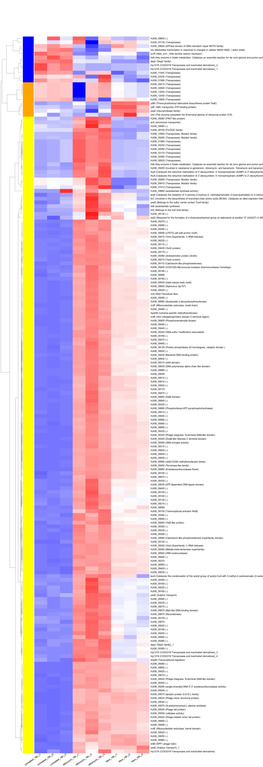
This post documents a complete, batch-ready pipeline to generate subset heatmaps (phage / stress-response / biofilm-associated) from bacterial RNA-seq data quantified with Salmon, using DE tables without any p-value cutoff.
You will end with:
Three gene sets (A/B/C):
GeneID_plainFor each *-all_annotated.csv in results/star_salmon/degenes/:
*_matched.tsv tables for sanity checksGeneID, GeneName, Description, and the plotted expression matrixEverything is written so you can run a single shell script for genesets + intersections, then one R script for heatmaps.
We use two conda environments:
plot-numpy1 for Python tools and BLAST setupr_env for DESeq2 + plotting heatmaps in Rconda activate plot-numpy1From your project root:
.
├── CP052959.gb
├── MT880872.1.gb
├── results/star_salmon/degenes/
│   ├── Mitomycin_4h_vs_Untreated_4h-all_annotated.csv
│   ├── ...
└── subset_heatmaps/          # all scripts + outputs go here
Create the output directory:
mkdir -p subset_heatmapsThis section generates:
geneset_A_phage_GeneID_plain.id (+ GeneID.id)geneset_B_stress_GeneID_plain.id (+ GeneID.id)geneset_C_biofilm_GeneID_plain.id (+ GeneID.id)GOI_* files and *_matched.tsvSave as subset_heatmaps/extract_cds_fasta.py
#!/usr/bin/env python3
from Bio import SeqIO
import sys

gb = sys.argv[1]
out_fa = sys.argv[2]

rec = SeqIO.read(gb, "genbank")
with open(out_fa, "w") as out:
    for f in rec.features:
        if f.type != "CDS":
            continue
        locus = f.qualifiers.get("locus_tag", ["NA"])[0]
        seq = f.extract(rec.seq)
out.write(f">{locus}\n{str(seq).upper()}\n")Save as subset_heatmaps/blast_hits_to_geneset.py
#!/usr/bin/env python3
import sys
import pandas as pd
from Bio import SeqIO

blast6 = sys.argv[1]
cp_gb  = sys.argv[2]
prefix = sys.argv[3]  # e.g. subset_heatmaps/geneset_A_phage

# Load CP052959 CDS intervals
rec = SeqIO.read(cp_gb, "genbank")
cds = []
for f in rec.features:
    if f.type != "CDS":
        continue
    locus = f.qualifiers.get("locus_tag", [None])[0]
    if locus is None:
        continue
    start = int(f.location.start) + 1
    end   = int(f.location.end)
    cds.append((locus, start, end))
cds_df = pd.DataFrame(cds, columns=["GeneID_plain","start","end"])

# Load BLAST tabular (outfmt 6)
cols = ["qseqid","sseqid","pident","length","mismatch","gapopen","qstart","qend",
        "sstart","send","evalue","bitscore"]
b = pd.read_csv(blast6, sep="\t", names=cols)

# Normalize subject coordinates
b["smin"] = b[["sstart","send"]].min(axis=1)
b["smax"] = b[["sstart","send"]].max(axis=1)

# Filter for strong hits (tune if needed)
b = b[(b["pident"] >= 90.0) & (b["length"] >= 100)]

hits = set()
for _, r in b.iterrows():
    ov = cds_df[(r["smin"] <= cds_df["end"]) & (r["smax"] >= cds_df["start"])]
    hits.update(ov["GeneID_plain"].unique().tolist())

hits = sorted(hits)

plain_path = f"{prefix}_GeneID_plain.id"
geneid_path = f"{prefix}_GeneID.id"

pd.Series(hits).to_csv(plain_path, index=False, header=False)
pd.Series(["gene-" + x for x in hits]).to_csv(geneid_path, index=False, header=False)

print(f"Wrote {len(hits)} genes:")
print(" ", plain_path)
print(" ", geneid_path)Save as subset_heatmaps/geneset_by_keywords.py
#!/usr/bin/env python3
import sys, re
import pandas as pd
from Bio import SeqIO

cp_gb  = sys.argv[1]
mode   = sys.argv[2]   # "stress" or "biofilm"
prefix = sys.argv[3]   # e.g. subset_heatmaps/geneset_B_stress

rec = SeqIO.read(cp_gb, "genbank")
rows=[]
for f in rec.features:
    if f.type != "CDS":
        continue
    locus = f.qualifiers.get("locus_tag", [None])[0]
    if locus is None:
        continue
    gene = (f.qualifiers.get("gene", [""])[0] or "")
    product = (f.qualifiers.get("product", [""])[0] or "")
    note = "; ".join(f.qualifiers.get("note", [])) if f.qualifiers.get("note") else ""
    text = " ".join([gene, product, note]).strip()
    rows.append((locus, gene, product, note, text))

df = pd.DataFrame(rows, columns=["GeneID_plain","gene","product","note","text"])

if mode == "stress":
    rgx = re.compile(
        r"\b(stress|heat shock|chaperone|dnaK|groEL|groES|clp|thioredoxin|peroxiredoxin|catalase|superoxide|"
        r"recA|lexA|uvr|mutS|mutL|usp|osm|sox|katA|sod)\b",
        re.I
    )
elif mode == "biofilm":
    rgx = re.compile(
        r"\b(biofilm|ica|pga|polysaccharide|PIA|adhesin|MSCRAMM|fibrinogen-binding|fibronectin-binding|"
        r"clumping factor|sortase|autolysin|atl|nuclease|DNase|protease|dispersin|luxS|agr|sarA|dlt)\b",
        re.I
    )
else:
    raise SystemExit("mode must be stress or biofilm")

sel = df[df["text"].apply(lambda x: bool(rgx.search(x)))].copy()
hits = sorted(sel["GeneID_plain"].unique())

plain_path = f"{prefix}_GeneID_plain.id"
geneid_path = f"{prefix}_GeneID.id"
sel_path = f"{prefix}_hits.tsv"

pd.Series(hits).to_csv(plain_path, index=False, header=False)
pd.Series(["gene-" + x for x in hits]).to_csv(geneid_path, index=False, header=False)
sel.drop(columns=["text"]).to_csv(sel_path, sep="\t", index=False)

print(f"{mode}: wrote {len(hits)} genes:")
print(" ", plain_path)
print(" ", geneid_path)
print(" ", sel_path)Save as subset_heatmaps/make_goi_lists_batch.py
#!/usr/bin/env python3
import sys, glob, os
import pandas as pd

de_dir = sys.argv[1]          # results/star_salmon/degenes
out_dir = sys.argv[2]         # subset_heatmaps
genesetA_plain = sys.argv[3]  # subset_heatmaps/geneset_A_phage_GeneID_plain.id
genesetB_plain = sys.argv[4]  # subset_heatmaps/geneset_B_stress_GeneID_plain.id
genesetC_plain = sys.argv[5]  # subset_heatmaps/geneset_C_biofilm_GeneID_plain.id

def load_plain_ids(path):
    with open(path) as f:
        return set(x.strip() for x in f if x.strip())

A = load_plain_ids(genesetA_plain)
B = load_plain_ids(genesetB_plain)
C = load_plain_ids(genesetC_plain)

def pick_id_cols(df):
    geneid = "GeneID" if "GeneID" in df.columns else None
    plain  = "GeneID_plain" if "GeneID_plain" in df.columns else None
    if plain is None and "GeneName" in df.columns:
        plain = "GeneName"
    return geneid, plain

os.makedirs(out_dir, exist_ok=True)

for csv in sorted(glob.glob(os.path.join(de_dir, "*-all_annotated.csv"))):
    base = os.path.basename(csv).replace("-all_annotated.csv", "")
    df = pd.read_csv(csv)
    geneid_col, plain_col = pick_id_cols(df)
    if plain_col is None:
        raise SystemExit(f"Cannot find GeneID_plain/GeneName in {csv}")

    df["__plain__"] = df[plain_col].astype(str).str.replace("^gene-","", regex=True)

    def write_set(tag, S):
        sub = df[df["__plain__"].isin(S)].copy()

        out_plain = os.path.join(out_dir, f"GOI_{base}_{tag}_GeneID_plain.id")
        out_geneid = os.path.join(out_dir, f"GOI_{base}_{tag}_GeneID.id")
        out_tsv = os.path.join(out_dir, f"{base}_{tag}_matched.tsv")

        sub["__plain__"].drop_duplicates().to_csv(out_plain, index=False, header=False)
        pd.Series(["gene-"+x for x in sub["__plain__"].drop_duplicates()]).to_csv(out_geneid, index=False, header=False)
        sub.to_csv(out_tsv, sep="\t", index=False)

        print(f"{base} {tag}: {sub.shape[0]} rows, {sub['__plain__'].nunique()} genes")

    write_set("A_phage", A)
    write_set("B_stress", B)
write_set("C_biofilm", C)Save as subset_heatmaps/run_subset_setup.sh
#!/usr/bin/env bash
set -euo pipefail

DE_DIR="./results/star_salmon/degenes"
OUT_DIR="./subset_heatmaps"

CP_GB="CP052959.gb"
PHAGE_GB="MT880872.1.gb"

mkdir -p "$OUT_DIR"

echo "[INFO] Using DE_DIR=$DE_DIR"
ls -lh "$DE_DIR"/*-all_annotated.csv

# ---- A) BLAST-based phage/prophage geneset ----
python - <<'PY'
from Bio import SeqIO
rec=SeqIO.read("CP052959.gb","genbank")
SeqIO.write(rec, "subset_heatmaps/CP052959.fna", "fasta")
PY

python subset_heatmaps/extract_cds_fasta.py "$PHAGE_GB" "$OUT_DIR/MT880872_CDS.fna"

makeblastdb -in "$OUT_DIR/CP052959.fna" -dbtype nucl -out "$OUT_DIR/CP052959_db" >/dev/null

blastn \
  -query "$OUT_DIR/MT880872_CDS.fna" \
  -db "$OUT_DIR/CP052959_db" \
  -out "$OUT_DIR/MT_vs_CP.blast6" \
  -outfmt "6 qseqid sseqid pident length mismatch gapopen qstart qend sstart send evalue bitscore" \
  -evalue 1e-10

python subset_heatmaps/blast_hits_to_geneset.py \
  "$OUT_DIR/MT_vs_CP.blast6" "$CP_GB" "$OUT_DIR/geneset_A_phage"

# ---- B/C) keyword-based genesets ----
python subset_heatmaps/geneset_by_keywords.py "$CP_GB" stress  "$OUT_DIR/geneset_B_stress"
python subset_heatmaps/geneset_by_keywords.py "$CP_GB" biofilm "$OUT_DIR/geneset_C_biofilm"

# ---- Batch: intersect each DE CSV with the genesets (no cutoff) ----
python subset_heatmaps/make_goi_lists_batch.py \
  "$DE_DIR" "$OUT_DIR" \
  "$OUT_DIR/geneset_A_phage_GeneID_plain.id" \
  "$OUT_DIR/geneset_B_stress_GeneID_plain.id" \
  "$OUT_DIR/geneset_C_biofilm_GeneID_plain.id"

echo "[INFO] Done. GOI lists are in $OUT_DIR"
ls -1 "$OUT_DIR"/GOI_*_GeneID.id | head
Run it:
bash subset_heatmaps/run_subset_setup.shAt this point you will have all *_matched.tsv files required for plotting, e.g.:
Mitomycin_4h_vs_Untreated_4h_A_phage_matched.tsvMoxi_4h_vs_Untreated_4h_A_phage_matched.tsvNow switch to your R environment and build the rlog (rld) expression matrix from Salmon quantifications.
conda activate r_envlibrary(tximport)
library(DESeq2)
setwd("~/DATA/Data_JuliaFuchs_RNAseq_2025/results/star_salmon")
files <- c(
"Untreated_4h_r1" = "./Untreated_4h_1a/quant.sf",
"Untreated_4h_r2" = "./Untreated_4h_1b/quant.sf",
"Untreated_4h_r3" = "./Untreated_4h_1c/quant.sf",
"Untreated_8h_r1" = "./Untreated_8h_1d/quant.sf",
"Untreated_8h_r2" = "./Untreated_8h_1e/quant.sf",
"Untreated_8h_r3" = "./Untreated_8h_1f/quant.sf",
"Untreated_18h_r1" = "./Untreated_18h_1g/quant.sf",
"Untreated_18h_r2" = "./Untreated_18h_1h/quant.sf",
"Untreated_18h_r3" = "./Untreated_18h_1i/quant.sf",
"Mitomycin_4h_r1" = "./Mitomycin_4h_2a/quant.sf",
"Mitomycin_4h_r2" = "./Mitomycin_4h_2b/quant.sf",
"Mitomycin_4h_r3" = "./Mitomycin_4h_2c/quant.sf",
"Mitomycin_8h_r1" = "./Mitomycin_8h_2d/quant.sf",
"Mitomycin_8h_r2" = "./Mitomycin_8h_2e/quant.sf",
"Mitomycin_8h_r3" = "./Mitomycin_8h_2f/quant.sf",
"Mitomycin_18h_r1" = "./Mitomycin_18h_2g/quant.sf",
"Mitomycin_18h_r2" = "./Mitomycin_18h_2h/quant.sf",
"Mitomycin_18h_r3" = "./Mitomycin_18h_2i/quant.sf",
"Moxi_4h_r1" = "./Moxi_4h_3a/quant.sf",
"Moxi_4h_r2" = "./Moxi_4h_3b/quant.sf",
"Moxi_4h_r3" = "./Moxi_4h_3c/quant.sf",
"Moxi_8h_r1" = "./Moxi_8h_3d/quant.sf",
"Moxi_8h_r2" = "./Moxi_8h_3e/quant.sf",
"Moxi_8h_r3" = "./Moxi_8h_3f/quant.sf",
"Moxi_18h_r1" = "./Moxi_18h_3g/quant.sf",
"Moxi_18h_r2" = "./Moxi_18h_3h/quant.sf",
"Moxi_18h_r3" = "./Moxi_18h_3i/quant.sf"
)
txi <- tximport(files, type = "salmon", txIn = TRUE, txOut = TRUE)
replicate <- factor(rep(c("r1","r2","r3"), 9))
condition <- factor(c(
rep("Untreated_4h",3), rep("Untreated_8h",3), rep("Untreated_18h",3),
rep("Mitomycin_4h",3), rep("Mitomycin_8h",3), rep("Mitomycin_18h",3),
rep("Moxi_4h",3), rep("Moxi_8h",3), rep("Moxi_18h",3)
))
colData <- data.frame(condition=condition, replicate=replicate, row.names=names(files))
dds <- DESeqDataSetFromTximport(txi, colData, design = ~ condition)
rld <- rlogTransformation(dds)suppressPackageStartupMessages(library(gplots))
need <- c("openxlsx")
to_install <- setdiff(need, rownames(installed.packages()))
if (length(to_install)) install.packages(to_install, repos = "https://cloud.r-project.org")
suppressPackageStartupMessages(library(openxlsx))
in_dir <- "subset_heatmaps"
out_dir <- file.path(in_dir, "heatmaps_merged3")
dir.create(out_dir, showWarnings = FALSE, recursive = TRUE)
pick_col <- function(df, candidates) {
hit <- intersect(candidates, names(df))
if (length(hit) == 0) return(NA_character_)
hit[1]
}
strip_gene_prefix <- function(x) sub("^gene[-_]", "", x)
match_tags <- function(nms, tags) {
pat <- paste0("(^|_)(?:", paste(tags, collapse = "|"), ")(_|$)")
grepl(pat, nms, perl = TRUE)
}
detect_tag <- function(nm, tags) {
hits <- vapply(tags, function(t)
grepl(paste0("(^|_)", t, "(_|$)"), nm, perl = TRUE), logical(1))
if (!any(hits)) NA_character_ else tags[which(hits)[1]]
}
make_pretty_labels <- function(gene_ids_in_matrix, id2name, id2desc) {
plain <- strip_gene_prefix(gene_ids_in_matrix)
nm <- unname(id2name[plain]); ds <- unname(id2desc[plain])
nm[is.na(nm)] <- ""; ds[is.na(ds)] <- ""
nm2 <- ifelse(nzchar(nm), nm, plain)
lbl <- ifelse(nzchar(ds), paste0(nm2, " (", ds, ")"), nm2)
make.unique(lbl, sep = "_")
}
if (exists("rld")) {
expr_all <- assay(rld)
} else if (exists("vsd")) {
expr_all <- assay(vsd)
} else {
stop("Neither 'rld' nor 'vsd' exists. Create/load it before running this script.")
}
expr_all <- as.matrix(expr_all)
mat_ids <- rownames(expr_all)
if (is.null(mat_ids)) stop("Expression matrix has no rownames.")
times <- c("4h", "8h", "18h")
tags <- c("A_phage", "B_stress", "C_biofilm")
cond_order_template <- c("Untreated_%s", "Mitomycin_%s", "Moxi_%s")
for (tt in times) {
for (tag in tags) {
f_mito <- file.path(in_dir, sprintf("Mitomycin_%s_vs_Untreated_%s_%s_matched.tsv", tt, tt, tag))
f_moxi <- file.path(in_dir, sprintf("Moxi_%s_vs_Untreated_%s_%s_matched.tsv", tt, tt, tag))
if (!file.exists(f_mito) || !file.exists(f_moxi)) next
df1 <- read.delim(f_mito, sep = "\t", header = TRUE, stringsAsFactors = FALSE, check.names = FALSE)
df2 <- read.delim(f_moxi, sep = "\t", header = TRUE, stringsAsFactors = FALSE, check.names = FALSE)
id_col_1 <- pick_col(df1, c("GeneID","GeneID_plain","Gene_Id","gene_id","locus_tag","LocusTag","ID"))
id_col_2 <- pick_col(df2, c("GeneID","GeneID_plain","Gene_Id","gene_id","locus_tag","LocusTag","ID"))
if (is.na(id_col_1) || is.na(id_col_2)) next
name_col_1 <- pick_col(df1, c("GeneName","Preferred_name","gene","Symbol","Name"))
name_col_2 <- pick_col(df2, c("GeneName","Preferred_name","gene","Symbol","Name"))
desc_col_1 <- pick_col(df1, c("Description","product","Product","annotation","Annot","note"))
desc_col_2 <- pick_col(df2, c("Description","product","Product","annotation","Annot","note"))
g1 <- unique(trimws(df1[[id_col_1]])); g1 <- g1[nzchar(g1)]
g2 <- unique(trimws(df2[[id_col_2]])); g2 <- g2[nzchar(g2)]
GOI_raw <- unique(c(g1, g2))
present <- intersect(mat_ids, GOI_raw)
if (!length(present)) {
present <- unique(mat_ids[strip_gene_prefix(mat_ids) %in% strip_gene_prefix(GOI_raw)])
}
if (!length(present)) next
getcol <- function(df, col, n) if (is.na(col)) rep("", n) else as.character(df[[col]])
plain1 <- strip_gene_prefix(as.character(df1[[id_col_1]]))
plain2 <- strip_gene_prefix(as.character(df2[[id_col_2]]))
nm1 <- getcol(df1, name_col_1, nrow(df1)); nm2 <- getcol(df2, name_col_2, nrow(df2))
ds1 <- getcol(df1, desc_col_1, nrow(df1)); ds2 <- getcol(df2, desc_col_2, nrow(df2))
nm1[is.na(nm1)] <- ""; nm2[is.na(nm2)] <- ""
ds1[is.na(ds1)] <- ""; ds2[is.na(ds2)] <- ""
keys_all <- unique(c(plain1, plain2))
id2name <- setNames(rep("", length(keys_all)), keys_all)
id2desc <- setNames(rep("", length(keys_all)), keys_all)
fill_map <- function(keys, vals, mp) {
for (i in seq_along(keys)) {
k <- keys[i]; v <- vals[i]
if (!nzchar(k)) next
if (!nzchar(mp[[k]]) && nzchar(v)) mp[[k]] <- v
}
mp
}
id2name <- fill_map(plain1, nm1, id2name); id2name <- fill_map(plain2, nm2, id2name)
id2desc <- fill_map(plain1, ds1, id2desc); id2desc <- fill_map(plain2, ds2, id2desc)
cond_tags <- sprintf(cond_order_template, tt)
keep_cols <- match_tags(colnames(expr_all), cond_tags)
if (!any(keep_cols)) next
sub_idx <- which(keep_cols)
sub_names <- colnames(expr_all)[sub_idx]
cond_for_col <- vapply(sub_names, detect_tag, character(1), tags = cond_tags)
cond_rank <- match(cond_for_col, cond_tags)
ord <- order(cond_rank, sub_names)
sub_idx <- sub_idx[ord]
expr_sub <- expr_all[present, sub_idx, drop = FALSE]
row_ok <- apply(expr_sub, 1, function(x) is.finite(sum(x)) && var(x, na.rm = TRUE) > 0)
datamat <- expr_sub[row_ok, , drop = FALSE]
if (nrow(datamat) < 2) next
hr <- hclust(as.dist(1 - cor(t(datamat), method = "pearson")), method = "complete")
mycl <- cutree(hr, h = max(hr$height) / 1.1)
palette_base <- c("yellow","blue","orange","magenta","cyan","red","green","maroon",
"lightblue","pink","purple","lightcyan","salmon","lightgreen")
mycol <- palette_base[(as.vector(mycl) - 1) %% length(palette_base) + 1]
labRow <- make_pretty_labels(rownames(datamat), id2name, id2desc)
labCol <- gsub("_", " ", colnames(datamat))
gene_id <- rownames(datamat)
gene_plain <- strip_gene_prefix(gene_id)
gene_name <- unname(id2name[gene_plain]); gene_name[is.na(gene_name)] <- ""
gene_desc <- unname(id2desc[gene_plain]); gene_desc[is.na(gene_desc)] <- ""
out_tbl <- data.frame(
GeneID = gene_id,
GeneID_plain = gene_plain,
GeneName = ifelse(nzchar(gene_name), gene_name, gene_plain),
Description = gene_desc,
datamat,
check.names = FALSE,
stringsAsFactors = FALSE
)
base <- sprintf("%s_%s_merged3", tt, tag)
out_xlsx <- file.path(out_dir, paste0("table_", base, ".xlsx"))
write.xlsx(out_tbl, out_xlsx, overwrite = TRUE)
out_png <- file.path(out_dir, paste0("heatmap_", base, ".png"))
cex_row <- if (nrow(datamat) > 600) 0.90 else if (nrow(datamat) > 300) 1.05 else 1.30
height <- max(1600, min(18000, 34 * nrow(datamat)))
png(out_png, width = 2200, height = height)
heatmap.2(
datamat,
Rowv = as.dendrogram(hr),
Colv = FALSE,
dendrogram = "row",
col = bluered(75),
scale = "row",
trace = "none",
density.info = "none",
RowSideColors = mycol,
margins = c(12, 60),
labRow = labRow,
labCol = labCol,
cexRow = cex_row,
cexCol = 2.0,
srtCol = 15,
key = FALSE
)
dev.off()
message("WROTE: ", out_png)
message("WROTE: ", out_xlsx)
}
}
message("Done. Output dir: ", out_dir)Run it:
setwd("~/DATA/Data_JuliaFuchs_RNAseq_2025")
source("subset_heatmaps/draw_9_merged_heatmaps.R")#!/usr/bin/env Rscript
## =============================================================
## Draw 18 subset heatmaps using *_matched.tsv as input
## Output: subset_heatmaps/heatmaps_from_matched/
##
## Requirements:
## - rld or vsd exists in environment (DESeq2 transform)
## If running as Rscript, you must load/create rld/vsd BEFORE sourcing this file
## (see the note at the bottom for the "source()" way)
##
## Matched TSV must contain GeneID or GeneID_plain (or GeneName) columns.
## =============================================================
suppressPackageStartupMessages(library(gplots))
in_dir <- "subset_heatmaps"
out_dir <- file.path(in_dir, "heatmaps_from_matched")
dir.create(out_dir, showWarnings = FALSE, recursive = TRUE)
# -------------------------
# Helper functions
# -------------------------
pick_col <- function(df, candidates) {
hit <- intersect(candidates, names(df))
if (length(hit) == 0) return(NA_character_)
hit[1]
}
strip_gene_prefix <- function(x) sub("^gene[-_]", "", x)
split_contrast_groups <- function(x) {
parts <- strsplit(x, "_vs_", fixed = TRUE)[[1]]
if (length(parts) != 2L) stop("Contrast must be in form A_vs_B: ", x)
parts
}
match_tags <- function(nms, tags) {
pat <- paste0("(^|_)(?:", paste(tags, collapse = "|"), ")(_|$)")
grepl(pat, nms, perl = TRUE)
}
# -------------------------
# Get expression matrix
# -------------------------
if (exists("rld")) {
expr_all <- assay(rld)
} else if (exists("vsd")) {
expr_all <- assay(vsd)
} else {
stop("Neither 'rld' nor 'vsd' exists. Create/load it before running this script.")
}
expr_all <- as.matrix(expr_all)
mat_ids <- rownames(expr_all)
if (is.null(mat_ids)) stop("Expression matrix has no rownames.")
# -------------------------
# List your 18 matched inputs
# -------------------------
matched_files <- c(
"Mitomycin_4h_vs_Untreated_4h_A_phage_matched.tsv",
"Mitomycin_4h_vs_Untreated_4h_B_stress_matched.tsv",
"Mitomycin_4h_vs_Untreated_4h_C_biofilm_matched.tsv",
"Mitomycin_8h_vs_Untreated_8h_A_phage_matched.tsv",
"Mitomycin_8h_vs_Untreated_8h_B_stress_matched.tsv",
"Mitomycin_8h_vs_Untreated_8h_C_biofilm_matched.tsv",
"Mitomycin_18h_vs_Untreated_18h_A_phage_matched.tsv",
"Mitomycin_18h_vs_Untreated_18h_B_stress_matched.tsv",
"Mitomycin_18h_vs_Untreated_18h_C_biofilm_matched.tsv",
"Moxi_4h_vs_Untreated_4h_A_phage_matched.tsv",
"Moxi_4h_vs_Untreated_4h_B_stress_matched.tsv",
"Moxi_4h_vs_Untreated_4h_C_biofilm_matched.tsv",
"Moxi_8h_vs_Untreated_8h_A_phage_matched.tsv",
"Moxi_8h_vs_Untreated_8h_B_stress_matched.tsv",
"Moxi_8h_vs_Untreated_8h_C_biofilm_matched.tsv",
"Moxi_18h_vs_Untreated_18h_A_phage_matched.tsv",
"Moxi_18h_vs_Untreated_18h_B_stress_matched.tsv",
"Moxi_18h_vs_Untreated_18h_C_biofilm_matched.tsv"
)
matched_paths <- file.path(in_dir, matched_files)
# -------------------------
# Main loop
# -------------------------
for (path in matched_paths) {
if (!file.exists(path)) {
message("SKIP missing: ", path)
next
}
base <- sub("_matched\\.tsv$", "", basename(path))
# base looks like: Mitomycin_4h_vs_Untreated_4h_A_phage
# split base into contrast + tag (last 2 underscore fields are the tag)
parts <- strsplit(base, "_")[[1]]
if (length(parts) < 6) {
message("SKIP unexpected name: ", base)
next
}
# infer tag as last 2 parts: e.g. A_phage / B_stress / C_biofilm
tag <- paste0(parts[length(parts)-1], "_", parts[length(parts)])
# contrast is the rest
contrast <- paste(parts[1:(length(parts)-2)], collapse = "_")
# read matched TSV
df <- read.delim(path, sep = "\t", header = TRUE, stringsAsFactors = FALSE, check.names = FALSE)
id_col <- pick_col(df, c("GeneID", "GeneID_plain", "GeneName", "Gene_Id", "gene_id", "locus_tag", "LocusTag", "ID"))
if (is.na(id_col)) {
message("SKIP (no ID col): ", path)
next
}
GOI_raw <- unique(trimws(df[[id_col]]))
GOI_raw <- GOI_raw[nzchar(GOI_raw)]
# match GOI to matrix ids robustly
present <- intersect(mat_ids, GOI_raw)
if (!length(present)) {
present <- unique(mat_ids[strip_gene_prefix(mat_ids) %in% strip_gene_prefix(GOI_raw)])
}
if (!length(present)) {
message("SKIP (no GOI matched matrix): ", base)
next
}
# subset columns for the two groups
groups <- split_contrast_groups(contrast)
keep_cols <- match_tags(colnames(expr_all), groups)
if (!any(keep_cols)) {
message("SKIP (no columns matched groups): ", contrast)
next
}
cols_idx <- which(keep_cols)
sub_colnames <- colnames(expr_all)[cols_idx]
# put Untreated first (2nd group in "Treated_vs_Untreated")
ord <- order(!grepl(paste0("(^|_)", groups[2], "(_|$)"), sub_colnames, perl = TRUE))
cols_idx <- cols_idx[ord]
expr_sub <- expr_all[present, cols_idx, drop = FALSE]
# remove constant/NA rows
row_ok <- apply(expr_sub, 1, function(x) is.finite(sum(x)) && var(x, na.rm = TRUE) > 0)
datamat <- expr_sub[row_ok, , drop = FALSE]
if (nrow(datamat) < 2) {
message("SKIP (too few rows after filtering): ", base)
next
}
# clustering
hr <- hclust(as.dist(1 - cor(t(datamat), method = "pearson")), method = "complete")
mycl <- cutree(hr, h = max(hr$height) / 1.1)
palette_base <- c("yellow","blue","orange","magenta","cyan","red","green","maroon",
"lightblue","pink","purple","lightcyan","salmon","lightgreen")
mycol <- palette_base[(as.vector(mycl) - 1) %% length(palette_base) + 1]
# labels
labRow <- rownames(datamat)
labRow <- sub("^gene-", "", labRow)
labRow <- sub("^rna-", "", labRow)
labCol <- colnames(datamat)
labCol <- gsub("_", " ", labCol)
# output sizes
height <- max(900, min(12000, 25 * nrow(datamat)))
out_png <- file.path(out_dir, paste0("heatmap_", base, ".png"))
out_mat <- file.path(out_dir, paste0("matrix_", base, ".csv"))
write.csv(as.data.frame(datamat), out_mat, quote = FALSE)
png(out_png, width = 1100, height = height)
heatmap.2(
datamat,
Rowv = as.dendrogram(hr),
Colv = FALSE,
dendrogram = "row",
col = bluered(75),
scale = "row",
trace = "none",
density.info = "none",
RowSideColors = mycol,
margins = c(10, 15),
sepwidth = c(0, 0),
labRow = labRow,
labCol = labCol,
cexRow = if (nrow(datamat) > 500) 0.6 else 1.0,
cexCol = 1.7,
srtCol = 15,
lhei = c(0.01, 4),
lwid = c(0.5, 4),
key = FALSE
)
dev.off()
message("WROTE: ", out_png)
}
message("All done. Output dir: ", out_dir)Run it:
setwd("~/DATA/Data_JuliaFuchs_RNAseq_2025")
source("subset_heatmaps/draw_18_heatmaps_from_matched.R")If you still use the older README_Heatmap logic that expects *-up.id and *-down.id, replace the GOI-building block with this (single GOI list or whole CSV with no cutoff):
geneset_file <- NA_character_   # e.g. "subset_heatmaps/GOI_Mitomycin_4h_vs_Untreated_4h_A_phage_GeneID.id"
use_all_genes_no_cutoff <- FALSE

if (!is.na(geneset_file) && file.exists(geneset_file)) {
  GOI <- read_ids_from_file(geneset_file)

} else if (isTRUE(use_all_genes_no_cutoff)) {
  all_path <- file.path("./results/star_salmon/degenes", paste0(contrast, "-all_annotated.csv"))
  ann <- read.csv(all_path, stringsAsFactors = FALSE, check.names = FALSE)

  id_col <- if ("GeneID" %in% names(ann)) "GeneID" else if ("GeneID_plain" %in% names(ann)) "GeneID_plain" else NA_character_
  if (is.na(id_col)) stop("No GeneID / GeneID_plain in: ", all_path)

  GOI <- unique(trimws(gsub('"', "", ann[[id_col]])))
  GOI <- GOI[nzchar(GOI)]

} else {
  stop("Set geneset_file OR set use_all_genes_no_cutoff <- TRUE")
}

present <- intersect(rownames(RNASeq.NoCellLine), GOI)
if (!length(present)) stop("None of the GOI found in expression matrix rownames.")
GOI <- presentBash
subset_heatmaps/run_subset_setup.shPython
subset_heatmaps/extract_cds_fasta.pysubset_heatmaps/blast_hits_to_geneset.pysubset_heatmaps/geneset_by_keywords.pysubset_heatmaps/make_goi_lists_batch.pyR
subset_heatmaps/draw_9_merged_heatmaps.Rsubset_heatmaps/draw_18_heatmaps_from_matched.RThis post is a lab wiki / GitHub README / methods note, every script referenced is included in full above (and can be copied into subset_heatmaps/ directly).
This post is a standalone, reproducible record of the bacterial WGS pipeline I used (example sample: AN6). I’m keeping all command lines (as-run) so you can reuse the workflow for future projects. Wherever you see absolute paths, replace them with your own.
-profile docker)fastqc, spades.py, shovill, pigz, awk, seqkit, fastANI, plus R (for plotting), and the tools required by the provided scripts.# Download the kmerfinder database: https://www.genomicepidemiology.org/services/ --> https://cge.food.dtu.dk/services/KmerFinder/ --> https://cge.food.dtu.dk/services/KmerFinder/etc/kmerfinder_db.tar.gz
# Download 20190108_kmerfinder_stable_dirs.tar.gz from https://zenodo.org/records/13447056 #--kmerfinderdb /path/to/kmerfinder/bacteria.tar.gz
#--kmerfinderdb /mnt/nvme1n1p1/REFs/kmerfinder_db.tar.gz
#--kmerfinderdb /mnt/nvme1n1p1/REFs/20190108_kmerfinder_stable_dirs.tar.gz
nextflow run nf-core/bacass -r 2.5.0 -profile docker \
--input samplesheet.tsv \
--outdir bacass_out \
--assembly_type long \
--kraken2db /mnt/nvme1n1p1/REFs/k2_standard_08_GB_20251015.tar.gz \
--kmerfinderdb /mnt/nvme1n1p1/REFs/kmerfinder/bacteria/ \
-resume
#SAVE bacass_out/Kmerfinder/kmerfinder_summary.csv to bacass_out/Kmerfinder/An6/An6_kmerfinder_results.xlsxln -s ../X101SC25116512-Z01-J002/01.RawData/An6/An6_1.fq.gz An6_R1.fastq.gz
ln -s ../X101SC25116512-Z01-J002/01.RawData/An6/An6_2.fq.gz An6_R2.fastq.gz
mkdir fastqc_out
fastqc -t 4 raw_data/* -o fastqc_out/
mamba activate /home/jhuang/miniconda3/envs/bengal3_ac3For the AN6 data, it’s not better to run Trimmomatic first in most cases (adapters OK; per-tile failures are instrument/tile related and not “fixed” by trimming).
* **Adapters:** FastQC shows **Adapter Content = PASS** for both R1/R2.
* **Overrepresented sequences:** none detected.
* **Per-tile sequence quality:** **FAIL** (this is usually an instrument/tile effect; trimming adapters won’t “fix” it).
Shovill: avoid pre-trimming (default read trimming already included unless disabled). SPAdes: trimming optional; try raw first, then trimmed if needed.
# Paired-end trimming with Trimmomatic (Illumina-style)
# Adjust TRIMMOMATIC_JAR and ADAPTERS paths to your install.

TRIMMOMATIC_JAR=/path/to/trimmomatic.jar
ADAPTERS=/path/to/Trimmomatic/adapters/TruSeq3-PE.fa

java -jar "$TRIMMOMATIC_JAR" PE -threads 16 -phred33 \
  An6_R1.fastq.gz An6_R2.fastq.gz \
  An6_R1.trim.paired.fastq.gz An6_R1.trim.unpaired.fastq.gz \
  An6_R2.trim.paired.fastq.gz An6_R2.trim.unpaired.fastq.gz \
  ILLUMINACLIP:"$ADAPTERS":2:30:10 \
  LEADING:3 TRAILING:3 \
  SLIDINGWINDOW:4:20 \
  MINLEN:50
What you feed into SPAdes/Shovill afterward:
Use the paired outputs:
An6_R1.trim.paired.fastq.gzAn6_R2.trim.paired.fastq.gzIf you want, I can also give the matching SPAdes command that includes unpaired reads (or the cleanest approach that ignores them).
spades.py \
  -1 raw_data/An6_R1.fastq.gz \
  -2 raw_data/An6_R2.fastq.gz \
  --isolate \
  -t 32 -m 250 \
  -o spades_out
spades.py \
  -1 raw_data/An6_R1.fastq.gz \
  -2 raw_data/An6_R2.fastq.gz \
  --careful \
  -t 32 -m 250 \
  -o spades_out_careful
Shovill (CHOSEN; default does read trimming unless you disable it):
shovill \
  --R1 raw_data/An6_R1.fastq.gz \
  --R2 raw_data/An6_R2.fastq.gz \
  --outdir shovill_out \
  --cpus 32 --ram 250 \
  --depth 100
If you want to keep reads completely untrimmed in Shovill, add --noreadtrim.
* Use: https://www.bv-brc.org/app/ComprehensiveGenomeAnalysis
* Input: scaffolded results from bacass
* Purpose: comprehensive overview + annotation of the genome assembly.# Prepare environment and run the Table 1 (Summary of sequence data and genome features (env: gunc_env)) pipeline:
# activate the env that has openpyxl
mamba activate gunc_env
mamba install -n gunc_env -c conda-forge openpyxl -y
mamba deactivate
# STEP_1
ENV_NAME=gunc_env \
SAMPLE=AN6 \
ASM=shovill_out/contigs.fa \
R1=./X101SC25116512-Z01-J002/01.RawData/An6/An6_1.fq.gz \
R2=./X101SC25116512-Z01-J002/01.RawData/An6/An6_2.fq.gz \
./make_table1_pe.sh
# STEP_2
python export_table1_stats_to_excel_py36_compat.py \
--workdir table1_AN6_work \
--out Comprehensive_AN6.xlsx \
--max-rows 200000 \
--sample AN6#Manually For the items “Total number of reads sequenced” and “Mean read length (bp)”:
#Total number of reads sequenced 9,127,297 × 2
#Coverage depth (sequencing depth) 589.4×
pigz -dc X101SC25116512-Z01-J002/01.RawData/An6/An6_1.fq.gz | awk 'END{print NR/4}'
seqkit stats X101SC25116512-Z01-J002/01.RawData/An6/An6_1.fq.gz
#file format type num_seqs sum_len min_len avg_len max_len
#X101SC25116512-Z01-J002/01.RawData/An6/An6_1.fq.gz FASTQ DNA 15,929,405 2,389,410,750 150 150 150Metricsa Value
Genome size (bp) 3,012,410
Contig count (>= 500 bp) 41
Total number of reads sequenced 15,929,405 × 2
Coverage depth (sequencing depth) 1454.3×
Coarse consistency (%) 99.67
Fine consistency (%) 94.50
Completeness (%) 99.73
Contamination (%) 0.21
Contigs N50 (bp) 169,757
Contigs L50 4
Guanine-cytosine content (%) 41.14
Number of coding sequences (CDSs) 2,938
Number of tRNAs 69
Number of rRNAs 3 cp shovill_out/contigs.fa AN6.fasta
ENV_NAME=/home/jhuang/miniconda3/envs/bengal3_ac3 ASM=AN6.fasta SAMPLE=AN6 THREADS=32 ./run_resistome_virulome_dedup.sh #Default MINID=90 MINCOV=60
ENV_NAME=/home/jhuang/miniconda3/envs/bengal3_ac3 ASM=AN6.fasta SAMPLE=AN6 MINID=80 MINCOV=60 ./run_resistome_virulome_dedup.sh # 0 0 0 0
ENV_NAME=/home/jhuang/miniconda3/envs/bengal3_ac3 ASM=AN6.fasta SAMPLE=AN6 MINID=70 MINCOV=50 ./run_resistome_virulome_dedup.sh # 5 5 0 4
#Sanity checks on ABRicate outputs
grep -vc '^#' resistome_virulence_AN6/raw/AN6.megares.tab
grep -vc '^#' resistome_virulence_AN6/raw/AN6.card.tab
grep -vc '^#' resistome_virulence_AN6/raw/AN6.resfinder.tab
grep -vc '^#' resistome_virulence_AN6/raw/AN6.vfdb.tab
#!!!!!! DEBUG_TOMORROW: why using 'MINID=70 MINCOV=50' didn't return the 5504?
#Dedup tables / “one per gene” mode
rm Resistome_Virulence_An6.xlsx
chmod +x run_abricate_resistome_virulome_one_per_gene.sh
ENV_NAME=/home/jhuang/miniconda3/envs/bengal3_ac3 \
ASM=AN6.fasta \
SAMPLE=AN6 \
OUTDIR=resistome_virulence_AN6 \
MINID=70 MINCOV=50 \
THREADS=32 \
./run_abricate_resistome_virulome_one_per_gene.sh
cd resistome_virulence_AN6
python3 -c 'import pandas as pd; from pathlib import Path; files=["Table_AMR_genes_dedup.tsv","Table_AMR_genes_one_per_gene.tsv","Table_Virulence_VFDB_dedup.tsv","Table_DB_hit_counts.tsv"]; out="AN6_resistome_virulence.xlsx"; w=pd.ExcelWriter(out, engine="openpyxl"); [pd.read_csv(f, sep="\t").to_excel(w, sheet_name=Path(f).stem[:31], index=False) for f in files]; w.close(); print(out)' #Generate targets.tsv from ./bvbrc_out/Acinetobacter_harbinensis_AN6/FullGenomeReport.html.
export NCBI_EMAIL="xxx@yyy.de"
./resolve_best_assemblies_entrez.py targets.tsv resolved_accessions.tsv
#[OK] Acinetobacter_harbinensis_HITLi7 -> GCF_000816495.1 (Scaffold)
#[OK] Acinetobacter_sp._ANC -> GCF_965200015.1 (Complete Genome)
#[OK] Acinetobacter_sp._TTH0-4 -> GCF_965200015.1 (Complete Genome)
#[OK] Acinetobacter_tandoii_DSM_14970 -> GCF_000621065.1 (Scaffold)
#[OK] Acinetobacter_towneri_DSM_14962 -> GCF_000368785.1 (Scaffold)
#[OK] Acinetobacter_radioresistens_SH164 -> GCF_000162115.1 (Scaffold)
#[OK] Acinetobacter_radioresistens_SK82 -> GCF_000175675.1 (Contig)
#[OK] Acinetobacter_radioresistens_DSM_6976 -> GCF_000368905.1 (Scaffold)
#[OK] Acinetobacter_indicus_ANC -> GCF_000413875.1 (Scaffold)
#[OK] Acinetobacter_indicus_CIP_110367 -> GCF_000488255.1 (Scaffold)
#NOTE the env bengal3_ac3 don’t have the following R package, using r_env for the plot-step → RUN TWICE, first bengal3_ac3, then run build_wgs_tree_fig3B.sh plot-only.
#ADAPT the params EXTRA_ASSEMBLIES (could stay as empty), and AN6.fasta as REF_FASTA
conda activate /home/jhuang/miniconda3/envs/bengal3_ac3
export NCBI_EMAIL="xxx@yyy.de"
ENV_NAME=/home/jhuang/miniconda3/envs/bengal3_ac3 ./build_wgs_tree_fig3B.sh
# (Optional) if want to delete some leaves from the tree, remove from inputs so Roary cannot include it
for id in "GCF_002291425.1" "GCF_047901425.1" "GCF_004342245.1" "GCA_032062225.1"; do
rm -f work_wgs_tree/gffs/${id}.gff
rm -f work_wgs_tree/fastas/${id}.fna
rm -rf work_wgs_tree/prokka/${id}
rm -rf work_wgs_tree/genomes_ncbi/${id}
# remove from accession list so it won't come back
awk -F'\t' 'NR==1 || $2!="${id}"' work_wgs_tree/meta/accessions.tsv > work_wgs_tree/meta/accessions.tsv.tmp \
&& mv work_wgs_tree/meta/accessions.tsv.tmp work_wgs_tree/meta/accessions.tsv
done
./build_wgs_tree_fig3B.sh
#Wrote: work_wgs_tree/plot/labels.tsv
#Error: package or namespace load failed for ‘ggtree’ in loadNamespace(j <- i[[1L]], c(lib.loc, .libPaths()), versionCheck = vI[[j]]):
#there is no package called ‘aplot’
#Execution halted --> Using env r_env instead (see below)!
# Run this to regenerate labels.tsv
bash regenerate_labels.sh
# Regenerate the plot --> ERROR --> Using Rscript instead (see below)!
ENV_NAME=/home/jhuang/mambaforge/envs/r_env ./build_wgs_tree_fig3B.sh plot-only
#-->Error in as.hclust.phylo(tr) : the tree is not ultrametric
# 8) Manual correct the display name in work_wgs_tree/plot/labels.tsv
#sample display
#GCF_000816495.1 Acinetobacter harbinensis HITLi7 (GCF_000816495.1)
#GCF_965200015.1 Acinetobacter sp. ANC (GCF_965200015.1)
#GCF_000621065.1 Acinetobacter tandoii DSM 14970 (GCF_000621065.1)
#GCF_000368785.1 Acinetobacter towneri DSM 14962 (GCF_000368785.1)
#GCF_000162115.1 Acinetobacter radioresistens SH164 (GCF_000162115.1)
#GCF_000175675.1 Acinetobacter radioresistens SK82 (GCF_000175675.1)
#GCF_000368905.1 Acinetobacter radioresistens DSM 6976 (GCF_000368905.1)
#GCF_000413875.1 Acinetobacter indicus ANC (GCF_000413875.1)
#GCF_000488255.1 Acinetobacter indicus CIP 110367 (GCF_000488255.1)
#REF AN6
# 9) Rerun only the plot step uisng plot_tree_v4.R
Rscript ./plot_tree_v4.R \
work_wgs_tree/raxmlng/core.raxml.support \
work_wgs_tree/plot/labels.tsv \
6 \
work_wgs_tree/plot/core_tree.pdf \
work_wgs_tree/plot/core_tree.png mamba activate /home/jhuang/miniconda3/envs/bengal3_ac3
for id in GCF_000621065.1.fna GCF_000368785.1.fna GCF_000175675.1.fna GCF_000368905.1.fna GCF_000816495.1.fna GCF_965200015.1.fna GCF_000488255.1.fna GCF_000413875.1.fna GCF_000162115.1.fna; do
fastANI -q AN6.fasta -r ./work_wgs_tree/fastas/${id} -o fastANI_AN6_vs_${id}.txt
done
# Alternatively, we can use the script run_fastani_batch_verbose.sh.In total, we obtained 41 contigs >500 nt. Of these, 36 contigs were scaffolded with Multi-CSAR v1.1 into three chromosomal scaffolds:
The remaining five contigs (contig00026/32/33/37/39) could not be scaffolded. Their partial BLASTn matches to both plasmid and chromosomal sequences suggest shared mobile elements, but do not confirm circular plasmids. A sequence/assembly summary was exported to Excel (Summary_AN6.xlsx), including read yield/read-length statistics and key assembly/QC metrics (genome size, contigs/scaffolds, N50, GC%, completeness, contamination).
Below are the full scripts exactly as provided, including plot_tree_v4.R.
make_table1_pe.sh#!/usr/bin/env bash
set -Eeuo pipefail
# =========================
# User config
ENV_NAME="${ENV_NAME:-checkm_env2}"
# If you have Illumina paired-end, set R1/R2 (recommended)
R1="${R1:-}"
R2="${R2:-}"
# If you have single-end/ONT-like reads, set READS instead (legacy mode)
READS="${READS:-}"
ASM="${ASM:-shovill_out/contigs.fa}"
SAMPLE="${SAMPLE:-An6}"
THREADS="${THREADS:-32}"
OUT_TSV="${OUT_TSV:-Table1_${SAMPLE}.tsv}"
WORKDIR="${WORKDIR:-table1_${SAMPLE}_work}"
LOGDIR="${LOGDIR:-${WORKDIR}/logs}"
LOGFILE="${LOGFILE:-${LOGDIR}/run_$(date +%F_%H%M%S).log}"
AUTO_INSTALL="${AUTO_INSTALL:-1}" # 1=install missing tools in ENV_NAME
GUNC_DB_KIND="${GUNC_DB_KIND:-progenomes}" # progenomes or gtdb
# =========================
mkdir -p "${LOGDIR}"
exec > >(tee -a "${LOGFILE}") 2>&1
ts(){ date +"%F %T"; }
log(){ echo "[$(ts)] $*"; }
on_err() {
local ec=$?
log "ERROR: failed (exit=${ec}) at line ${BASH_LINENO[0]}: ${BASH_COMMAND}"
log "Logfile: ${LOGFILE}"
exit "${ec}"
}
trap on_err ERR
# print every command
set -x
need_cmd(){ command -v "$1" >/dev/null 2>&1; }
pick_pm() {
if need_cmd mamba; then echo "mamba"
elif need_cmd conda; then echo "conda"
else
log "ERROR: neither mamba nor conda found in PATH"
exit 1
fi
}
activate_env() {
if ! need_cmd conda; then
log "ERROR: conda not found; cannot activate env"
exit 1
fi
# shellcheck disable=SC1091
source "$(conda info --base)/etc/profile.d/conda.sh"
conda activate "${ENV_NAME}"
}
ensure_env_exists() {
# shellcheck disable=SC1091
source "$(conda info --base)/etc/profile.d/conda.sh"
if ! conda env list | awk '{print $1}' | grep -qx "${ENV_NAME}"; then
log "ERROR: env ${ENV_NAME} not found. Create it first."
exit 1
fi
}
install_pkgs_in_env() {
local pm="$1"; shift
local pkgs=("$@")
log "Installing into env ${ENV_NAME}: ${pkgs[*]}"
"${pm}" install -n "${ENV_NAME}" -c bioconda -c conda-forge -y "${pkgs[@]}"
}
pick_quast_cmd() {
if need_cmd quast; then echo "quast"
elif need_cmd quast.py; then echo "quast.py"
else echo ""
fi
}
# tool->package mapping (install missing ones)
declare -A TOOL2PKG=(
[quast]="quast"
[minimap2]="minimap2"
[samtools]="samtools"
[mosdepth]="mosdepth"
[checkm]="checkm-genome=1.1.3"
[gunc]="gunc"
[python]="python"
)
# =========================
# Detect mode (PE vs single)
MODE=""
if [[ -n "${R1}" || -n "${R2}" ]]; then
[[ -n "${R1}" && -n "${R2}" ]] || { log "ERROR: Provide both R1 and R2."; exit 1; }
MODE="PE"
elif [[ -n "${READS}" ]]; then
MODE="SINGLE"
else
log "ERROR: Provide either (R1+R2) OR READS."
exit 1
fi
# =========================
# Start
log "Start: Table 1 generation (reuse env=${ENV_NAME})"
log "Assembly: ${ASM}"
log "Sample: ${SAMPLE}"
log "Threads: ${THREADS}"
log "Workdir: ${WORKDIR}"
log "Logfile: ${LOGFILE}"
log "Mode: ${MODE}"
if [[ "${MODE}" == "PE" ]]; then
log "R1: ${R1}"
log "R2: ${R2}"
else
log "Reads: ${READS}"
fi
PM="$(pick_pm)"
log "Pkg manager: ${PM}"
ensure_env_exists
activate_env
log "Active envs:"
conda info --envs
log "Versions (if available):"
( python --version || true )
( checkm --version || true )
( gunc -v || true )
( minimap2 --version 2>&1 | head -n 2 || true )
( samtools --version 2>&1 | head -n 2 || true )
( mosdepth --version 2>&1 | head -n 2 || true )
( quast --version 2>&1 | head -n 2 || true )
( quast.py --version 2>&1 | head -n 2 || true )
# =========================
# Check/install missing tools in this env
MISSING_PKGS=()
for tool in minimap2 samtools mosdepth checkm gunc python; do
if ! need_cmd "${tool}"; then
MISSING_PKGS+=("${TOOL2PKG[$tool]}")
fi
done
QUAST_CMD="$(pick_quast_cmd)"
if [[ -z "${QUAST_CMD}" ]]; then
MISSING_PKGS+=("${TOOL2PKG[quast]}")
fi
if [[ "${#MISSING_PKGS[@]}" -gt 0 ]]; then
if [[ "${AUTO_INSTALL}" != "1" ]]; then
log "ERROR: missing tools and AUTO_INSTALL=0. Missing packages: ${MISSING_PKGS[*]}"
exit 1
fi
mapfile -t UNIQUE < <(printf "%s\n" "${MISSING_PKGS[@]}" | awk '!seen[$0]++')
install_pkgs_in_env "${PM}" "${UNIQUE[@]}"
activate_env
QUAST_CMD="$(pick_quast_cmd)"
fi
for tool in minimap2 samtools mosdepth checkm gunc python; do
need_cmd "${tool}" || { log "ERROR: still missing tool: ${tool}"; exit 1; }
done
[[ -n "${QUAST_CMD}" ]] || { log "ERROR: QUAST still missing."; exit 1; }
log "All tools ready. QUAST cmd: ${QUAST_CMD}"
# =========================
# Prepare workdir
mkdir -p "${WORKDIR}"/{genomes,reads,stats,quast,map,checkm,gunc,tmp}
ASM_ABS="$(realpath "${ASM}")"
ln -sf "${ASM_ABS}" "${WORKDIR}/genomes/${SAMPLE}.fasta"
if [[ "${MODE}" == "PE" ]]; then
R1_ABS="$(realpath "${R1}")"
R2_ABS="$(realpath "${R2}")"
ln -sf "${R1_ABS}" "${WORKDIR}/reads/${SAMPLE}.R1.fastq.gz"
ln -sf "${R2_ABS}" "${WORKDIR}/reads/${SAMPLE}.R2.fastq.gz"
else
READS_ABS="$(realpath "${READS}")"
ln -sf "${READS_ABS}" "${WORKDIR}/reads/${SAMPLE}.reads.fastq.gz"
fi
# =========================
# 1) QUAST
log "Run QUAST..."
"${QUAST_CMD}" "${WORKDIR}/genomes/${SAMPLE}.fasta" -o "${WORKDIR}/quast"
QUAST_TSV="${WORKDIR}/quast/report.tsv"
test -s "${QUAST_TSV}"
# =========================
# 2) Map reads + mosdepth
log "Map reads (minimap2) + sort BAM..."
SORT_T="$((THREADS>16?16:THREADS))"
if [[ "${MODE}" == "PE" ]]; then
minimap2 -t "${THREADS}" -ax sr \
"${WORKDIR}/genomes/${SAMPLE}.fasta" \
"${WORKDIR}/reads/${SAMPLE}.R1.fastq.gz" "${WORKDIR}/reads/${SAMPLE}.R2.fastq.gz" \
| samtools sort -@ "${SORT_T}" -o "${WORKDIR}/map/${SAMPLE}.bam" -
else
# legacy single-read mode; keep map-ont as in original script
minimap2 -t "${THREADS}" -ax map-ont \
"${WORKDIR}/genomes/${SAMPLE}.fasta" "${WORKDIR}/reads/${SAMPLE}.reads.fastq.gz" \
| samtools sort -@ "${SORT_T}" -o "${WORKDIR}/map/${SAMPLE}.bam" -
fi
samtools index "${WORKDIR}/map/${SAMPLE}.bam"
log "Compute depth (mosdepth)..."
mosdepth -t "${SORT_T}" "${WORKDIR}/map/${SAMPLE}" "${WORKDIR}/map/${SAMPLE}.bam"
MOS_SUMMARY="${WORKDIR}/map/${SAMPLE}.mosdepth.summary.txt"
test -s "${MOS_SUMMARY}"
# =========================
# 3) CheckM
log "Run CheckM lineage_wf..."
checkm lineage_wf -x fasta -t "${THREADS}" "${WORKDIR}/genomes" "${WORKDIR}/checkm/out"
log "Run CheckM qa..."
checkm qa "${WORKDIR}/checkm/out/lineage.ms" "${WORKDIR}/checkm/out" --tab_table -o 2 \
> "${WORKDIR}/checkm/checkm_summary.tsv"
CHECKM_SUM="${WORKDIR}/checkm/checkm_summary.tsv"
test -s "${CHECKM_SUM}"
# =========================
# 4) GUNC
log "Run GUNC..."
mkdir -p "${WORKDIR}/gunc/db" "${WORKDIR}/gunc/out"
if [[ -z "$(ls -A "${WORKDIR}/gunc/db" 2>/dev/null || true)" ]]; then
log "Downloading GUNC DB kind=${GUNC_DB_KIND} to ${WORKDIR}/gunc/db ..."
gunc download_db -db "${GUNC_DB_KIND}" "${WORKDIR}/gunc/db"
fi
DMND="$(find "${WORKDIR}/gunc/db" -type f -name "*.dmnd" | head -n 1 || true)"
if [[ -z "${DMND}" ]]; then
log "ERROR: No *.dmnd found under ${WORKDIR}/gunc/db after download."
ls -lah "${WORKDIR}/gunc/db" || true
exit 1
fi
log "Using GUNC db_file: ${DMND}"
gunc run \
--db_file "${DMND}" \
--input_fasta "${WORKDIR}/genomes/${SAMPLE}.fasta" \
--out_dir "${WORKDIR}/gunc/out" \
--threads "${THREADS}" \
--detailed_output \
--contig_taxonomy_output \
--use_species_level
ALL_LEVELS="$(find "${WORKDIR}/gunc/out" -name "*all_levels.tsv" | head -n 1 || true)"
test -n "${ALL_LEVELS}"
log "Found GUNC all_levels.tsv: ${ALL_LEVELS}"
# =========================
# 5) Parse outputs and write Table 1 TSV
log "Parse outputs → ${OUT_TSV}"
export SAMPLE WORKDIR OUT_TSV GUNC_ALL_LEVELS="${ALL_LEVELS}"
python - <<'PY'
import csv, os
sample = os.environ["SAMPLE"]
workdir = os.environ["WORKDIR"]
out_tsv = os.environ["OUT_TSV"]
gunc_all_levels = os.environ["GUNC_ALL_LEVELS"]
quast_tsv = os.path.join(workdir, "quast", "report.tsv")
mos_summary = os.path.join(workdir, "map", f"{sample}.mosdepth.summary.txt")
checkm_sum = os.path.join(workdir, "checkm", "checkm_summary.tsv")
def read_quast(path):
with open(path, newline="") as f:
rows = list(csv.reader(f, delimiter="\t"))
asm_idx = 1
d = {}
for r in rows[1:]:
if not r: continue
key = r[0].strip()
val = r[asm_idx].strip() if asm_idx < len(r) else ""
d[key] = val
return d
def read_mosdepth(path):
with open(path) as f:
for line in f:
if line.startswith("chrom"): continue
parts = line.rstrip("\n").split("\t")
if len(parts) >= 4 and parts[0] == "total":
return parts[3]
return ""
def read_checkm(path, sample):
with open(path, newline="") as f:
reader = csv.DictReader(f, delimiter="\t")
for row in reader:
bid = row.get("Bin Id") or row.get("Bin") or row.get("bin_id") or ""
if bid == sample:
return row
return {}
def read_gunc_all_levels(path):
coarse_lvls = {"kingdom","phylum","class"}
fine_lvls = {"order","family","genus","species"}
coarse, fine = [], []
best_line = None
rank = {"kingdom":0,"phylum":1,"class":2,"order":3,"family":4,"genus":5,"species":6}
best_rank = -1
with open(path, newline="") as f:
reader = csv.DictReader(f, delimiter="\t")
for row in reader:
lvl = (row.get("taxonomic_level") or "").strip()
p = row.get("proportion_genes_retained_in_major_clades") or ""
try:
pv = float(p)
except:
pv = None
if pv is not None:
if lvl in coarse_lvls: coarse.append(pv)
if lvl in fine_lvls: fine.append(pv)
if lvl in rank and rank[lvl] > best_rank:
best_rank = rank[lvl]
best_line = row
coarse_mean = sum(coarse)/len(coarse) if coarse else ""
fine_mean = sum(fine)/len(fine) if fine else ""
contamination_portion = best_line.get("contamination_portion","") if best_line else ""
pass_gunc = best_line.get("pass.GUNC","") if best_line else ""
return coarse_mean, fine_mean, contamination_portion, pass_gunc
qu = read_quast(quast_tsv)
mean_depth = read_mosdepth(mos_summary)
ck = read_checkm(checkm_sum, sample)
coarse_mean, fine_mean, contamination_portion, pass_gunc = read_gunc_all_levels(gunc_all_levels)
header = [
"Sample",
"Genome_length_bp",
"Contigs",
"N50_bp",
"L50",
"GC_percent",
"Mean_depth_x",
"CheckM_completeness_percent",
"CheckM_contamination_percent",
"CheckM_strain_heterogeneity_percent",
"GUNC_coarse_consistency",
"GUNC_fine_consistency",
"GUNC_contamination_portion",
"GUNC_pass"
]
row = [
sample,
qu.get("Total length", ""),
qu.get("# contigs", ""),
qu.get("N50", ""),
qu.get("L50", ""),
qu.get("GC (%)", ""),
mean_depth,
ck.get("Completeness", ""),
ck.get("Contamination", ""),
ck.get("Strain heterogeneity", ""),
f"{coarse_mean:.4f}" if isinstance(coarse_mean, float) else coarse_mean,
f"{fine_mean:.4f}" if isinstance(fine_mean, float) else fine_mean,
contamination_portion,
pass_gunc
]
with open(out_tsv, "w", newline="") as f:
w = csv.writer(f, delimiter="\t")
w.writerow(header)
w.writerow(row)
print(f"OK: wrote {out_tsv}")
PY
log "SUCCESS"
log "Output TSV: ${OUT_TSV}"
log "Workdir: ${WORKDIR}"
log "Logfile: ${LOGFILE}"export_table1_stats_to_excel_py36_compat.py#!/usr/bin/env python3
# -*- coding: utf-8 -*-
"""
Export a comprehensive Excel workbook from a Table1 pipeline workdir.
Python 3.6 compatible (no PEP604 unions, no builtin generics).
Requires: openpyxl
Sheets (as available):
- Summary
- Table1 (if Table1_*.tsv exists)
- QUAST_report (report.tsv)
- QUAST_metrics (metric/value)
- Mosdepth_summary (*.mosdepth.summary.txt)
- CheckM (checkm_summary.tsv)
- GUNC_* (all .tsv under gunc/out)
- File_Inventory (relative path, size, mtime; optional md5 for small files)
- Run_log_preview (head/tail of latest log under workdir/logs or workdir/*/logs)
"""
from __future__ import print_function
import argparse
import csv
import hashlib
import os
import sys
import time
from pathlib import Path
try:
from openpyxl import Workbook
from openpyxl.utils import get_column_letter
except ImportError:
sys.stderr.write("ERROR: openpyxl is required. Install with:\n"
" conda install -c conda-forge openpyxl\n")
raise
MAX_XLSX_ROWS = 1048576
def safe_sheet_name(name, used):
# Excel: <=31 chars, cannot contain: : \ / ? * [ ]
bad = r'[:\\/?*\[\]]'
base = name.strip() or "Sheet"
base = __import__("re").sub(bad, "_", base)
base = base[:31]
if base not in used:
used.add(base)
return base
# make unique with suffix
for i in range(2, 1000):
suffix = "_%d" % i
cut = 31 - len(suffix)
candidate = (base[:cut] + suffix)
if candidate not in used:
used.add(candidate)
return candidate
raise RuntimeError("Too many duplicate sheet names for base=%s" % base)
def autosize(ws, max_width=60):
for col in ws.columns:
max_len = 0
col_letter = get_column_letter(col[0].column)
for cell in col:
v = cell.value
if v is None:
continue
s = str(v)
if len(s) > max_len:
max_len = len(s)
ws.column_dimensions[col_letter].width = min(max_width, max(10, max_len + 2))
def write_table(ws, header, rows, max_rows=None):
if header:
ws.append(header)
count = 0
for r in rows:
ws.append(r)
count += 1
if max_rows is not None and count >= max_rows:
break
def read_tsv(path, max_rows=None):
header = []
rows = []
with path.open("r", newline="") as f:
reader = csv.reader(f, delimiter="\t")
for i, r in enumerate(reader):
if i == 0:
header = r
continue
rows.append(r)
if max_rows is not None and len(rows) >= max_rows:
break
return header, rows
def read_text_table(path, max_rows=None):
# for mosdepth summary (tsv with header)
return read_tsv(path, max_rows=max_rows)
def md5_file(path, chunk=1024*1024):
h = hashlib.md5()
with path.open("rb") as f:
while True:
b = f.read(chunk)
if not b:
break
h.update(b)
return h.hexdigest()
def find_latest_log(workdir):
candidates = []
# common locations
for p in [workdir / "logs", workdir / "log", workdir / "Logs"]:
if p.exists():
candidates.extend(p.glob("*.log"))
# nested logs
candidates.extend(workdir.glob("**/logs/*.log"))
if not candidates:
return None
candidates.sort(key=lambda x: x.stat().st_mtime, reverse=True)
return candidates[0]
def add_summary_sheet(wb, used, info_items):
ws = wb.create_sheet(title=safe_sheet_name("Summary", used))
ws.append(["Key", "Value"])
for k, v in info_items:
ws.append([k, v])
autosize(ws)
def add_log_preview(wb, used, log_path, head_n=80, tail_n=120):
if log_path is None or not log_path.exists():
return
ws = wb.create_sheet(title=safe_sheet_name("Run_log_preview", used))
ws.append(["Log path", str(log_path)])
ws.append([])
lines = log_path.read_text(errors="replace").splitlines()
ws.append(["--- HEAD (%d) ---" % head_n])
for line in lines[:head_n]:
ws.append([line])
ws.append([])
ws.append(["--- TAIL (%d) ---" % tail_n])
for line in lines[-tail_n:]:
ws.append([line])
ws.column_dimensions["A"].width = 120
def add_file_inventory(wb, used, workdir, do_md5=True, md5_max_bytes=200*1024*1024, max_rows=None):
ws = wb.create_sheet(title=safe_sheet_name("File_Inventory", used))
ws.append(["relative_path", "size_bytes", "mtime_iso", "md5(optional)"])
count = 0
for p in sorted(workdir.rglob("*")):
if p.is_dir():
continue
rel = str(p.relative_to(workdir))
st = p.stat()
mtime = time.strftime("%Y-%m-%d %H:%M:%S", time.localtime(st.st_mtime))
md5 = ""
if do_md5 and st.st_size <= md5_max_bytes:
try:
md5 = md5_file(p)
except Exception:
md5 = "ERROR"
ws.append([rel, st.st_size, mtime, md5])
count += 1
if max_rows is not None and count >= max_rows:
break
autosize(ws, max_width=80)
def add_tsv_sheet(wb, used, name, path, max_rows=None):
header, rows = read_tsv(path, max_rows=max_rows)
ws = wb.create_sheet(title=safe_sheet_name(name, used))
write_table(ws, header, rows, max_rows=max_rows)
autosize(ws, max_width=80)
def add_quast_metrics_sheet(wb, used, quast_report_tsv):
header, rows = read_tsv(quast_report_tsv, max_rows=None)
if not header or len(header) < 2:
return
asm_name = header[1]
ws = wb.create_sheet(title=safe_sheet_name("QUAST_metrics", used))
ws.append(["Metric", asm_name])
for r in rows:
if not r:
continue
metric = r[0]
val = r[1] if len(r) > 1 else ""
ws.append([metric, val])
autosize(ws, max_width=80)
def main():
ap = argparse.ArgumentParser()
ap.add_argument("--workdir", required=True, help="workdir produced by pipeline (e.g., table1_GE11174_work)")
ap.add_argument("--out", required=True, help="output .xlsx")
ap.add_argument("--sample", default="", help="sample name for summary")
ap.add_argument("--max-rows", type=int, default=200000, help="max rows per large sheet")
ap.add_argument("--no-md5", action="store_true", help="skip md5 calculation in File_Inventory")
args = ap.parse_args()
workdir = Path(args.workdir).resolve()
out = Path(args.out).resolve()
if not workdir.exists():
sys.stderr.write("ERROR: workdir not found: %s\n" % workdir)
sys.exit(2)
wb = Workbook()
# remove default sheet
wb.remove(wb.active)
used = set()
# Summary info
info = [
("sample", args.sample or ""),
("workdir", str(workdir)),
("generated_at", time.strftime("%Y-%m-%d %H:%M:%S")),
("python", sys.version.replace("\n", " ")),
("openpyxl", __import__("openpyxl").__version__),
]
add_summary_sheet(wb, used, info)
# Table1 TSV (try common names)
table1_candidates = list(workdir.glob("Table1_*.tsv")) + list(workdir.glob("*.tsv"))
# Prefer Table1_*.tsv in workdir root
table1_path = None
for p in table1_candidates:
if p.name.startswith("Table1_") and p.suffix == ".tsv":
table1_path = p
break
if table1_path is None:
# maybe created in cwd, not inside workdir; try alongside workdir
parent = workdir.parent
for p in parent.glob("Table1_*.tsv"):
if args.sample and args.sample in p.name:
table1_path = p
break
if table1_path is None and list(parent.glob("Table1_*.tsv")):
table1_path = sorted(parent.glob("Table1_*.tsv"))[0]
if table1_path is not None and table1_path.exists():
add_tsv_sheet(wb, used, "Table1", table1_path, max_rows=args.max_rows)
# QUAST
quast_report = workdir / "quast" / "report.tsv"
if quast_report.exists():
add_tsv_sheet(wb, used, "QUAST_report", quast_report, max_rows=args.max_rows)
add_quast_metrics_sheet(wb, used, quast_report)
# Mosdepth summary
for p in sorted((workdir / "map").glob("*.mosdepth.summary.txt")):
# mosdepth summary is TSV-like
name = "Mosdepth_" + p.stem.replace(".mosdepth.summary", "")
add_tsv_sheet(wb, used, name[:31], p, max_rows=args.max_rows)
# CheckM
checkm_sum = workdir / "checkm" / "checkm_summary.tsv"
if checkm_sum.exists():
add_tsv_sheet(wb, used, "CheckM", checkm_sum, max_rows=args.max_rows)
# GUNC outputs (all TSV under gunc/out)
gunc_out = workdir / "gunc" / "out"
if gunc_out.exists():
for p in sorted(gunc_out.rglob("*.tsv")):
rel = str(p.relative_to(gunc_out))
sheet = "GUNC_" + rel.replace("/", "_").replace("\\", "_").replace(".tsv", "")
add_tsv_sheet(wb, used, sheet[:31], p, max_rows=args.max_rows)
# Log preview
latest_log = find_latest_log(workdir)
add_log_preview(wb, used, latest_log)
# File inventory
add_file_inventory(
wb, used, workdir,
do_md5=(not args.no_md5),
md5_max_bytes=200*1024*1024,
max_rows=args.max_rows
)
# Save
out.parent.mkdir(parents=True, exist_ok=True)
wb.save(str(out))
print("OK: wrote %s" % out)
if __name__ == "__main__":
main()run_resistome_virulome_dedup.sh#!/usr/bin/env bash
set -Eeuo pipefail
# -------- user inputs --------
ENV_NAME="${ENV_NAME:-bengal3_ac3}"
ASM="${ASM:-GE11174.fasta}"
SAMPLE="${SAMPLE:-GE11174}"
OUTDIR="${OUTDIR:-resistome_virulence_${SAMPLE}}"
THREADS="${THREADS:-16}"
# thresholds (set to 0/0 if you truly want ABRicate defaults)
MINID="${MINID:-90}"
MINCOV="${MINCOV:-60}"
# ----------------------------
log(){ echo "[$(date +'%F %T')] $*" >&2; }
need_cmd(){ command -v "$1" >/dev/null 2>&1; }
activate_env() {
# shellcheck disable=SC1091
source "$(conda info --base)/etc/profile.d/conda.sh"
conda activate "${ENV_NAME}"
}
main(){
activate_env
mkdir -p "${OUTDIR}"/{raw,amr,virulence,card,tmp}
log "Env: ${ENV_NAME}"
log "ASM: ${ASM}"
log "Sample: ${SAMPLE}"
log "Outdir: ${OUTDIR}"
log "ABRicate thresholds: MINID=${MINID} MINCOV=${MINCOV}"
log "ABRicate DB list:"
abricate --list | egrep -i "vfdb|resfinder|megares|card" || true
# Make sure indices exist
log "Running abricate --setupdb (safe even if already done)..."
abricate --setupdb
# ---- ABRicate AMR DBs ----
log "Running ABRicate: ResFinder"
abricate --db resfinder --minid "${MINID}" --mincov "${MINCOV}" "${ASM}" > "${OUTDIR}/raw/${SAMPLE}.resfinder.tab"
log "Running ABRicate: MEGARes"
abricate --db megares --minid "${MINID}" --mincov "${MINCOV}" "${ASM}" > "${OUTDIR}/raw/${SAMPLE}.megares.tab"
# ---- Virulence (VFDB) ----
log "Running ABRicate: VFDB"
abricate --db vfdb --minid "${MINID}" --mincov "${MINCOV}" "${ASM}" > "${OUTDIR}/raw/${SAMPLE}.vfdb.tab"
# ---- CARD: prefer RGI if available, else ABRicate card ----
CARD_MODE="ABRicate"
if need_cmd rgi; then
log "RGI found. Trying RGI (CARD) ..."
set +e
rgi main --input_sequence "${ASM}" --output_file "${OUTDIR}/card/${SAMPLE}.rgi" --input_type contig --num_threads "${THREADS}"
rc=$?
set -e
if [[ $rc -eq 0 ]]; then
CARD_MODE="RGI"
else
log "RGI failed (likely CARD data not installed). Falling back to ABRicate card."
fi
fi
if [[ "${CARD_MODE}" == "ABRicate" ]]; then
log "Running ABRicate: CARD"
abricate --db card --minid "${MINID}" --mincov "${MINCOV}" "${ASM}" > "${OUTDIR}/raw/${SAMPLE}.card.tab"
fi
# ---- Build deduplicated tables ----
log "Creating deduplicated AMR/VFDB tables..."
export OUTDIR SAMPLE CARD_MODE
python - <<'PY'
import os, re
from pathlib import Path
import pandas as pd
from io import StringIO
outdir = Path(os.environ["OUTDIR"])
sample = os.environ["SAMPLE"]
card_mode = os.environ["CARD_MODE"]
def read_abricate_tab(path: Path, source: str) -> pd.DataFrame:
if not path.exists() or path.stat().st_size == 0:
return pd.DataFrame()
lines=[]
with path.open("r", errors="replace") as f:
for line in f:
if line.startswith("#") or not line.strip():
continue
lines.append(line)
if not lines:
return pd.DataFrame()
df = pd.read_csv(StringIO("".join(lines)), sep="\t", dtype=str)
df.insert(0, "Source", source)
return df
def to_num(s):
try:
return float(str(s).replace("%",""))
except:
return None
def normalize_abricate(df: pd.DataFrame, dbname: str) -> pd.DataFrame:
if df.empty:
return pd.DataFrame(columns=[
"Source","Database","Gene","Product","Accession","Contig","Start","End","Strand","Pct_Identity","Pct_Coverage"
])
# Column names vary slightly; handle common ones
gene = "GENE" if "GENE" in df.columns else None
prod = "PRODUCT" if "PRODUCT" in df.columns else None
acc = "ACCESSION" if "ACCESSION" in df.columns else None
contig = "SEQUENCE" if "SEQUENCE" in df.columns else ("CONTIG" if "CONTIG" in df.columns else None)
start = "START" if "START" in df.columns else None
end = "END" if "END" in df.columns else None
strand= "STRAND" if "STRAND" in df.columns else None
pid = "%IDENTITY" if "%IDENTITY" in df.columns else ("% Identity" if "% Identity" in df.columns else None)
pcv = "%COVERAGE" if "%COVERAGE" in df.columns else ("% Coverage" if "% Coverage" in df.columns else None)
out = pd.DataFrame()
out["Source"] = df["Source"]
out["Database"] = dbname
out["Gene"] = df[gene] if gene else ""
out["Product"] = df[prod] if prod else ""
out["Accession"] = df[acc] if acc else ""
out["Contig"] = df[contig] if contig else ""
out["Start"] = df[start] if start else ""
out["End"] = df[end] if end else ""
out["Strand"] = df[strand] if strand else ""
out["Pct_Identity"] = df[pid] if pid else ""
out["Pct_Coverage"] = df[pcv] if pcv else ""
return out
def dedup_best(df: pd.DataFrame, key_cols):
"""Keep best hit per key by highest identity, then coverage, then longest span."""
if df.empty:
return df
# numeric helpers
df = df.copy()
df["_pid"] = df["Pct_Identity"].map(to_num)
df["_pcv"] = df["Pct_Coverage"].map(to_num)
def span(row):
try:
return abs(int(row["End"]) - int(row["Start"])) + 1
except:
return 0
df["_span"] = df.apply(span, axis=1)
# sort best-first
df = df.sort_values(by=["_pid","_pcv","_span"], ascending=[False,False,False], na_position="last")
df = df.drop_duplicates(subset=key_cols, keep="first")
df = df.drop(columns=["_pid","_pcv","_span"])
return df
# ---------- AMR inputs ----------
amr_frames = []
# ResFinder (often 0 hits; still okay)
resfinder = outdir / "raw" / f"{sample}.resfinder.tab"
df = read_abricate_tab(resfinder, "ABRicate")
amr_frames.append(normalize_abricate(df, "ResFinder"))
# MEGARes
megares = outdir / "raw" / f"{sample}.megares.tab"
df = read_abricate_tab(megares, "ABRicate")
amr_frames.append(normalize_abricate(df, "MEGARes"))
# CARD: RGI or ABRicate
if card_mode == "RGI":
# Try common RGI tab outputs
prefix = outdir / "card" / f"{sample}.rgi"
rgi_tab = None
for ext in [".txt",".tab",".tsv"]:
p = Path(str(prefix) + ext)
if p.exists() and p.stat().st_size > 0:
rgi_tab = p
break
if rgi_tab is not None:
rgi = pd.read_csv(rgi_tab, sep="\t", dtype=str)
out = pd.DataFrame()
out["Source"] = "RGI"
out["Database"] = "CARD"
# Prefer ARO_name/Best_Hit_ARO if present
out["Gene"] = rgi["ARO_name"] if "ARO_name" in rgi.columns else (rgi["Best_Hit_ARO"] if "Best_Hit_ARO" in rgi.columns else "")
out["Product"] = rgi["ARO_name"] if "ARO_name" in rgi.columns else ""
out["Accession"] = rgi["ARO_accession"] if "ARO_accession" in rgi.columns else ""
out["Contig"] = rgi["Sequence"] if "Sequence" in rgi.columns else ""
out["Start"] = rgi["Start"] if "Start" in rgi.columns else ""
out["End"] = rgi["Stop"] if "Stop" in rgi.columns else (rgi["End"] if "End" in rgi.columns else "")
out["Strand"] = rgi["Orientation"] if "Orientation" in rgi.columns else ""
out["Pct_Identity"] = rgi["% Identity"] if "% Identity" in rgi.columns else ""
out["Pct_Coverage"] = rgi["% Coverage"] if "% Coverage" in rgi.columns else ""
amr_frames.append(out)
else:
card = outdir / "raw" / f"{sample}.card.tab"
df = read_abricate_tab(card, "ABRicate")
amr_frames.append(normalize_abricate(df, "CARD"))
amr_all = pd.concat([x for x in amr_frames if not x.empty], ignore_index=True) if any(not x.empty for x in amr_frames) else pd.DataFrame(
columns=["Source","Database","Gene","Product","Accession","Contig","Start","End","Strand","Pct_Identity","Pct_Coverage"]
)
# Deduplicate within each (Database,Gene) – this is usually what you want for manuscript tables
amr_dedup = dedup_best(amr_all, key_cols=["Database","Gene"])
# Sort nicely
if not amr_dedup.empty:
amr_dedup = amr_dedup.sort_values(["Database","Gene"]).reset_index(drop=True)
amr_out = outdir / "Table_AMR_genes_dedup.tsv"
amr_dedup.to_csv(amr_out, sep="\t", index=False)
# ---------- Virulence (VFDB) ----------
vfdb = outdir / "raw" / f"{sample}.vfdb.tab"
vf = read_abricate_tab(vfdb, "ABRicate")
vf_norm = normalize_abricate(vf, "VFDB")
# Dedup within (Gene) for VFDB (or use Database,Gene; Database constant)
vf_dedup = dedup_best(vf_norm, key_cols=["Gene"]) if not vf_norm.empty else vf_norm
if not vf_dedup.empty:
vf_dedup = vf_dedup.sort_values(["Gene"]).reset_index(drop=True)
vf_out = outdir / "Table_Virulence_VFDB_dedup.tsv"
vf_dedup.to_csv(vf_out, sep="\t", index=False)
print("OK wrote:")
print(" ", amr_out)
print(" ", vf_out)
PY
log "Done."
log "Outputs:"
log " ${OUTDIR}/Table_AMR_genes_dedup.tsv"
log " ${OUTDIR}/Table_Virulence_VFDB_dedup.tsv"
log "Raw:"
log " ${OUTDIR}/raw/${SAMPLE}.*.tab"
}
mainrun_abricate_resistome_virulome_one_per_gene.sh#!/usr/bin/env bash
set -Eeuo pipefail
# ------------------- USER SETTINGS -------------------
ENV_NAME="${ENV_NAME:-bengal3_ac3}"
ASM="${ASM:-GE11174.fasta}" # input assembly fasta
SAMPLE="${SAMPLE:-GE11174}"
OUTDIR="${OUTDIR:-resistome_virulence_${SAMPLE}}"
THREADS="${THREADS:-16}"
# ABRicate thresholds
# If you want your earlier "35 genes" behavior, use MINID=70 MINCOV=50.
# If you want stricter: e.g. MINID=80 MINCOV=70.
MINID="${MINID:-70}"
MINCOV="${MINCOV:-50}"
# -----------------------------------------------------
ts(){ date +"%F %T"; }
log(){ echo "[$(ts)] $*" >&2; }
on_err(){
local ec=$?
log "ERROR: failed (exit=${ec}) at line ${BASH_LINENO[0]}: ${BASH_COMMAND}"
exit $ec
}
trap on_err ERR
need_cmd(){ command -v "$1" >/dev/null 2>&1; }
activate_env() {
# shellcheck disable=SC1091
source "$(conda info --base)/etc/profile.d/conda.sh"
conda activate "${ENV_NAME}"
}
main(){
activate_env
log "Env: ${ENV_NAME}"
log "ASM: ${ASM}"
log "Sample: ${SAMPLE}"
log "Outdir: ${OUTDIR}"
log "Threads: ${THREADS}"
log "ABRicate thresholds: MINID=${MINID} MINCOV=${MINCOV}"
mkdir -p "${OUTDIR}"/{raw,logs}
# Save full log
LOGFILE="${OUTDIR}/logs/run_$(date +'%F_%H%M%S').log"
exec > >(tee -a "${LOGFILE}") 2>&1
log "Tool versions:"
abricate --version || true
abricate-get_db --help | head -n 5 || true
log "ABRicate DB list (selected):"
abricate --list | egrep -i "vfdb|resfinder|megares|card" || true
log "Indexing ABRicate databases (safe to re-run)..."
abricate --setupdb
# ---------------- Run ABRicate ----------------
log "Running ABRicate: MEGARes"
abricate --db megares --minid "${MINID}" --mincov "${MINCOV}" "${ASM}" > "${OUTDIR}/raw/${SAMPLE}.megares.tab"
log "Running ABRicate: CARD"
abricate --db card --minid "${MINID}" --mincov "${MINCOV}" "${ASM}" > "${OUTDIR}/raw/${SAMPLE}.card.tab"
log "Running ABRicate: ResFinder"
abricate --db resfinder --minid "${MINID}" --mincov "${MINCOV}" "${ASM}" > "${OUTDIR}/raw/${SAMPLE}.resfinder.tab"
log "Running ABRicate: VFDB"
abricate --db vfdb --minid "${MINID}" --mincov "${MINCOV}" "${ASM}" > "${OUTDIR}/raw/${SAMPLE}.vfdb.tab"
# --------------- Build tables -----------------
export OUTDIR SAMPLE
export MEGARES_TAB="${OUTDIR}/raw/${SAMPLE}.megares.tab"
export CARD_TAB="${OUTDIR}/raw/${SAMPLE}.card.tab"
export RESFINDER_TAB="${OUTDIR}/raw/${SAMPLE}.resfinder.tab"
export VFDB_TAB="${OUTDIR}/raw/${SAMPLE}.vfdb.tab"
export AMR_OUT="${OUTDIR}/Table_AMR_genes_one_per_gene.tsv"
export VIR_OUT="${OUTDIR}/Table_Virulence_VFDB_dedup.tsv"
export STATUS_OUT="${OUTDIR}/Table_DB_hit_counts.tsv"
log "Generating deduplicated tables..."
python - <<'PY'
import os
import pandas as pd
from pathlib import Path
megares_tab = Path(os.environ["MEGARES_TAB"])
card_tab = Path(os.environ["CARD_TAB"])
resfinder_tab = Path(os.environ["RESFINDER_TAB"])
vfdb_tab = Path(os.environ["VFDB_TAB"])
amr_out = Path(os.environ["AMR_OUT"])
vir_out = Path(os.environ["VIR_OUT"])
status_out = Path(os.environ["STATUS_OUT"])
def read_abricate(path: Path) -> pd.DataFrame:
"""Parse ABRicate .tab where header line starts with '#FILE'."""
if (not path.exists()) or path.stat().st_size == 0:
return pd.DataFrame()
header = None
rows = []
with path.open("r", errors="replace") as f:
for line in f:
if not line.strip():
continue
if line.startswith("#FILE"):
header = line.lstrip("#").rstrip("\n").split("\t")
continue
if line.startswith("#"):
continue
rows.append(line.rstrip("\n").split("\t"))
if header is None:
return pd.DataFrame()
if not rows:
return pd.DataFrame(columns=header)
return pd.DataFrame(rows, columns=header)
def normalize(df: pd.DataFrame, dbname: str) -> pd.DataFrame:
cols_out = ["Database","Gene","Product","Accession","Contig","Start","End","Strand","Pct_Identity","Pct_Coverage"]
if df is None or df.empty:
return pd.DataFrame(columns=cols_out)
out = pd.DataFrame({
"Database": dbname,
"Gene": df.get("GENE",""),
"Product": df.get("PRODUCT",""),
"Accession": df.get("ACCESSION",""),
"Contig": df.get("SEQUENCE",""),
"Start": df.get("START",""),
"End": df.get("END",""),
"Strand": df.get("STRAND",""),
"Pct_Identity": pd.to_numeric(df.get("%IDENTITY",""), errors="coerce"),
"Pct_Coverage": pd.to_numeric(df.get("%COVERAGE",""), errors="coerce"),
})
return out[cols_out]
def best_hit_dedup(df: pd.DataFrame, key_cols):
"""Keep best hit by highest identity, then coverage, then alignment length."""
if df.empty:
return df
d = df.copy()
d["Start_i"] = pd.to_numeric(d["Start"], errors="coerce").fillna(0).astype(int)
d["End_i"] = pd.to_numeric(d["End"], errors="coerce").fillna(0).astype(int)
d["Len"] = (d["End_i"] - d["Start_i"]).abs() + 1
d = d.sort_values(["Pct_Identity","Pct_Coverage","Len"], ascending=[False,False,False])
d = d.drop_duplicates(subset=key_cols, keep="first")
return d.drop(columns=["Start_i","End_i","Len"])
def count_hits(path: Path) -> int:
if not path.exists():
return 0
n = 0
with path.open() as f:
for line in f:
if line.startswith("#") or not line.strip():
continue
n += 1
return n
# -------- load + normalize --------
parts = []
for dbname, p in [("MEGARes", megares_tab), ("CARD", card_tab), ("ResFinder", resfinder_tab)]:
df = read_abricate(p)
parts.append(normalize(df, dbname))
amr_all = pd.concat([x for x in parts if not x.empty], ignore_index=True) if any(not x.empty for x in parts) else pd.DataFrame(
columns=["Database","Gene","Product","Accession","Contig","Start","End","Strand","Pct_Identity","Pct_Coverage"]
)
# remove empty genes
amr_all = amr_all[amr_all["Gene"].astype(str).str.len() > 0].copy()
# best per (Database,Gene)
amr_db_gene = best_hit_dedup(amr_all, ["Database","Gene"]) if not amr_all.empty else amr_all
# one row per Gene overall, priority: CARD > ResFinder > MEGARes
priority = {"CARD": 0, "ResFinder": 1, "MEGARes": 2}
if not amr_db_gene.empty:
amr_db_gene["prio"] = amr_db_gene["Database"].map(priority).fillna(9).astype(int)
amr_one = amr_db_gene.sort_values(
["Gene","prio","Pct_Identity","Pct_Coverage"],
ascending=[True, True, False, False]
)
amr_one = amr_one.drop_duplicates(["Gene"], keep="first").drop(columns=["prio"])
amr_one = amr_one.sort_values(["Gene"]).reset_index(drop=True)
else:
amr_one = amr_db_gene
amr_out.parent.mkdir(parents=True, exist_ok=True)
amr_one.to_csv(amr_out, sep="\t", index=False)
# -------- VFDB --------
vf = normalize(read_abricate(vfdb_tab), "VFDB")
vf = vf[vf["Gene"].astype(str).str.len() > 0].copy()
vf_one = best_hit_dedup(vf, ["Gene"]) if not vf.empty else vf
if not vf_one.empty:
vf_one = vf_one.sort_values(["Gene"]).reset_index(drop=True)
vir_out.parent.mkdir(parents=True, exist_ok=True)
vf_one.to_csv(vir_out, sep="\t", index=False)
# -------- status counts --------
status = pd.DataFrame([
{"Database":"MEGARes", "Hit_lines": count_hits(megares_tab), "File": str(megares_tab)},
{"Database":"CARD", "Hit_lines": count_hits(card_tab), "File": str(card_tab)},
{"Database":"ResFinder", "Hit_lines": count_hits(resfinder_tab), "File": str(resfinder_tab)},
{"Database":"VFDB", "Hit_lines": count_hits(vfdb_tab), "File": str(vfdb_tab)},
])
status_out.parent.mkdir(parents=True, exist_ok=True)
status.to_csv(status_out, sep="\t", index=False)
print("OK wrote:")
print(" ", amr_out, "rows=", len(amr_one))
print(" ", vir_out, "rows=", len(vf_one))
print(" ", status_out)
PY
log "Finished."
log "Main outputs:"
log " ${AMR_OUT}"
log " ${VIR_OUT}"
log " ${STATUS_OUT}"
log "Raw ABRicate outputs:"
log " ${OUTDIR}/raw/${SAMPLE}.megares.tab"
log " ${OUTDIR}/raw/${SAMPLE}.card.tab"
log " ${OUTDIR}/raw/${SAMPLE}.resfinder.tab"
log " ${OUTDIR}/raw/${SAMPLE}.vfdb.tab"
log "Log:"
log " ${LOGFILE}"
}
mainresolve_best_assemblies_entrez.py#!/usr/bin/env python3
import csv
import os
import re
import sys
import time
from dataclasses import dataclass
from typing import List, Optional, Tuple
from Bio import Entrez
# REQUIRED by NCBI policy
Entrez.email = os.environ.get("NCBI_EMAIL", "your.email@example.com")
# Be nice to NCBI
ENTREZ_DELAY_SEC = float(os.environ.get("ENTREZ_DELAY_SEC", "0.34"))
LEVEL_RANK = {
"Complete Genome": 0,
"Chromosome": 1,
"Scaffold": 2,
"Contig": 3,
# sometimes NCBI uses slightly different strings:
"complete genome": 0,
"chromosome": 1,
"scaffold": 2,
"contig": 3,
}
def level_rank(level: str) -> int:
return LEVEL_RANK.get(level.strip(), 99)
def is_refseq(accession: str) -> bool:
return accession.startswith("GCF_")
@dataclass
class AssemblyHit:
assembly_uid: str
assembly_accession: str # GCF_... or GCA_...
organism: str
strain: str
assembly_level: str
refseq_category: str
submitter: str
ftp_path: str
def entrez_search_assembly(term: str, retmax: int = 50) -> List[str]:
"""Return Assembly UIDs matching term."""
h = Entrez.esearch(db="assembly", term=term, retmax=str(retmax))
rec = Entrez.read(h)
h.close()
time.sleep(ENTREZ_DELAY_SEC)
return rec.get("IdList", [])
def entrez_esummary_assembly(uids: List[str]) -> List[AssemblyHit]:
"""Fetch assembly summary records for given UIDs."""
if not uids:
return []
h = Entrez.esummary(db="assembly", id=",".join(uids), report="full")
rec = Entrez.read(h)
h.close()
time.sleep(ENTREZ_DELAY_SEC)
hits: List[AssemblyHit] = []
docs = rec.get("DocumentSummarySet", {}).get("DocumentSummary", [])
for d in docs:
# Some fields can be missing
acc = str(d.get("AssemblyAccession", "")).strip()
org = str(d.get("Organism", "")).strip()
level = str(d.get("AssemblyStatus", "")).strip() or str(d.get("AssemblyLevel", "")).strip()
# NCBI uses "AssemblyStatus" sometimes, "AssemblyLevel" other times;
# in practice AssemblyStatus often equals "Complete Genome"/"Chromosome"/...
if not level:
level = str(d.get("AssemblyLevel", "")).strip()
strain = str(d.get("Biosample", "")).strip()
# Strain is not always in a clean field. Try "Sub_value" in Meta, or parse Submitter/Title.
# We'll try a few common places:
title = str(d.get("AssemblyName", "")).strip()
submitter = str(d.get("SubmitterOrganization", "")).strip()
refcat = str(d.get("RefSeq_category", "")).strip()
ftp = str(d.get("FtpPath_RefSeq", "")).strip() or str(d.get("FtpPath_GenBank", "")).strip()
hits.append(
AssemblyHit(
assembly_uid=str(d.get("Uid", "")),
assembly_accession=acc,
organism=org,
strain=strain,
assembly_level=level,
refseq_category=refcat,
submitter=submitter,
ftp_path=ftp,
)
)
return hits
def best_hit(hits: List[AssemblyHit]) -> Optional[AssemblyHit]:
"""Pick best hit by level (Complete>Chromosome>...), prefer RefSeq, then prefer representative/reference."""
if not hits:
return None
def key(h: AssemblyHit) -> Tuple[int, int, int, str]:
# lower is better
lvl = level_rank(h.assembly_level)
ref = 0 if is_refseq(h.assembly_accession) else 1
# prefer reference/representative if present
cat = (h.refseq_category or "").lower()
rep = 0
if "reference" in cat:
rep = 0
elif "representative" in cat:
rep = 1
else:
rep = 2
# tie-breaker: accession string (stable)
return (lvl, ref, rep, h.assembly_accession)
return sorted(hits, key=key)[0]
def relaxed_fallback_terms(organism: str, strain_tokens: List[str]) -> List[str]:
"""
Build fallback search terms:
1) organism + strain tokens
2) organism only (species-only)
3) genus-only (if species fails)
"""
terms = []
# 1) Full term: organism + strain tokens
if strain_tokens:
t = f'"{organism}"[Organism] AND (' + " OR ".join(f'"{s}"[All Fields]' for s in strain_tokens) + ")"
terms.append(t)
# 2) Species only
terms.append(f'"{organism}"[Organism]')
# 3) Genus only
genus = organism.split()[0]
terms.append(f'"{genus}"[Organism]')
return terms
def resolve_one(label: str, organism: str, strain_tokens: List[str], retmax: int = 80) -> Tuple[str, Optional[AssemblyHit], str]:
"""
Returns:
- selected accession or "NA"
- selected hit (optional)
- which query term matched
"""
for term in relaxed_fallback_terms(organism, strain_tokens):
uids = entrez_search_assembly(term, retmax=retmax)
hits = entrez_esummary_assembly(uids)
chosen = best_hit(hits)
if chosen and chosen.assembly_accession:
return chosen.assembly_accession, chosen, term
return "NA", None, ""
def parse_targets_tsv(path: str) -> List[Tuple[str, str, List[str]]]:
"""
Input TSV format:
label organism strain_tokens
where strain_tokens is a semicolon-separated list, e.g. "FRB97;FRB 97"
"""
rows = []
with open(path, newline="") as f:
r = csv.DictReader(f, delimiter="\t")
for row in r:
label = row["label"].strip()
org = row["organism"].strip()
tokens = [x.strip() for x in row.get("strain_tokens", "").split(";") if x.strip()]
rows.append((label, org, tokens))
return rows
def main():
if len(sys.argv) < 3:
print("Usage: resolve_best_assemblies_entrez.py targets.tsv out.tsv", file=sys.stderr)
sys.exit(2)
targets_tsv = sys.argv[1]
out_tsv = sys.argv[2]
targets = parse_targets_tsv(targets_tsv)
with open(out_tsv, "w", newline="") as f:
w = csv.writer(f, delimiter="\t")
w.writerow(["label", "best_accession", "assembly_level", "refseq_category", "organism", "query_used"])
for label, org, tokens in targets:
acc, hit, term = resolve_one(label, org, tokens)
if hit:
w.writerow([label, acc, hit.assembly_level, hit.refseq_category, hit.organism, term])
print(f"[OK] {label} -> {acc} ({hit.assembly_level})")
else:
w.writerow([label, "NA", "", "", org, ""])
print(f"[WARN] {label} -> NA (no assemblies found)")
if __name__ == "__main__":
main()build_wgs_tree_fig3B.sh#!/usr/bin/env bash
set -euo pipefail
###############################################################################
# Core-genome phylogeny pipeline (genome-wide; no 16S/MLST):
#
# Uses existing conda env prefix:
# ENV_NAME=/home/jhuang/miniconda3/envs/bengal3_ac3
#
# Inputs:
# - resolved_accessions.tsv
# - REF.fasta
#
# Also consider these 4 accessions (duplicates removed):
# GCF_002291425.1, GCF_047901425.1, GCF_004342245.1, GCA_032062225.1
#
# Robustness:
# - Conda activation hook may reference JAVA_HOME under set -u (handled)
# - GFF validation ignores the ##FASTA FASTA block (valid GFF3)
# - FIXED: No more double Roary directories (script no longer pre-creates -f dir)
# Logs go to WORKDIR/logs and are also copied into the final Roary dir.
#
# Outputs:
# ${WORKDIR}/plot/core_tree.pdf
# ${WORKDIR}/plot/core_tree.png
###############################################################################
THREADS="${THREADS:-8}"
WORKDIR="${WORKDIR:-work_wgs_tree}"
RESOLVED_TSV="${RESOLVED_TSV:-resolved_accessions.tsv}"
REF_FASTA="${REF_FASTA:-AN6.fasta}"
ENV_NAME="${ENV_NAME:-/home/jhuang/miniconda3/envs/bengal3_ac3}"
EXTRA_ASSEMBLIES=(
#"GCF_002291425.1"
#"GCF_047901425.1"
#"GCF_004342245.1"
#"GCA_032062225.1"
)
CLUSTERS_K="${CLUSTERS_K:-6}"
MODE="${1:-all}"
log(){ echo "[$(date +'%F %T')] $*" >&2; }
need_cmd(){ command -v "$1" >/dev/null 2>&1; }
activate_existing_env(){
if [[ ! -d "${ENV_NAME}" ]]; then
log "ERROR: ENV_NAME path does not exist: ${ENV_NAME}"
exit 1
fi
conda_base="$(dirname "$(dirname "${ENV_NAME}")")"
if [[ -f "${conda_base}/etc/profile.d/conda.sh" ]]; then
# shellcheck disable=SC1091
source "${conda_base}/etc/profile.d/conda.sh"
else
if need_cmd conda; then
# shellcheck disable=SC1091
source "$(conda info --base)/etc/profile.d/conda.sh"
else
log "ERROR: cannot find conda.sh and conda is not on PATH."
exit 1
fi
fi
# Avoid "unbound variable" in activation hooks under set -u
export JAVA_HOME="${JAVA_HOME:-}"
log "Activating env: ${ENV_NAME}"
set +u
conda activate "${ENV_NAME}"
set -u
}
check_dependencies() {
# ---- plot-only mode: only need R (and optionally python) ----
if [[ "${MODE}" == "plot-only" ]]; then
local missing=()
command -v Rscript >/dev/null 2>&1 || missing+=("Rscript")
command -v python >/dev/null 2>&1 || missing+=("python")
if (( ${#missing[@]} )); then
log "ERROR: Missing required tools for plot-only in env: ${ENV_NAME}"
printf ' - %s\n' "${missing[@]}" >&2
exit 1
fi
# Check required R packages (fail early with clear message)
Rscript -e 'pkgs <- c("ggtree","ggplot2","aplot");
miss <- pkgs[!sapply(pkgs, requireNamespace, quietly=TRUE)];
if(length(miss)) stop("Missing R packages: ", paste(miss, collapse=", "))'
return 0
fi
# ------------------------------------------------------------
# existing full-pipeline checks continue below...
# (your current prokka/roary/raxml-ng checks stay as-is)
#...
}
prepare_accessions(){
[[ -s "${RESOLVED_TSV}" ]] || { log "ERROR: missing ${RESOLVED_TSV}"; exit 1; }
mkdir -p "${WORKDIR}/meta"
printf "%s\n" "${EXTRA_ASSEMBLIES[@]}" > "${WORKDIR}/meta/extras.txt"
WORKDIR="${WORKDIR}" RESOLVED_TSV="${RESOLVED_TSV}" python - << 'PY'
import os
import pandas as pd
import pathlib
workdir = pathlib.Path(os.environ.get("WORKDIR", "work_wgs_tree"))
resolved_tsv = os.environ.get("RESOLVED_TSV", "resolved_accessions.tsv")
df = pd.read_csv(resolved_tsv, sep="\t")
# Expect columns like: label, best_accession (but be tolerant)
if "best_accession" not in df.columns:
df = df.rename(columns={df.columns[1]:"best_accession"})
if "label" not in df.columns:
df = df.rename(columns={df.columns[0]:"label"})
df = df[["label","best_accession"]].dropna()
df = df[df["best_accession"]!="NA"].copy()
extras_path = workdir/"meta/extras.txt"
extras = [x.strip() for x in extras_path.read_text().splitlines() if x.strip()]
extra_df = pd.DataFrame({"label":[f"EXTRA_{a}" for a in extras], "best_accession": extras})
all_df = pd.concat([df, extra_df], ignore_index=True)
all_df = all_df.drop_duplicates(subset=["best_accession"], keep="first").reset_index(drop=True)
out = workdir/"meta/accessions.tsv"
out.parent.mkdir(parents=True, exist_ok=True)
all_df.to_csv(out, sep="\t", index=False)
print("Final unique genomes:", len(all_df))
print(all_df)
print("Wrote:", out)
PY
}
download_genomes(){
mkdir -p "${WORKDIR}/genomes_ncbi"
while IFS=$'\t' read -r label acc; do
[[ "$label" == "label" ]] && continue
[[ -z "${acc}" ]] && continue
outdir="${WORKDIR}/genomes_ncbi/${acc}"
if [[ -d "${outdir}" ]]; then
log "Found ${acc}, skipping download"
continue
fi
log "Downloading ${acc}..."
datasets download genome accession "${acc}" --include genome --filename "${WORKDIR}/genomes_ncbi/${acc}.zip"
unzip -q "${WORKDIR}/genomes_ncbi/${acc}.zip" -d "${outdir}"
rm -f "${WORKDIR}/genomes_ncbi/${acc}.zip"
done < "${WORKDIR}/meta/accessions.tsv"
}
collect_fastas(){
mkdir -p "${WORKDIR}/fastas"
while IFS=$'\t' read -r label acc; do
[[ "$label" == "label" ]] && continue
[[ -z "${acc}" ]] && continue
fna="$(find "${WORKDIR}/genomes_ncbi/${acc}" -type f -name "*.fna" | head -n 1 || true)"
[[ -n "${fna}" ]] || { log "ERROR: .fna not found for ${acc}"; exit 1; }
cp -f "${fna}" "${WORKDIR}/fastas/${acc}.fna"
done < "${WORKDIR}/meta/accessions.tsv"
[[ -s "${REF_FASTA}" ]] || { log "ERROR: missing ${REF_FASTA}"; exit 1; }
cp -f "${REF_FASTA}" "${WORKDIR}/fastas/REF.fna"
}
run_prokka(){
mkdir -p "${WORKDIR}/prokka" "${WORKDIR}/gffs"
for fna in "${WORKDIR}/fastas/"*.fna; do
base="$(basename "${fna}" .fna)"
outdir="${WORKDIR}/prokka/${base}"
gffout="${WORKDIR}/gffs/${base}.gff"
if [[ -s "${gffout}" ]]; then
log "GFF exists for ${base}, skipping Prokka"
continue
fi
log "Prokka annotating ${base}..."
prokka --outdir "${outdir}" --prefix "${base}" --cpus "${THREADS}" --force "${fna}"
cp -f "${outdir}/${base}.gff" "${gffout}"
done
}
sanitize_and_check_gffs(){
log "Sanity checking GFFs (ignoring ##FASTA section)..."
for gff in "${WORKDIR}/gffs/"*.gff; do
if file "$gff" | grep -qi "CRLF"; then
log "Fixing CRLF -> LF in $(basename "$gff")"
sed -i 's/\r$//' "$gff"
fi
bad=$(awk '
BEGIN{bad=0; in_fasta=0}
/^##FASTA/{in_fasta=1; next}
in_fasta==1{next}
/^#/{next}
NF==0{next}
{
if (split($0,a,"\t")!=9) {bad=1}
}
END{print bad}
' "$gff")
if [[ "$bad" == "1" ]]; then
log "ERROR: GFF feature section not 9-column tab-delimited: $gff"
log "First 5 problematic feature lines (before ##FASTA):"
awk '
BEGIN{in_fasta=0; c=0}
/^##FASTA/{in_fasta=1; next}
in_fasta==1{next}
/^#/{next}
NF==0{next}
{
if (split($0,a,"\t")!=9) {
print
c++
if (c==5) exit
}
}
' "$gff" || true
exit 1
fi
done
}
run_roary(){
mkdir -p "${WORKDIR}/meta" "${WORKDIR}/logs"
ts="$(date +%s)"
run_id="${ts}_$$"
ROARY_OUT="${WORKDIR}/roary_${run_id}"
ROARY_STDOUT="${WORKDIR}/logs/roary_${run_id}.stdout.txt"
ROARY_STDERR="${WORKDIR}/logs/roary_${run_id}.stderr.txt"
MARKER="${WORKDIR}/meta/roary_${run_id}.start"
: > "${MARKER}"
log "Running Roary (outdir: ${ROARY_OUT})"
log "Roary logs:"
log " STDOUT: ${ROARY_STDOUT}"
log " STDERR: ${ROARY_STDERR}"
set +e
roary -e --mafft -p "${THREADS}" -cd 95 -i 95 \
-f "${ROARY_OUT}" "${WORKDIR}/gffs/"*.gff \
> "${ROARY_STDOUT}" 2> "${ROARY_STDERR}"
rc=$?
set -e
if [[ "${rc}" -ne 0 ]]; then
log "WARNING: Roary exited non-zero (rc=${rc}). Will check if core alignment was produced anyway."
fi
CORE_ALN="$(find "${WORKDIR}" -maxdepth 2 -type f -name "core_gene_alignment.aln" -newer "${MARKER}" -printf '%T@ %p\n' 2>/dev/null \
| sort -nr | head -n 1 | cut -d' ' -f2- || true)"
if [[ -z "${CORE_ALN}" || ! -s "${CORE_ALN}" ]]; then
log "ERROR: Could not find core_gene_alignment.aln produced by this Roary run under ${WORKDIR}"
log "---- STDERR (head) ----"
head -n 120 "${ROARY_STDERR}" 2>/dev/null || true
log "---- STDERR (tail) ----"
tail -n 120 "${ROARY_STDERR}" 2>/dev/null || true
exit 1
fi
CORE_DIR="$(dirname "${CORE_ALN}")"
cp -f "${ROARY_STDOUT}" "${CORE_DIR}/roary.stdout.txt" || true
cp -f "${ROARY_STDERR}" "${CORE_DIR}/roary.stderr.txt" || true
# >>> IMPORTANT FIX: store ABSOLUTE path <<<
CORE_ALN_ABS="$(readlink -f "${CORE_ALN}")"
log "Using core alignment: ${CORE_ALN_ABS}"
echo "${CORE_ALN_ABS}" > "${WORKDIR}/meta/core_alignment_path.txt"
echo "$(readlink -f "${CORE_DIR}")" > "${WORKDIR}/meta/roary_output_dir.txt"
}
run_raxmlng(){
mkdir -p "${WORKDIR}/raxmlng"
CORE_ALN="$(cat "${WORKDIR}/meta/core_alignment_path.txt")"
[[ -s "${CORE_ALN}" ]] || { log "ERROR: core alignment not found or empty: ${CORE_ALN}"; exit 1; }
log "Running RAxML-NG..."
raxml-ng --all \
--msa "${CORE_ALN}" \
--model GTR+G \
--bs-trees 1000 \
--threads "${THREADS}" \
--prefix "${WORKDIR}/raxmlng/core"
}
ensure_r_pkgs(){
Rscript - <<'RS'
need <- c("ape","ggplot2","dplyr","readr","aplot","ggtree")
missing <- need[!vapply(need, requireNamespace, logical(1), quietly=TRUE)]
if (length(missing)) {
message("Missing R packages: ", paste(missing, collapse=", "))
message("Try:")
message(" conda install -c conda-forge -c bioconda r-aplot bioconductor-ggtree r-ape r-ggplot2 r-dplyr r-readr")
quit(status=1)
}
RS
}
plot_tree(){
mkdir -p "${WORKDIR}/plot"
WORKDIR="${WORKDIR}" python - << 'PY'
import os
import pandas as pd
import pathlib
workdir = pathlib.Path(os.environ.get("WORKDIR", "work_wgs_tree"))
acc = pd.read_csv(workdir/"meta/accessions.tsv", sep="\t")
g = (acc.groupby("best_accession")["label"]
.apply(lambda x: "; ".join(sorted(set(map(str, x)))))
.reset_index())
g["display"] = g.apply(lambda r: f'{r["label"]} ({r["best_accession"]})', axis=1)
labels = g.rename(columns={"best_accession":"sample"})[["sample","display"]]
# Add REF
labels = pd.concat([labels, pd.DataFrame([{"sample":"REF","display":"REF"}])], ignore_index=True)
out = workdir/"plot/labels.tsv"
out.parent.mkdir(parents=True, exist_ok=True)
labels.to_csv(out, sep="\t", index=False)
print("Wrote:", out)
PY
cat > "${WORKDIR}/plot/plot_tree.R" << 'RS'
suppressPackageStartupMessages({
library(ape); library(ggplot2); library(ggtree); library(dplyr); library(readr)
})
args <- commandArgs(trailingOnly=TRUE)
tree_in <- args[1]; labels_tsv <- args[2]; k <- as.integer(args[3])
out_pdf <- args[4]; out_png <- args[5]
tr <- read.tree(tree_in)
lab <- read_tsv(labels_tsv, show_col_types=FALSE)
tipmap <- setNames(lab$display, lab$sample)
tr$tip.label <- ifelse(tr$tip.label %in% names(tipmap), tipmap[tr$tip.label], tr$tip.label)
hc <- as.hclust.phylo(tr)
grp <- cutree(hc, k=k)
grp_df <- tibble(tip=names(grp), clade=paste0("Clade_", grp))
p <- ggtree(tr, layout="rectangular") %<+% grp_df +
aes(color=clade) +
geom_tree(linewidth=0.9) +
geom_tippoint(aes(color=clade), size=2.3) +
geom_tiplab(aes(color=clade), size=3.1, align=TRUE,
linetype="dotted", linesize=0.35, offset=0.02) +
theme_tree2() +
theme(legend.position="right", legend.title=element_blank(),
plot.margin=margin(8,18,8,8))
# + geom_treescale(x=0, y=0, width=0.01, fontsize=3)
# ---- Manual scale bar (fixed label "0.01") ----
scale_x <- 0
scale_y <- 0
scale_w <- 0.01
p <- p +
annotate("segment",
x = scale_x, xend = scale_x + scale_w,
y = scale_y, yend = scale_y,
linewidth = 0.6) +
annotate("text",
x = scale_x + scale_w/2,
y = scale_y - 0.6,
label = "0.01",
size = 3)
# ----------------------------------------------
ggsave(out_pdf, p, width=9, height=6.5, device="pdf")
ggsave(out_png, p, width=9, height=6.5, dpi=300)
RS
Rscript "${WORKDIR}/plot/plot_tree.R" \
"${WORKDIR}/raxmlng/core.raxml.support" \
"${WORKDIR}/plot/labels.tsv" \
"${CLUSTERS_K}" \
"${WORKDIR}/plot/core_tree.pdf" \
"${WORKDIR}/plot/core_tree.png"
log "Plot written:"
log " ${WORKDIR}/plot/core_tree.pdf"
log " ${WORKDIR}/plot/core_tree.png"
}
main(){
mkdir -p "${WORKDIR}"
activate_existing_env
check_dependencies
if [[ "${MODE}" == "plot-only" ]]; then
log "Running plot-only mode"
plot_tree
log "DONE."
exit 0
fi
log "1) Prepare unique accessions"
prepare_accessions
log "2) Download genomes"
download_genomes
log "3) Collect FASTAs (+ REF)"
collect_fastas
log "4) Prokka"
run_prokka
log "4b) GFF sanity check"
sanitize_and_check_gffs
log "5) Roary"
run_roary
log "6) RAxML-NG"
run_raxmlng
#log "6b) Check R packages"
#ensure_r_pkgs
log "7) Plot"
plot_tree
log "DONE."
}
main "$@"regenerate_labels.shpython - <<'PY'
import json, re
from pathlib import Path
import pandas as pd
WORKDIR = Path("work_wgs_tree")
ACC_TSV = WORKDIR / "meta/accessions.tsv"
GENOMES_DIR = WORKDIR / "genomes_ncbi"
OUT = WORKDIR / "plot/labels.tsv"
def first_existing(paths):
for p in paths:
if p and Path(p).exists():
return Path(p)
return None
def find_metadata_files(acc_dir: Path):
# NCBI Datasets layouts vary by version; search broadly
candidates = []
for pat in [
"**/assembly_data_report.jsonl",
"**/data_report.jsonl",
"**/dataset_catalog.json",
"**/*assembly_report*.txt",
"**/*assembly_report*.tsv",
]:
candidates += list(acc_dir.glob(pat))
# de-dup, keep stable order
seen = set()
uniq = []
for p in candidates:
if p.as_posix() not in seen:
uniq.append(p)
seen.add(p.as_posix())
return uniq
def parse_jsonl_for_name_and_strain(p: Path):
# assembly_data_report.jsonl / data_report.jsonl: first JSON object usually has organism info
try:
with p.open() as f:
for line in f:
line = line.strip()
if not line:
continue
obj = json.loads(line)
# Try common fields
# organismName may appear as:
# obj["organism"]["organismName"] or obj["organismName"]
org = None
strain = None
if isinstance(obj, dict):
if "organism" in obj and isinstance(obj["organism"], dict):
org = obj["organism"].get("organismName") or obj["organism"].get("taxName")
# isolate/strain can hide in infraspecificNames or isolate/strain keys
infra = obj["organism"].get("infraspecificNames") or {}
if isinstance(infra, dict):
strain = infra.get("strain") or infra.get("isolate")
strain = strain or obj["organism"].get("strain") or obj["organism"].get("isolate")
org = org or obj.get("organismName") or obj.get("taxName")
# Sometimes isolate/strain is nested elsewhere
if not strain:
# assemblyInfo / assembly / sampleInfo patterns
for key in ["assemblyInfo", "assembly", "sampleInfo", "biosample"]:
if key in obj and isinstance(obj[key], dict):
d = obj[key]
strain = strain or d.get("strain") or d.get("isolate")
infra = d.get("infraspecificNames")
if isinstance(infra, dict):
strain = strain or infra.get("strain") or infra.get("isolate")
if org:
return org, strain
except Exception:
pass
return None, None
def parse_dataset_catalog(p: Path):
# dataset_catalog.json can include assembly/organism info, but structure varies.
try:
obj = json.loads(p.read_text())
except Exception:
return None, None
org = None
strain = None
# walk dict recursively looking for likely keys
def walk(x):
nonlocal org, strain
if isinstance(x, dict):
# organism keys
if not org:
if "organismName" in x and isinstance(x["organismName"], str):
org = x["organismName"]
elif "taxName" in x and isinstance(x["taxName"], str):
org = x["taxName"]
# strain/isolate keys
if not strain:
for k in ["strain", "isolate"]:
if k in x and isinstance(x[k], str) and x[k].strip():
strain = x[k].strip()
break
for v in x.values():
walk(v)
elif isinstance(x, list):
for v in x:
walk(v)
walk(obj)
return org, strain
def parse_assembly_report_txt(p: Path):
# NCBI assembly_report.txt often has lines like: "# Organism name:" and "# Infraspecific name:"
org = None
strain = None
try:
for line in p.read_text(errors="ignore").splitlines():
if line.startswith("# Organism name:"):
org = line.split(":", 1)[1].strip()
elif line.startswith("# Infraspecific name:"):
val = line.split(":", 1)[1].strip()
# e.g. "strain=XXXX" or "isolate=YYYY"
m = re.search(r"(strain|isolate)\s*=\s*(.+)", val)
if m:
strain = m.group(2).strip()
if org and strain:
break
except Exception:
pass
return org, strain
def best_name_for_accession(acc: str):
acc_dir = GENOMES_DIR / acc
if not acc_dir.exists():
return None
files = find_metadata_files(acc_dir)
org = None
strain = None
# Prefer JSONL reports first
for p in files:
if p.name.endswith(".jsonl"):
org, strain = parse_jsonl_for_name_and_strain(p)
if org:
break
# Next try dataset_catalog.json
if not org:
for p in files:
if p.name == "dataset_catalog.json":
org, strain = parse_dataset_catalog(p)
if org:
break
# Finally try assembly report text
if not org:
for p in files:
if "assembly_report" in p.name and p.suffix in [".txt", ".tsv"]:
org, strain = parse_assembly_report_txt(p)
if org:
break
if not org:
return None
# normalize whitespace
org = re.sub(r"\s+", " ", org).strip()
if strain:
strain = re.sub(r"\s+", " ", str(strain)).strip()
# avoid duplicating if strain already in organism string
if strain and strain.lower() not in org.lower():
return f"{org} {strain}"
return org
# --- build labels ---
acc = pd.read_csv(ACC_TSV, sep="\t")
if "label" not in acc.columns or "best_accession" not in acc.columns:
raise SystemExit("accessions.tsv must have columns: label, best_accession")
rows = []
for _, r in acc.iterrows():
label = str(r["label"])
accn = str(r["best_accession"])
if label.startswith("EXTRA_"):
nm = best_name_for_accession(accn)
if nm:
label = nm
else:
# fallback: keep previous behavior if metadata not found
label = label.replace("EXTRA_", "EXTRA ")
display = f"{label} ({accn})"
rows.append({"sample": accn, "display": display})
# Add GE11174 exactly as-is
rows.append({"sample": "GE11174", "display": "GE11174"})
out_df = pd.DataFrame(rows).drop_duplicates(subset=["sample"], keep="first")
OUT.parent.mkdir(parents=True, exist_ok=True)
out_df.to_csv(OUT, sep="\t", index=False)
print("Wrote:", OUT)
print(out_df)
PYplot_tree_v4.RsuppressPackageStartupMessages({
library(ape)
library(readr)
})
args <- commandArgs(trailingOnly = TRUE)
tree_in <- args[1]
labels_tsv <- args[2]
# args[3] is k (ignored here since all-black)
out_pdf <- args[4]
out_png <- args[5]
# --- Load tree ---
tr <- read.tree(tree_in)
# --- Root on outgroup (Brenneria nigrifluens) by accession ---
outgroup_id <- "GCF_005484965.1"
if (outgroup_id %in% tr$tip.label) {
tr <- root(tr, outgroup = outgroup_id, resolve.root = TRUE)
} else {
warning("Outgroup tip not found in tree: ", outgroup_id, " (tree will remain unrooted)")
}
# Make plotting order nicer
tr <- ladderize(tr, right = FALSE)
# --- Load labels (columns: sample, display) ---
lab <- read_tsv(labels_tsv, show_col_types = FALSE)
if (!all(c("sample","display") %in% colnames(lab))) {
stop("labels.tsv must contain columns: sample, display")
}
# Map tip labels AFTER rooting (rooting uses accession IDs)
tipmap <- setNames(lab$display, lab$sample)
tr$tip.label <- ifelse(tr$tip.label %in% names(tipmap),
unname(tipmap[tr$tip.label]),
tr$tip.label)
# --- Plot helper ---
plot_one <- function(device_fun) {
device_fun()
op <- par(no.readonly = TRUE)
on.exit(par(op), add = TRUE)
# Bigger right margin for long labels; tighter overall
par(mar = c(4, 2, 2, 18), xpd = NA)
# Compute xlim with padding so labels fit but whitespace is limited
xx <- node.depth.edgelength(tr)
xmax <- max(xx)
xpad <- 0.10 * xmax
plot(tr,
type = "phylogram",
use.edge.length = TRUE,
show.tip.label = TRUE,
edge.color = "black",
tip.color = "black",
cex = 0.9, # smaller text -> less overlap
label.offset = 0.003, # small gap after tip
no.margin = FALSE,
x.lim = c(0, xmax + xpad))
# Add a clear scale bar near bottom-left
# Use a fixed fraction of tree length for bar length
bar_len <- 0.05 * xmax
add.scale.bar(x = 0, y = 0, length = 0.01, lwd = 2, cex = 0.9)
}
# --- Write outputs (shorter height -> less vertical whitespace) ---
plot_one(function() pdf(out_pdf, width = 11, height = 6, useDingbats = FALSE))
dev.off()
plot_one(function() png(out_png, width = 3000, height = 1000, res = 300))
dev.off()
cat("Wrote:\n", out_pdf, "\n", out_png, "\n", sep = "")run_fastani_batch_verbose.sh#!/usr/bin/env bash
set -euo pipefail
# ============ CONFIG ============
QUERY="bacass_out/Prokka/An6/An6.fna" # 你的 query fasta
ACC_LIST="accessions.txt" # 每行一个 GCF/GCA
OUTDIR="fastani_batch"
THREADS=8
SUFFIX=".genomic.fna"
# =================================
ts() { date +"%F %T"; }
log() { echo "[$(ts)] $*"; }
die() { echo "[$(ts)] ERROR: $*" >&2; exit 1; }
# --- checks ---
log "Checking required commands..."
for cmd in fastANI awk sort unzip find grep wc head readlink; do
command -v "$cmd" >/dev/null 2>&1 || die "Missing command: $cmd"
done
command -v datasets >/dev/null 2>&1 || die "Missing NCBI datasets CLI. Install from NCBI Datasets."
[[ -f "$QUERY" ]] || die "QUERY not found: $QUERY"
[[ -f "$ACC_LIST" ]] || die "Accession list not found: $ACC_LIST"
log "QUERY: $QUERY"
log "ACC_LIST: $ACC_LIST"
log "OUTDIR: $OUTDIR"
log "THREADS: $THREADS"
mkdir -p "$OUTDIR/ref_fasta" "$OUTDIR/zips" "$OUTDIR/tmp" "$OUTDIR/logs"
REF_LIST="$OUTDIR/ref_list.txt"
QUERY_LIST="$OUTDIR/query_list.txt"
RAW_OUT="$OUTDIR/fastani_raw.tsv"
FINAL_OUT="$OUTDIR/fastani_results.tsv"
DL_LOG="$OUTDIR/logs/download.log"
ANI_LOG="$OUTDIR/logs/fastani.log"
: > "$REF_LIST"
: > "$DL_LOG"
: > "$ANI_LOG"
# --- build query list ---
q_abs="$(readlink -f "$QUERY")"
echo "$q_abs" > "$QUERY_LIST"
log "Wrote query list: $QUERY_LIST"
log " -> $q_abs"
# --- download refs ---
log "Downloading reference genomes via NCBI datasets..."
n_ok=0
n_skip=0
while read -r acc; do
[[ -z "$acc" ]] && continue
[[ "$acc" =~ ^# ]] && continue
log "Ref: $acc"
zip="$OUTDIR/zips/${acc}.zip"
unpack="$OUTDIR/tmp/$acc"
out_fna="$OUTDIR/ref_fasta/${acc}${SUFFIX}"
# download zip
log " - datasets download -> $zip"
if datasets download genome accession "$acc" --include genome --filename "$zip" >>"$DL_LOG" 2>&1; then
log " - download OK"
else
log " - download FAILED (see $DL_LOG), skipping $acc"
n_skip=$((n_skip+1))
continue
fi
# unzip
rm -rf "$unpack"
mkdir -p "$unpack"
log " - unzip -> $unpack"
if unzip -q "$zip" -d "$unpack" >>"$DL_LOG" 2>&1; then
log " - unzip OK"
else
log " - unzip FAILED (see $DL_LOG), skipping $acc"
n_skip=$((n_skip+1))
continue
fi
# find genomic.fna (兼容不同包结构:优先找 genomic.fna,其次找任何 .fna)
fna="$(find "$unpack" -type f \( -name "*genomic.fna" -o -name "*genomic.fna.gz" \) | head -n 1 || true)"
if [[ -z "${fna:-}" ]]; then
log " - genomic.fna not found, try any *.fna"
fna="$(find "$unpack" -type f -name "*.fna" | head -n 1 || true)"
fi
if [[ -z "${fna:-}" ]]; then
log " - FAILED to find any .fna in package (see $DL_LOG). skipping $acc"
n_skip=$((n_skip+1))
continue
fi
# handle gz if needed
if [[ "$fna" == *.gz ]]; then
log " - found gzipped fasta: $(basename "$fna"), gunzip -> $out_fna"
gunzip -c "$fna" > "$out_fna"
else
log " - found fasta: $(basename "$fna"), copy -> $out_fna"
cp -f "$fna" "$out_fna"
fi
# sanity check fasta looks non-empty
if [[ ! -s "$out_fna" ]]; then
log " - output fasta is empty, skipping $acc"
n_skip=$((n_skip+1))
continue
fi
echo "$(readlink -f "$out_fna")" >> "$REF_LIST"
n_ok=$((n_ok+1))
log " - saved ref fasta OK"
done < "$ACC_LIST"
log "Download summary: OK=$n_ok, skipped=$n_skip"
log "Ref list written: $REF_LIST ($(wc -l < "$REF_LIST") refs)"
if [[ "$(wc -l < "$REF_LIST")" -eq 0 ]]; then
die "No references available. Check $DL_LOG"
fi
# --- run fastANI ---
log "Running fastANI..."
log "Command:"
log " fastANI -ql $QUERY_LIST -rl $REF_LIST -t $THREADS -o $RAW_OUT"
# 重要:不要吞掉错误信息,把 stdout/stderr 进日志
if fastANI -ql "$QUERY_LIST" -rl "$REF_LIST" -t "$THREADS" -o "$RAW_OUT" >>"$ANI_LOG" 2>&1; then
log "fastANI finished (see $ANI_LOG)"
else
log "fastANI FAILED (see $ANI_LOG)"
die "fastANI failed. Inspect $ANI_LOG"
fi
# --- verify raw output ---
if [[ ! -f "$RAW_OUT" ]]; then
die "fastANI did not create $RAW_OUT. Check $ANI_LOG"
fi
if [[ ! -s "$RAW_OUT" ]]; then
die "fastANI output is empty ($RAW_OUT). Check $ANI_LOG; also verify fasta validity."
fi
log "fastANI raw output: $RAW_OUT ($(wc -l < "$RAW_OUT") lines)"
log "Sample lines:"
head -n 5 "$RAW_OUT" || true
# --- create final table ---
log "Creating final TSV with header..."
echo -e "Query\tReference\tANI\tMatchedFrag\tTotalFrag" > "$FINAL_OUT"
awk 'BEGIN{OFS="\t"} {print $1,$2,$3,$4,$5}' "$RAW_OUT" >> "$FINAL_OUT"
log "Final results: $FINAL_OUT ($(wc -l < "$FINAL_OUT") lines incl. header)"
log "Top hits (ANI desc):"
tail -n +2 "$FINAL_OUT" | sort -k3,3nr | head -n 10 || true
log "DONE."
log "Logs:"
log " download log: $DL_LOG"
log " fastANI log: $ANI_LOG"