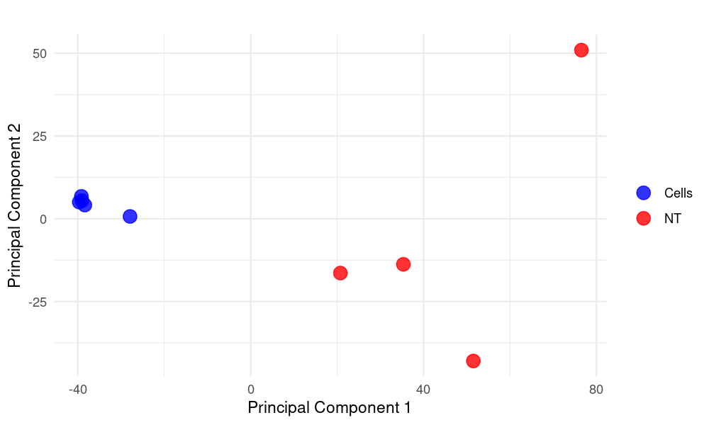
PCA Plot Created Using R for Data_Liu_PCA_plot
gene_x 0 like s 449 view s
Tags: pipeline
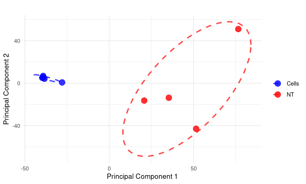
To make the circles (ellipses) more focused on the point clouds, we can adjust the level parameter in stat_ellipse() to a smaller value, which will create tighter circles around the clusters. Here's the modified code with more focused circles:
    library(ggrepel)
    library(dplyr)
    library(ggplot2)
    library(readxl)  # To read Excel files

    # Load the data from the Excel file
    merged_pca_data <- read_excel("PCA figure.xlsx")

    # Prepare the data: select relevant columns and add a 'condition' variable
    pca_data <- merged_pca_data %>%
    select("Component 1", "Component 2", "Component 3", "Component 4", "Component 5",
            "Component 6", "Component 7", "Component 8", "C: Grouping") %>%
    rename(
    PC1 = "Component 1",
    PC2 = "Component 2",
    PC3 = "Component 3",
    PC4 = "Component 4",
    PC5 = "Component 5",
    PC6 = "Component 6",
    PC7 = "Component 7",
    PC8 = "Component 8",
    condition = "C: Grouping"
    ) %>%
    mutate(condition = factor(condition))  # Add 'condition' as a factor for coloring

    # Prepare PCA plot data (data to be plotted)
    plot_pca_df <- pca_data

    # Save PCA plot as PNG
    png("PCA_plot.png", width = 1000, height = 600, res = 150)

    # Create PCA plot using ggplot with tighter circles around point clouds
    ggplot(plot_pca_df, aes(x = PC1, y = PC2, color = condition)) +
    geom_point(size = 4, alpha = 0.8) +  # Plot points
    stat_ellipse(
    type = "norm",
    level = 0.6,  # Reduced from 0.9 to make circles tighter
    size = 1,
    linetype = 2,
    alpha = 0.7  # Added transparency to circles
    ) +
    labs(
    title = "",  # PCA Plot
    x = "Principal Component 1",
    y = "Principal Component 2"
    ) +
    theme_minimal() +
    scale_color_manual(values = c("blue", "red")) +  # Customize colors for different conditions
    theme(legend.title = element_blank())  # Optional: remove legend title

    dev.off()  # Close the PNG device and save the file
Key changes:
-
Reduced the level parameter from 0.9 to 0.6 to make the circles tighter around the point clouds
-
Added alpha = 0.7 to make the circles slightly transparent
-
Kept the dashed line style (linetype = 2) for better visibility
If the circles are still too large, you can try:
-
Decreasing the level further (e.g., 0.5 or 0.4)
-
Using type = "t" instead of "norm" for a more robust ellipse estimation
-
Adding segments = 100 to make the ellipses smoother
For perfect circles (if your data is properly scaled), we could also try:
stat_ellipse(type = "euclid", level = 0.6, size = 1, linetype = 2, alpha = 0.7)
点赞本文的读者
还没有人对此文章表态
本文有评论
没有评论
看文章,发评论,不要沉默
最受欢迎文章
- Motif Discovery in Biological Sequences: A Comparison of MEME and HOMER
- Why Do Significant Gene Lists Change After Adding Additional Conditions in Differential Gene Expression Analysis?
- Calling peaks using findPeaks of HOMER
- PiCRUST2 Pipeline for Functional Prediction and Pathway Analysis in Metagenomics
- Updating Human Gene Identifiers using Ensembl BioMart: A Step-by-Step Guide
- pheatmap vs heatmap.2
- Should the inputs for GSVA be normalized or raw?
- Setup conda environments
- Kraken2 Installation and Usage Guide
- File format for single channel analysis of Agilent microarray data with Limma?
最新文章
- Setup the environment for lumicks-pylake and C_Trap-Multimer-photontrack.ipynb
- 🧬 Cadmium Resistance Gene Analysis in Staphylococcus epidermidis HD46
- MCV病毒中的LT与sT蛋白功能
- Analysis of the RNA binding protein (RBP) motifs for RNA-Seq and miRNAs (v3, simplied)
最多评论文章
- Updating Human Gene Identifiers using Ensembl BioMart: A Step-by-Step Guide
- The top 10 genes
- Retrieving KEGG Genes Using Bioservices in Python
推荐相似文章
Setup the environment for lumicks-pylake and C_Trap-Multimer-photontrack.ipynb
🧬 Cadmium Resistance Gene Analysis in Staphylococcus epidermidis HD46
Analysis of the RNA binding protein (RBP) motifs for RNA-Seq and miRNAs (v3, simplied)

