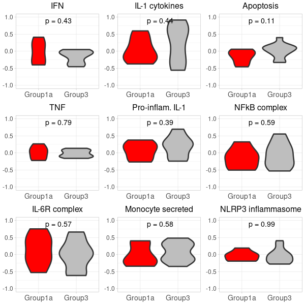
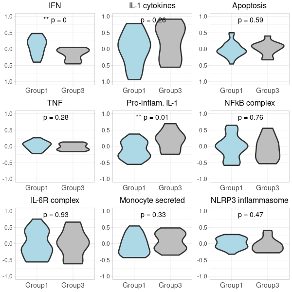
GSVA-plot for carotis nanoString data
gene_x 0 like s 1152 view s
Tags: plot, R, RNA-seq
-
preparing exprs for gsva(exprs, selected_geneSets, method="gsva")
#Input: Images/*png and (hard-coded) /mnt/Samsung_T5/Data_Susanne_spatialRNA/M666_UKE_Hamburg_box/ dccs/*.dcc, pkcs3/all.zip, and annotation/M666_All_Data_SP.xlsx library("rmarkdown") library("tidyverse") library(rmarkdown) library("GeomxTools") library("GeoMxWorkflows") library("NanoStringNCTools") setwd("/home/jhuang/DATA/Data_Susanne_Carotis_spatialRNA_PUBLISHING/run_2023_2_GSVA") render("run.Rmd", c("html_document")) #identical(exprs(target_m666Data), assay(target_m666Data, "exprs")): contains the gene expression values that have been both normalized and log-transformed, which are often used for downstream analysis and visualization in many genomic studies. #assay(target_m666Data, "log_q"): These are likely log2-transformed values of the quantile-normalized data. Quantile normalization ensures that the distributions of gene expression values across samples are the same, and taking the log2 of these normalized values is a common step in the analysis of high-throughput gene expression data. It's a way to make the data more suitable for downstream statistical analysis and visualization. #assay(target_m666Data, "q_norm"): This typically represents the quantile-normalized gene expression values. Quantile normalization adjusts the expression values in each sample so that they have the same distribution. This normalization method helps remove systematic biases and makes the data more comparable across samples. # For the following calculation, the GSVA input requires a gene expression matrix 'exprs' where rows are genes and columns are samples. This matrix must be in non-log space. exprs <- exprs(target_m666Data) #> dim(exprs) #[1] 18677 45 #exprs <- exprs(filtered_or_neg_target_m666Data) -
preparing selected_geneSets in gsva(exprs, selected_geneSets, method="gsva")
#Input: Signatures.xls library(readxl) library(gridExtra) library(ggplot2) library(GSVA) # Paths to the Excel files file_paths <- list("Signatures.xls", "Signatures_additional.xls") # Get sheet names for each file sheet_names_list <- lapply(file_paths, excel_sheets) # Initialize an empty list to hold gene sets geneSets <- list() # Loop over each file path and its corresponding sheet names for (i in 1:length(file_paths)) { file_path <- file_paths[[i]] sheet_names <- sheet_names_list[[i]] # Loop over each sheet, extract the ENSEMBL IDs, and add to the list for (sheet in sheet_names) { # Read the sheet data <- read_excel(file_path, sheet = sheet) # Process the GeneSet names (replacing spaces with underscores, for example) gene_set_name <- gsub(" ", "_", unique(data$GeneSet)[1]) # Add ENSEMBL IDs to the list geneSets[[gene_set_name]] <- unique(as.character(data$geneSymbol)) } } # Print the result to check summary(geneSets) #desired_geneSets <- c("Monocytes", "Plasma_cells", "T_regs", "Cyt._act._T_cells", "Neutrophils", "Inflammatory_neutrophils", "Suppressive_neutrophils", "LDG", "CD40_activated") desired_geneSets <- c("IFN", "TNF", "IL-6R_complex", "IL-1_cytokines", "Pro-inflam._IL-1", "Monocyte_secreted", "Apoptosis", "NFkB_complex", "NLRP3_inflammasome") selected_geneSets <- geneSets[desired_geneSets] # Print the selected gene sets print(selected_geneSets) -
prepare violin plots for 1_vs_3
# 1. Compute GSVA scores: gsva_scores <- gsva(exprs, selected_geneSets, method="gsva") # 2. Convert to data.frame for ggplot: gsva_df <- as.data.frame(t(gsva_scores)) # 3. Add conditions to gsva_df: identical(rownames(pData(target_m666Data)), rownames(gsva_df)) gsva_df$Condition <- pData(target_m666Data)$Grp #identical(rownames(gsva_df_filtered), rownames(pData(target_m666Data)) ) gsva_df$SampleID <- pData(target_m666Data)$SampleID # 4. Filter the gsva_df to retain only the desired conditions: #group 1 vs. group 3 in the nanostring data gsva_df_filtered <- gsva_df[gsva_df$Condition %in% c("1", "3"), ] # 5. Define a function to plot violin plots: # Define custom colors custom_colors <- c("Group1" = "lightblue", "Group1a" = "red", "Group3" = "grey") #To implement the custom colors, and make the adjustments to abbreviate "Inflammatory" and "Suppressive", as well as increase the font size for the groups on the x-axis, we can modify the plot_violin function as follows: gsva_df_filtered$Condition <- gsub("1", "Group1", gsva_df_filtered$Condition) gsva_df_filtered$Condition <- gsub("3", "Group3", gsva_df_filtered$Condition) gsva_df_filtered$Condition <- factor(gsva_df_filtered$Condition, levels = c("Group1", "Group3")) plot_violin <- function(data, gene_name) { # Calculate the t-test p-value for the two conditions condition1_data <- data[data$Condition == "Group1", gene_name] condition2_data <- data[data$Condition == "Group3", gene_name] p_value <- t.test(condition1_data, condition2_data)$p.value # Convert p-value to annotation p_annotation <- ifelse(p_value < 0.01, "**", ifelse(p_value < 0.05, "*", "")) rounded_p_value <- paste0("p = ", round(p_value, 2)) plot_title <- gsub("_", " ", gene_name) p <- ggplot(data, aes(x=Condition, y=!!sym(gene_name), fill=Condition)) + geom_violin(linewidth=1.2) + scale_fill_manual(values = custom_colors) + labs(title=plot_title, y="GSVA Score") + ylim(-1, 1) + theme_light() + theme( axis.title.x = element_text(size=12), axis.title.y = element_text(size=12), axis.text.x = element_text(size=10), axis.text.y = element_text(size=10), plot.title = element_text(size=12, hjust=0.5), legend.position = "none" # Hide legend since the colors are self-explanatory ) # Add p-value annotation to the plot p <- p + annotate("text", x=1.5, y=0.9, label=paste0(p_annotation, " ", rounded_p_value), size=5, hjust=0.5) return(p) } # 6. Generate the list of plots in a predefined order: #desired_order <- c("Monocytes", "Plasma_cells", "T_regs", "Cyt._act._T_cells", "Neutrophils", "Inflammatory_neutrophils", "Suppressive_neutrophils", "LDG", "CD40_activated") desired_order <- c("IFN", "TNF", "IL-6R_complex", "IL-1_cytokines", "Pro-inflam._IL-1", "Monocyte_secreted", "Apoptosis", "NFkB_complex", "NLRP3_inflammasome") genes <- colnames(gsva_df_filtered)[!colnames(gsva_df_filtered) %in% "Condition"] genes <- genes[match(desired_order, genes)] genes <- genes[!is.na(genes)] second_row_plots <- lapply(genes, function(gene) plot_violin(gsva_df_filtered, gene)) -
prepare violin plots for 1a_vs_3
# 2. Convert to data.frame for ggplot: gsva_df <- as.data.frame(t(gsva_scores)) # 3. Add conditions to gsva_df: identical(rownames(pData(target_m666Data)), rownames(gsva_df)) gsva_df$Condition <- pData(target_m666Data)$Group #identical(rownames(gsva_df_filtered), rownames(pData(target_m666Data)) ) gsva_df$SampleID <- pData(target_m666Data)$SampleID # 4. Filter the gsva_df to retain only the desired conditions: #group 1 vs. group 3 in the nanostring data gsva_df_filtered <- gsva_df[gsva_df$Condition %in% c("1a", "3"), ] # 5. Define a function to plot violin plots: # Update the condition levels in gsva_df_filtered to ensure the desired order on x-axis: gsva_df_filtered$Condition <- gsub("1a", "Group1a", gsva_df_filtered$Condition) gsva_df_filtered$Condition <- gsub("3", "Group3", gsva_df_filtered$Condition) gsva_df_filtered$Condition <- factor(gsva_df_filtered$Condition, levels = c("Group1a", "Group3")) plot_violin <- function(data, gene_name) { # Calculate the t-test p-value for the two conditions condition1_data <- data[data$Condition == "Group1a", gene_name] condition2_data <- data[data$Condition == "Group3", gene_name] p_value <- t.test(condition1_data, condition2_data)$p.value # Convert p-value to annotation p_annotation <- ifelse(p_value < 0.01, "**", ifelse(p_value < 0.05, "*", "")) rounded_p_value <- paste0("p = ", round(p_value, 2)) plot_title <- gsub("_", " ", gene_name) p <- ggplot(data, aes(x=Condition, y=!!sym(gene_name), fill=Condition)) + geom_violin(linewidth=1.2) + scale_fill_manual(values = custom_colors) + labs(title=plot_title, y="GSVA Score") + ylim(-1, 1) + theme_light() + theme( axis.title.x = element_text(size=12), axis.title.y = element_text(size=12), axis.text.x = element_text(size=10), axis.text.y = element_text(size=10), plot.title = element_text(size=12, hjust=0.5), legend.position = "none" # Hide legend since the colors are self-explanatory ) # Add p-value annotation to the plot p <- p + annotate("text", x=1.5, y=0.9, label=paste0(p_annotation, " ", rounded_p_value), size=5, hjust=0.5) return(p) } # 6. Generate the list of plots in a predefined order: genes <- colnames(gsva_df_filtered)[!colnames(gsva_df_filtered) %in% "Condition"] genes <- genes[match(desired_order, genes)] genes <- genes[!is.na(genes)] first_row_plots <- lapply(genes, function(gene) plot_violin(gsva_df_filtered, gene)) -
(option 1 for plot 1) merge first_row_plots and second_row_plots to a final plot using cowplot
library(cowplot) library(ggplot2) # Start by extracting the 1-8 plots from each list first_row_plots <- first_row_plots[1:9] second_row_plots <- second_row_plots[1:9] # Function to modify the individual plots based on position in the grid modify_plot <- function(p, row, col) { #if (col > 1) { p <- p + theme(axis.title.y = element_blank()) # remove y-axis title if not the first plot #} #if (row == 2) { # p <- p + theme(plot.title = element_blank()) # remove plot title for second row, commented because it has alreay been done below. #} p <- p + theme( axis.title.x = element_blank(), # remove x-axis title for all plots axis.title.y = element_blank(), # remove x-axis title for all plots axis.text = element_text(size = 14), # Increase axis text size axis.title = element_text(size = 16), # Increase axis title size plot.title = element_text(size = 16) # Increase plot title size ) return(p) } # Abbreviate titles for specific plots first_row_plots[[6]]$labels$title <- "Inflam. neutrophils" first_row_plots[[7]]$labels$title <- "Suppr. neutrophils" second_row_plots[[6]]$labels$title <- "Inflam. neutrophils" second_row_plots[[7]]$labels$title <- "Suppr. neutrophils" # Apply the modifications to the plots for (i in 1:9) { first_row_plots[[i]] <- modify_plot(first_row_plots[[i]], 1, i) second_row_plots[[i]] <- modify_plot(second_row_plots[[i]], 2, i) } # Increase the font size of x-axis labels for each plot for (i in 1:9) { first_row_plots[[i]] <- first_row_plots[[i]] + theme(axis.text.x = element_text(size = 14), axis.text.y = element_text(size = 12)) second_row_plots[[i]] <- second_row_plots[[i]] + theme(axis.text.x = element_text(size = 14), axis.text.y = element_text(size = 12), plot.title= element_blank()) } # Now, combine the modified plots into a single list all_plots <- c(first_row_plots, second_row_plots) # Generate the 2x9 grid final_plot <- plot_grid(plotlist = all_plots, ncol = 9) # Save the plot to a PNG file png("Carotis_NanoString2.png", width=1400, height=380) print(final_plot) dev.off() -
(option 2 for plot 2) generating two 3x3 grid plots
# Start by extracting the 1-9 plots from each list
first_row_plots <- first_row_plots[1:9]
second_row_plots <- second_row_plots[1:9]

# Function to modify the individual plots based on position in the grid
modify_plot <- function(p, row, col) {
  p <- p + theme(axis.title.y = element_blank()) # remove y-axis title if not the first plot
  p <- p + theme(
    axis.title.x = element_blank(), # remove x-axis title for all plots
    axis.title.y = element_blank(), # remove x-axis title for all plots
    axis.text = element_text(size = 14), # Increase axis text size
    axis.title = element_text(size = 16), # Increase axis title size
    plot.title = element_text(size = 16) # Increase plot title size
  )
  return(p)
}

# Apply the modifications to the plots
for (i in 1:9) {
  first_row_plots[[i]] <- modify_plot(first_row_plots[[i]], 1, i)
  second_row_plots[[i]] <- modify_plot(second_row_plots[[i]], 2, i)
}

# Increase the font size of x-axis labels for each plot
for (i in 1:9) {
  first_row_plots[[i]] <- first_row_plots[[i]] + theme(axis.text.x = element_text(size = 14), axis.text.y = element_text(size = 12))
  second_row_plots[[i]] <- second_row_plots[[i]] + theme(axis.text.x = element_text(size = 14), axis.text.y = element_text(size = 12))
}

# Pad first_row_plots to have 9 plots
remaining_plots <- 9 - length(first_row_plots)
if (remaining_plots > 0) {
  first_row_plots <- c(first_row_plots, rep(list(NULL), remaining_plots))
}

# Pad second_row_plots to have 9 plots
remaining_plots2 <- 9 - length(second_row_plots)
if (remaining_plots2 > 0) {
  second_row_plots <- c(second_row_plots, rep(list(NULL), remaining_plots2))
}

# Convert the first_row_plots to a matrix and draw
plots_matrix_1 <- matrix(first_row_plots, ncol=3, byrow=TRUE)
png("Carotis_NanoString_grid_1.png", width=600, height=600)
do.call("grid.arrange", c(plots_matrix_1, list(ncol=3)))
dev.off()

# Convert the second_row_plots to a matrix and draw
plots_matrix_2 <- matrix(second_row_plots, ncol=3, byrow=TRUE)
png("Carotis_NanoString_grid_2.png", width=600, height=600)
do.call("grid.arrange", c(plots_matrix_2, list(ncol=3)))
dev.off()
点赞本文的读者
还没有人对此文章表态
本文有评论
没有评论
看文章,发评论,不要沉默
最受欢迎文章
- Motif Discovery in Biological Sequences: A Comparison of MEME and HOMER
- Why Do Significant Gene Lists Change After Adding Additional Conditions in Differential Gene Expression Analysis?
- Calling peaks using findPeaks of HOMER
- Updating Human Gene Identifiers using Ensembl BioMart: A Step-by-Step Guide
- pheatmap vs heatmap.2
- Should the inputs for GSVA be normalized or raw?
- PiCRUST2 Pipeline for Functional Prediction and Pathway Analysis in Metagenomics
- Setup conda environments
- Kraken2 Installation and Usage Guide
- File format for single channel analysis of Agilent microarray data with Limma?
最新文章
- Analysis of the RNA binding protein (RBP) motifs for RNA-Seq and miRNAs (v3, simplied)
- Somatic Variation Detection
- MicrobiotaProcess_PCA_Group3-4.R processing Data_Karoline_16S_2025
- Phyloseq.Rmd processing Data_Karoline_16S_2025
最多评论文章
- Updating Human Gene Identifiers using Ensembl BioMart: A Step-by-Step Guide
- The top 10 genes
- Retrieving KEGG Genes Using Bioservices in Python
推荐相似文章
Bubble plot for 1457∆atlE vs 1457-M10 vs 1457 vs mock
GSVA-plot for carotis RNA-seq data


