pheatmap vs heatmap.2
gene_x 0 like s 1993 view s
Tags: plot, packages
pheatmap and heatmap.2 are two popular R functions used to generate heatmaps. Both functions are based on the base heatmap function in R, but they have additional features and customizations that make them more flexible and user-friendly. Here are some differences between the two functions:
-
Package: pheatmap is a function in the pheatmap package, while heatmap.2 is part of the gplots package.
-
Clustering: Both pheatmap and heatmap.2 can perform hierarchical clustering on rows and columns. However, pheatmap allows users to directly input custom clustering results, while heatmap.2 requires the data to be pre-clustered and sorted accordingly.
-
Annotations: pheatmap has a more straightforward way of adding annotations to rows and/or columns through the annotation_row and annotation_col parameters. In heatmap.2, you can add annotations through the Rowv and Colv parameters, but it requires more manual manipulation.
-
Color scales: Both functions allow customization of color scales, but pheatmap provides the colorRampPalette function for generating color scales, while heatmap.2 uses the colorpanel function.
-
Output: pheatmap outputs a grid object that can be further customized using the grid package functions. heatmap.2 generates base R graphics, and its output is less flexible for customization.
-
Overall, pheatmap is known for its simplicity and ease of use, whereas heatmap.2 offers more customization options but might be more complex to use.
-
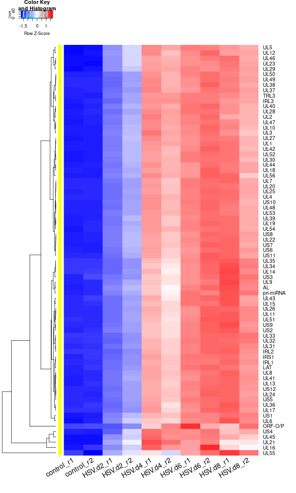
Plot the organoid data using heatmap.2
rld <- rlogTransformation(dds) GOI <- c("AL", "IRL1","IRL2", "IRL3", "IRS1", "LAT", "ORF-O/P", "pri-miRNA", "TRL3", "UL1", "UL10", "UL11", "UL12", "UL13", "UL14", "UL15", "UL16", "UL17", "UL18", "UL19", "UL2", "UL20","UL21", "UL22", "UL23", "UL24", "UL25", "UL26", "UL27", "UL28", "UL29", "UL3", "UL30", "UL31", "UL32", "UL33", "UL34", "UL35", "UL36", "UL37", "UL38", "UL39", "UL4", "UL40", "UL41", "UL42", "UL43", "UL44", "UL45", "UL46","UL47", "UL48", "UL49", "UL5", "UL50", "UL51", "UL52", "UL53", "UL54", "UL55", "UL56", "UL6", "UL7", "UL8", "UL9", "US1", "US10", "US11", "US12", "US2", "US3", "US4", "US5", "US6", "US7", "US8", "US9") RNASeq.NoCellLine <- assay(rld) library("gplots") datamat = RNASeq.NoCellLine[GOI, ] write.csv(as.data.frame(datamat), file ="viral_gene_expressions.txt") constant_rows <- apply(datamat, 1, function(row) var(row) == 0) if(any(constant_rows)) { cat("Removing", sum(constant_rows), "constant rows.\n") datamat <- datamat[!constant_rows, ] } hr <- hclust(as.dist(1-cor(t(datamat), method="pearson")), method="complete") hc <- hclust(as.dist(1-cor(datamat, method="spearman")), method="complete") mycl = cutree(hr, h=max(hr$height)/1.00) mycol = c("YELLOW", "BLUE", "ORANGE", "MAGENTA", "CYAN", "RED", "GREEN", "MAROON", "LIGHTBLUE", "PINK", "MAGENTA", "LIGHTCYAN", "LIGHTRED", "LIGHTGREEN"); mycol = mycol[as.vector(mycl)] png("viral_deg_heatmap2.png", width=600, height=1000) #labRow="", heatmap.2( as.matrix(datamat), Rowv=as.dendrogram(hr), Colv = NA, dendrogram = 'row', scale='row', trace='none', col=bluered(75), cexCol=1.8, RowSideColors = mycol, margins=c(8,8), cexRow=1.3, # Adjust font size for row labels srtCol=30, lhei = c(1, 10), # Adjust relative height of rows, larger values give more space to the heatmap lwid=c(2, 8) ) dev.off() -
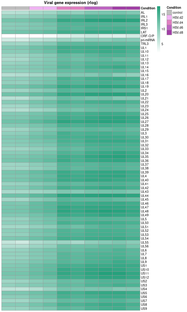
Plot the organoid data using pheatmap
# Extract the colData as metadata metadata <- as.data.frame(colData(dds)) # Select only the 'condition' column for the heatmap annotations and rename it heatmap_metadata <- metadata[ , "condition", drop=FALSE] colnames(heatmap_metadata) <- "Condition" # Rename the column # Set the order of levels for 'Condition' column heatmap_metadata$Condition <- factor(heatmap_metadata$Condition, levels = c('control', 'HSV.d2', 'HSV.d4', 'HSV.d6', 'HSV.d8')) please reorder the color from light to dark # Colors for the heatmap based on the condition # Colors for the heatmap based on the condition condition_cols <- c( 'control' = 'grey', 'HSV.d2' = '#F1B3F4', # Lightest 'HSV.d4' = '#E080C1', 'HSV.d6' = '#BE64C2', 'HSV.d8' = '#A13FA6' # Darkest ) # Drawing the heatmap using pheatmap library(pheatmap) png("viral_deg_pheatmap.png", width=600, height=1000) pheatmap( datamat, # Using rlog-transformed data directly cluster_rows = F, cluster_cols = F, display_numbers = F, color = colorRampPalette(c("white", "#23A17B"))(100), angle_col = 90, show_rownames = T, main = 'Viral gene expression (rlog)', fontsize = 10, fontsize_col = 10, annotation_col = heatmap_metadata, # Using only the 'Condition' column for annotations annotation_colors = list(Condition = condition_cols), # Adjusted to match the new column name show_colnames = F ) dev.off() -
Note that the plot above used rlog rather than log10. While both are types of logarithmic transformations, they serve slightly different purposes and are calculated differently.
-
rlogTransformation (regularized log transformation): This is a transformation used especially with DESeq2 package for RNA-seq data analysis. The "regularized" log transformation stabilizes the variance across genes, especially for genes with low counts, by borrowing information from all genes. It’s a variance stabilizing transformation that aims to make the variance roughly constant across different genes and conditions, without requiring separate normalization to correct for differences in sequencing depth or RNA composition.
-
log10(gene expression): This is a simple logarithm base 10 transformation of the gene expression values. This transformation is used to adjust the dynamic range of the data and make it more interpretable, especially when dealing with large differences in gene expression levels. But it does not have the variance stabilizing properties of the rlogTransformation.
- Original Label rlogTransformation Label ("Regularized log-transformed expression" or "rlog Expression")
- Viral gene expression (log10) Viral gene expression (rlog)
- Host gene expression (log10) Host gene expression (rlog)
- Differential expression (log10) Differential expression (rlog)
- Transcription level (log10) Transcription level (rlog)
- Expression fold-change (log10) Expression fold-change (rlog)
-
点赞本文的读者
还没有人对此文章表态
本文有评论
没有评论
看文章,发评论,不要沉默
最受欢迎文章
- Motif Discovery in Biological Sequences: A Comparison of MEME and HOMER
- Why Do Significant Gene Lists Change After Adding Additional Conditions in Differential Gene Expression Analysis?
- Calling peaks using findPeaks of HOMER
- PiCRUST2 Pipeline for Functional Prediction and Pathway Analysis in Metagenomics
- Updating Human Gene Identifiers using Ensembl BioMart: A Step-by-Step Guide
- Should the inputs for GSVA be normalized or raw?
- pheatmap vs heatmap.2
- Kraken2 Installation and Usage Guide
- Setup conda environments
- File format for single channel analysis of Agilent microarray data with Limma?
最新文章
- From Genbank-ID to Phylogenetic Tree Visualization using roary, raxml and ete3
- 📊 Transposon Analysis: Sequencing Depth Requirements
- Setup the environment for lumicks-pylake and C_Trap-Multimer-photontrack.ipynb
- 🧬 Cadmium Resistance Gene Analysis in Staphylococcus epidermidis HD46
最多评论文章
- Updating Human Gene Identifiers using Ensembl BioMart: A Step-by-Step Guide
- The top 10 genes
- Retrieving KEGG Genes Using Bioservices in Python
推荐相似文章
MicrobiotaProcess Group2 vs Group6 (v1)
Visualizing Phylogenetic Relationships and Metadata with Circular ggtree and gheatmap in R

